The three companies I looked up were AbbVie, Abbott, and American Addiction Centers, while focusing on their choice of photography I noticed some striking similarities. First of all, majority of the photographs had people, and some focused on environments. The photographs of people were well lit, giving the subjects a very warm and inviting look and most of the shots were either head shots or 3/4 shots. Also when the health care companies used photographs of people they used very energetic images, any image that had a multitude of people were quite engaging and looked very natural and full of life. If scenery was used, it was used in to ways, by itself or with people. The scenery would be something very peaceful to look at, being very easy on the eyes, when used with people, the people are usually in focus while the background scenery would be soft and blurred.
For a company trying to promote themselves as a health care company, certain key elements should be incorporated within each photograph. Each photograph should invoke a warm and inviting feeling, so that people would not feel, for whatever reason threatened or hostility to your company. Each image should also flow with energy and not be static or boring, to be able to catch people’s attention.
I would like my photographs to be a mix of some breathtaking scenery and some positively inviting looking photographs of individual. This blend would not only make costumer feel invited but I believe it will also leave them with a very tranquil feeling.


Please don’t forget to go back after the shoot and add a results section.
Light and bright is certainly the style used in all of these ads. And the outdoors is a common theme to evoke health and feeling well and full of energy.
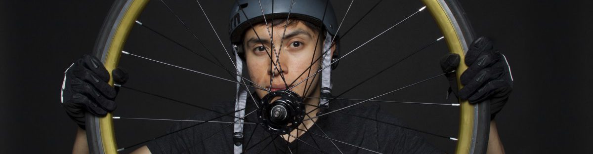
Your healthcare ad looks a little tentative. The subject (you) looks a bit small in the frame. This particular image is also a bit over exposed particularly in the highlights. I would suggest looking for another frame where the expression is as good but is a better exposure. I would also suggest putting in a background. Go to the park and take some out of focus frames so that it can look like shallow depth of field for the background. The subject shot against white should be easy to silhouette. Also if you shoot a background put the sun at your back so it is front light to match the studio shot as much as possible.