Author: Kevin
In Steven Heller’s article titled “The underground mainstream”, the idea of design is depicted not only as a means of creating and sharing ideas, but also for commercial and business uses that may have a negative effect on the art itself or possibly build more awareness around it. Some companies see art as a means to promote products even if the original art is stolen or altered to better fit their demographic, while others have intentions to shock or change people in a manner that would capture their attentions. In a way it can gain attention and followings even if it fails to shock or frighten viewers with a different perspective shown. “Design Studies Theory and Research in Graphic Design” by Audrey Bennett does mention that images and designs have their own goals and specific communities one works a process towards, though not all images are seen just for appearances but rather the culture in visual context.
There are other sources that could be relevant to the article at hand. In one of sources titled “Graphic Design Discourse: Evolving Theories, Ideologies, & Process of Visual communication” by Henry Hongmin, many points regarding how designs represents the economy of form and function. How a designer’s work should not only be functional, but also aesthetically pleasing, hence how the attention of businesses and even viewers are drawn in.
“Graphic Design as Communication” by Malcolm Barnard also mentions how a design meant to shock viewers can have different effects. One of their examples being a poster of a black and white man handcuffed together, which gained many negative receptions but also gain other attention with what the poster’s message could mean to them.
Many different understandings and questions come to mind when I read Roland Barthes’ article titled “Rhetoric of the Image”, especially with how it looks into the concept of images and meanings within or around it.
What is interesting is how the article discusses Linguistics in terms of how a message within images are read. As well as how signs are utilized as well. Is it the image itself that gives the message, or a combination of other factors such as texts that does so instead? And could there be multiple meanings behind an image, or just a limit amount of possibilities. And could these questions aldo be attributed with how some designs are made in the modern era?
In this week’s article by Stuart Hall, the ideologies of how statements and concepts are created using different elements of individuals is explored, from mindsets to appearances. It can range from different intentions and range through varying meanings, something that can be seen with many advertisements in the modern era.
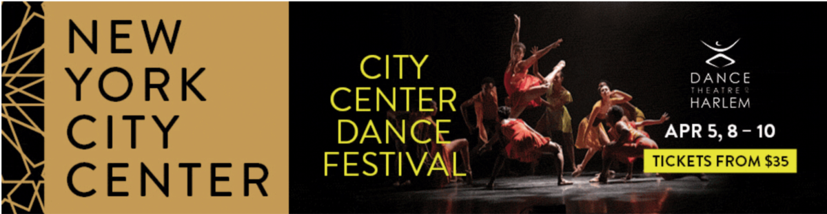
One of the many advertisements I feel can relate to the article’s idea comes from The New York Times’ website, with one of their pop out ads displaying the New York City Center Dance Festival. What makes this ad stand out is the different racial, gender, and cultural representation that its embracement ads to the ad’s call to action. It depicts the gatherings of these different identities in a positive manner not only for an entertainment event, but also to emphasize the event’s idea of a gathering of different groups.

Another advertisement that can also relate to the article comes from The Economist, with a unique design which the call to action may not be as immediate as others. The idea of this ad is to share with consumers the importance of different women’s identities and their history, but instead of using photos, silhouettes and overlapping colors are used to show how diverse these women are. While seemingly done in a more artistic manner, the call to action of showing women of different appearances and background can be examined. Some ads may be explicitly with their ideology of representation, but this one uses the concept in a unique manner.
An advertisement from GAP displays a large groups of individuals varying of age, shape, colors, gender, and backgrounds. Some of them do not appear to be in the same location of each photograph however which does have the focus placed onto each individual exclusively in each of them. It still follows the article’s idea of elements of these individuals being explores and how diverse they can be. It may not emphasize them all as together as a group, but still shows how unique they are all.
People and society have been shaped through many different methods, whether with minor or major effects. One of the articles this week, titled “The Medium is the Massage” has the writer express their own interpretation on the concept that can have both positive and negative effects.
One of the ideas mentioned in the article is how exactly people are changed when exposed to media. Similar to how the concept of communication is done through media, communication itself can also change throughout time. In what I feel is both a positive and negative suggestion, is how quickly influenced society can be with the consumption of media to where it is possible older media can become obsolete in favor of newer ones. In a way this can be an extreme observation even with how human are shaped both physical and psychic by media, but it is an interesting observation especially with how we consume different art and ideas.
While I do agree with how we learn and perceive utilize concepts such as words and meanings in certain ways as the article explains, I also do not agree with how the writer’s ideas of how much rapidly society and humans’ mindset will change with media consumption. It is an interesting article to look into through my understandings, even with how media is consumed by today’s modern era.
There are different interpretations of designing and how one should approach it. Sometimes art is no only through the colors or materials used, but also from how certain elements are organized. The three articles assigned for this week explain this in further details and what benefits and drawbacks it may have with design.
Some designs explained or given examples within each article reflect what can be done with type in terms of design, one notable thing is how some examples show it constructed is how they are arranged in specific grids or amount of spaces. Some examples in the article show how complex a design may appear in terms of shapes used, but the text itself remains organized. While it is presentable for different language arrangements and quality, it is also seen not to be as a solution when creating designs but instead a part of it. And type itself must be organic to work as part of a design instead of being forced into a design even within a grid like structure.
From my understanding, even if certain type have to arranged to fit languages and cultures of how they are read or whether they are meant to fit a design style with old typography or pseudo-modern type, typography does play an important role within art. Sometimes the structure of the type’s positioning itself is just as important as how the entire piece is made, whether because of how it appeals to certain viewers or if it is legible and makes sense in context to the piece. What some see in typography as organized and natural others may also see as static and forced into a shape.


Recent Comments