LL3-Scavenger Hunt

First assess how well did you work in a group? Did you give honest and constructive feedback on other’s photos and ideas while remembering to be polite and encouraging? Did you support your group members by including everyone’s shots in the final selection?

Then consider how well you were able to create an image that meets the scavenger hunt criteria but also is visually engaging. Include your best example that shows how you were able to do both. Describe how the image meets both sets of criteria.

Posted in LL3-Scavenger Hunt | Leave a comment

ll2


IMG_1213

This photo uses the element of negative space very powerfully. It also shows vertical lines and can be used for close up framing.

Posted in LL2-Composition | Leave a comment

LL2-Composition

IMG_8552


I really like this picture because it shows rules of thirds and it also has negative space

Posted in Uncategorized | Leave a comment

HW1

I was fascinated by Matthew Pillsbury’s work and the one that grabbed my attention the most was Main Reading Room. New York Public Library. The setting takes place in the library. Even though I know It’s people just reading in the library I still get this mysterious feeling from the photo due to the figures being blurred out and this perfect symmetry is what got my attention the most from his collection, It reminds me of West Anderson film. The symmetry makes it feel like a film and It’s not just people reading books but there’s a bigger story and the photographer focused it on that building. I like how the photographer doesn’t work with color, it makes the photograph feel more natural and it fits rather perfectly for this specific photo.

The first thing I noticed about the photo is the leading lines. Chandeliers and the floor seem to lead towards the door and above to the arch. I don’t know the artist enough but I could make a guess that the lines leading towards the door could symbolize something as well. Also there’s contrast between light and dark which adds more drama to the photograph. With the symmetry in the photograph I think It’s safe to say that there are patterns and repetition. If we took half of the photo and reflect it, it would almost be the same photo as most of the things on the photograph would repeat. With the blurred out people the photographer created an illusion that makes it seem more like the people are part of a pattern as well since It’s harder to see them and identify how are they different from each other.

http://matthewpillsbury.com/photographs/main-reading-room-new-york-public-library/

Posted in Uncategorized | 1 Comment

The Thing Itself

The subject that has been photographed vs the actual subject differ in many ways. Photograph captures what the photographer wants to show. Photograph can be bold, powerful, memorable and the people will convert the photograph into reality. Photograph can be so compelling it will subdue the viewer and when we would try to reimagine a specific event in our head we might just remember the photo because a photograph stops time and captures the moment.

Posted in Uncategorized | Leave a comment

HW1 – The Manhattan Cutout That Really Isn’t

Michael Kenna
Manhattan Skyline, Study 1, New York City, USA, 2006
http://michaelkenna.net/gallery_images/a6ecec24.jpg
http://michaelkenna.net/gallery.php?id=14

This photograph gave me the sense of how small Manhattan kind of is because of how cluttered all these buildings are to one another. The darkness from the buildings makes it seem like they are interconnected and that the light was shining behind the city scape, as if the sun was setting. It feels as though there isn’t much going on in the city as it isn’t shining brightly as Manhattan is typically depicted when it’s dark; although, the little specks of going through does show that this city isn’t a lifeless as I thought from a first glance.
This photo is heavily reliant on the contrast of light and dark. The photographer seemed like wanted to make it look like a painting or a cardboard cutout place onto an image of a river. It does make it seem as if the skyline is flat compared to the river foreground. The fascinating part of this photo is the little bump at the far right of the composition. This part is different because this bump doesn’t match the rest of the skyline’s straight edges and that it is much lighter compared to the rest, thus making it seem like there is something that the skyline is hiding. The flat skyline is balance out by the ocean in the foreground by having a more rich and dynamic look. This contrast helps create the feeling of emptiness, as it makes it look like a deserted city without any real light shining through. It can also be a sense of mystery, where people would question whether this is an elaborate cutout or not. I could hardly tell at first glance.

Posted in HW1-photo description | 1 Comment

Homework1

http://matthewpillsbury.com/photographs/self-portrait-with-jetlag-in-tokyo-friday-march-28th-2015-513-528am/

The photo I chose is called Self Portrait with Jet lag in Tokyo by Matthew Pillsbury. This photo stood out to me because I like how the photographer captured the city at night and was still able to balance the photo with the guy who appears to be in motion. When I first saw this photo, I was in awe by the city lights but then I realized the name has some significance.  According to Oxford Dictionary, jet lag refers to “extreme tiredness and other physical effects felt by a person after a long flight across several time zones.” The name of the photo is called self portrait with jet lag so, I think this has some connection with the photographer. I researched Matthew Pillsbury and found out that he lives in New York so I came to the conclusion that this photo represents the state of mind of the photographer travelling from New York to Tokyo.

I was also fascinated by the way the photographer was able to portray tiredness by using motion. Just by looking at this photo gives the viewer a feel of exhaustion. The title is very important, but the photo is also very strong on its own.  Although the guy looks drained, the city lights are brighter than ever and makes the photo come alive. This balances out the outside illuminated world from the inside, consumed world.

Pillsbury uses the framing technique to add depth to the photo . The window serves as a scene to draw the viewer into the photo. It also separates the busy city from the worn out guy. He also uses diagonals to give the photo a sense of perspective. The window ledges are used as dividers and also draw the viewer further in the photo. The city lights and buildings also create a pattern because of the repetition of lights.

Posted in HW1-photo description | 1 Comment

Photo Description

http://www.michaelkenna.net/gallery_images/6d7bc15.jpg

“Central Park Reservoir, New York City, USA, 1998”

The photo I chose by Michael Kenna was taken of central park in 1998. The black and white photo consists of buildings overlooking a body of water in central park as seen through a fence. The grain and lack of color make it an appealing picture that gives a deep reaction since the main subject of the photo is distant and unclear. The fence that the photo was taken through creates a frame for the main focus of the photo and draws your eye towards it. Kenna also utilized the rule of thirds on this picture since the body of water and two distinguishable buildings are in the middle of the frame which gives it harmony. For the most part there is symmetry in this photograph since the rhombus shape of the fence lines up with the middle of the frame as well as the buildings that stand out. The contrast that the black and white creates in this photo also makes certain aspects of the picture distinguishable and stand out such as the plants at the bottom of the frame which are almost completely black and stand against the very bright grey body of water in central park.

Posted in HW1-photo description | 1 Comment

HW1

Michael Kenna took this photograph, in the year of 1998 in New York City. The name of the photograph is Central Park Reservoir. I found his work style very interesting and unique in many aspects. The photograph is quite interesting and really caught my eye because it was taken through a wired fence from central park to capture the buildings of NYC right across the river. I think that the photographer’s purpose for taking this photograph was to show you a different angle of perspective of things. It seems that he wanted to capture the buildings in the picture to show you a different view, instead of showing you the whole fence in the picture. In the perspective that the photographer is trying to show us, makes the picture seem as if we were looking through a window from part of the fence rather than just showing us the whole image itself without zooming into the fence.

I believe Michael Kenna uses a couple of techniques in order to capture the photograph. One of those techniques is framing which is the use of some sort of window or door. In this case the photographer uses the fence to make it seem like we are viewing the image through a window. I think this is very interesting because you are seeing the image from a different perspective. Another technique that Kenna uses is Symmetry. This photograph can be folded vertical to show symmetry. I think that when using these sorts of techniques you can learn a lot from it. What I mean by this is that, when you use these sorts of techniques you can really grasp a much more different view rather than doing something simple as just taking a photo of the whole image without cropping into it. I think that these elements really help bring out the mood of the picture by telling a story. In this photograph I believe that the photographer was trying to make the mood very settle and give it an old vintage feeling to it.


http://www.michaelkenna.net/gallery.php?id=14

Posted in HW1-photo description | 1 Comment

Thomas Holton-The Lams of Ludlow Street

the lams of ludlow street

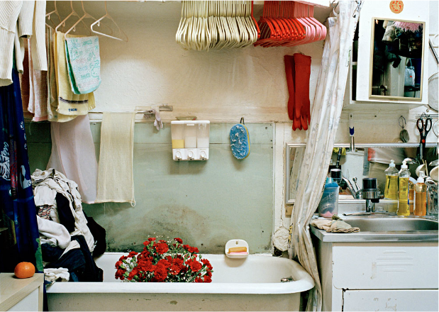
Thomas Holton is graduated from the School of Visual Art, and got the master in MFA photography, video, and related media. One of his famous photography works is called “The Lams of Ludlow Street”. In this photography work, Thomas Holton used his camera to record the life of one Chinese family who live in the neighborhood of New York City’s Chinatown. The idea of Thomas Holton shooting these photos is that he wants to show the real life of Chinese immigrants and Chinese culture to people, so they gain a deep understanding of Chinese immigrant’s daily life in the today.

Based on the photo that I choose from Thomas Holton’s “The Lams of Ludlow Street”, I can realize some composition tips that he used in this photo. At first, Thomas utilizes the composition tips of ‘Rule of Third’ to place the positions of the red carnation, clothes hangers especially red clothes hanger, and red rubber gloves to make a connection between wall and ground. Secondly, I think Thomas Holton also uses ‘Figure to Ground’ through the color of the carnation, rubber gloves, and clothes hangers which is red to create a contrast with white wall, clothes hangers, and the bathtub. It makes me feel isolated and helplessness, which is similar to the condition of Chinese immigrants because of cultural diversity and language communication barrier. At last, Thomas Holton uses symmetry in this photo; for instance, the line of blue sponge mat and the soap holder is like the symmetric vertical axis. The subjects of the left side of this axis are towels and clothes, and the objects of right side of the axis are some plastic and metal bottles and jars.  In addition the crack of wall also creates a symmetric horizontal axis, so the white and red clothes hangers are like the inverted reflection of the red carnation and bathtub.

http://www.thomasholton.com/

Posted in Homework, HW1-photo description | 1 Comment