Category: Critique (Page 1 of 11)
I like the first image because it’s a good example of broad light. I like how the second image is centered nicely I believe it is butterfly light. The last image is a good example of wide angle distortion making her hand look extremely large compared to her face.
Members: Lisa, Andres, Chris, and Alex

One 
Two 
Three
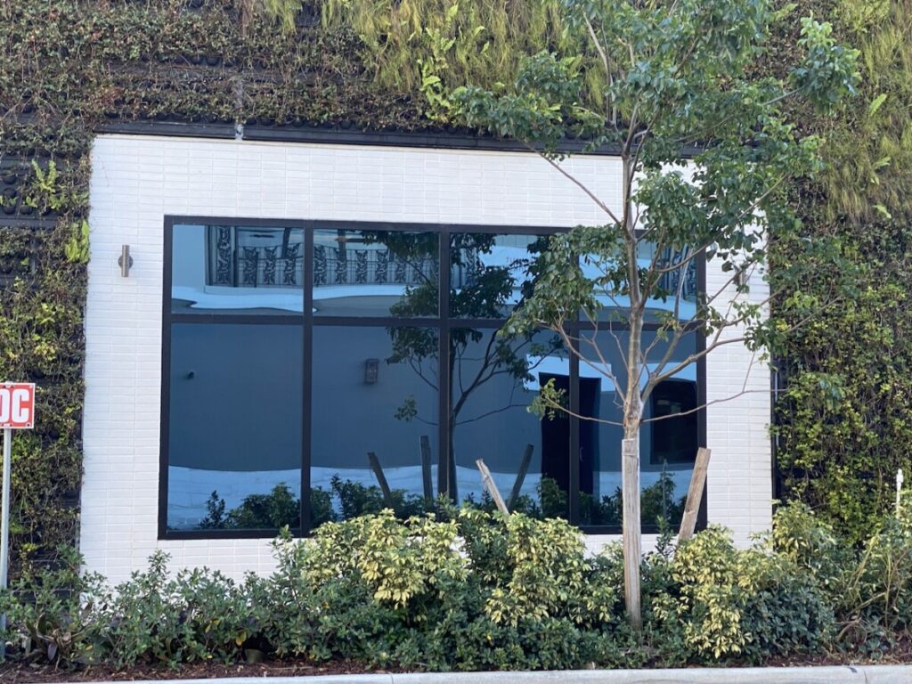
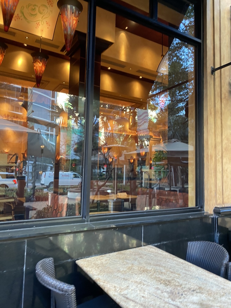
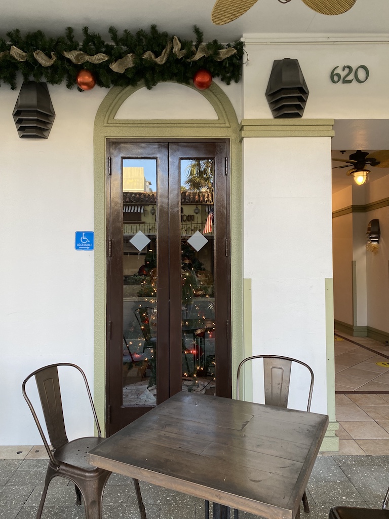
In the first photo, I really liked her use of the rule of thirds by centering the window in frame. This is also a good example of a frame within a frame with the way the plants frame the rectangle shape of the window. In the second photo, I liked the way the camera is at a bit of an angle, giving some depth to the reflection and table set up. In the third, I liked how there was still something being seen through the windows of the doors, but very subtly.


Recent Comments