Type & Media Blog

COMD 1167 e148 Fall 2016

Page 2 of 5

Juan, Paola, and Natalie – Blueprint Magazine

The Grid: The magazine mainly consists of five columns but sometimes it can play by only using a three to four column. Which allows more or less information to be displayed; text or picture.

The Color Scheme: The colors that appear in this magazine are, vibrant yellow, electric blue, red, orange, black and white. These colors are used in modern snapshots of the 1950’s. Yellows are specially used in the kitchen walls and wall paper, and blue is used on backgrounds and clothing. Lastly, reds are used on minor details of the magazine.

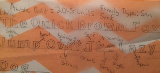
Typeface Concept: The two most consistent typeface used in the magazine is Helvetica and Modern type. Headlines are in Modern typeface while Helvetic is usually used as the subtitles.

Joshua Magazine Design Assessment

Anthony and Nelson

Grid: The grid implemented in the magazine seems to be a 4 column grid. Although the use of large images seems to take priority over the grid, we think for the sake of showcasing a clean aesthetic, which showcases the item is trying to sell you.

Color: All colors seem to be toned down or muted,  evoking a feeling of upscale elitism that. by providing a clean look with images mostly showcasing the quality of the product over expository text.


Typeface:

The magazine uses a clean san serif font to create a sense of elegance, while maintaining a modern tone. A Serif font is used in the headings to contrast the sans serif font, again adding to the sense of clean, upscale look that is found throughout the entire magazine.

Magazine Design Hunt – Julie, Natalya, Cheng

• Consistant Grid
— Pages mainly consist of a 4 grid system that sometimes feature a 2-3 grid system

• Color Scheme

— Lollipop, bubblegum, pastel colors, bright highlights. Mainly geared towards young women and budding artists.

• Typeface concept

— Magazine is very typeface heavy. Typeface changes depending on the article to reflect the content. Body text is consistent throughout. Header text highly stylised to both grab attention and define the article.

Grid Layout

From Jhoanna, Melendy, and Alex

In this layout, the image imposes itself partly over the header (designating the section of the magazine). The image encourages the reader to find out more about the topic (food, restaurant).

The subheader offers both text and symbols (stars) to emphasize the importance of the restaurant’s food quality.

The layout has different typefaces–different sizes and colors, serif body, sans in headers.

The second image, diagonally placed to the first, breaks up the body text to increase interest. Overall, the placement of the images and headers are diagonally opposed, drawing the readers’ eyes down to the text, and offering a good balance.

20161022_111801

Gestalt Images –Figure/Ground & Simplicity

This first example is Figure-Ground, teaser movie posters from Black Swan.  The figure of the ballet dancer’s arms can be in focus alternately with the feathers of the swan.

Figure-Ground Example, Black Swan

[Credit: http://site.laboca.co.uk/Black-Swan]

The second example is Simplicity, with the iconic movie poster from Silence of the Lambs.  Simplicity is the mind’s perception making an immediate and simple interpretation. Here, the “skull” of the Death Head’s moth in the poster is actually made up from the form of women, an image taken from an old Salvador Dali image.

Simplicity example of Gestalt, Silence of the Lambs

  Simplicity – Silence of the Lambs

[Credit: http://dontpanic-marci.blogspot.com/2010/11/gestalt-psychology.html]

« Older posts Newer posts »

© 2024 Type & Media Blog

Theme by Anders NorenUp ↑