COMD 1167 e148 Fall 2016

Category: Participation

Conventions (3/3)

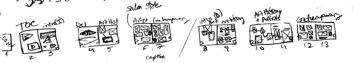
Thumbnails: used to plan and design the layout

img_1200

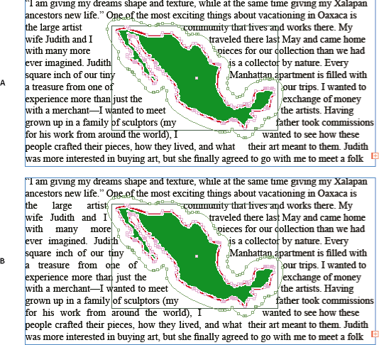
Text wrap: text that wraps around an object or shape. Can wrap around specific shapes of objects, including invisible ones. Can customize the shape around the object.

wrap

Folio: Area within the margins, where the page numbers and sometimes section head are located.
Bleed: When photos or text extend past the printable/viewable margin area.
WHY is it bad to use all caps in a paragraph such as a kicker or body copy? It makes it difficult to read and overpowers the rest of the page. If anything needs to be fully capitalized, it should only be the title.

Magazine Anatomy:

magazine-anatomy-worksheet

Define –

  • Infographics –  visual representations of information, in forms of graphs, charts, interactive lists, so on.
  • Spread(facing pages), – The layout of a magazine, book, page etc. Facing pages are pages that will ultimately face each other when printed/closed, so you design the layout with both pages considered.
  • Table of Contents – The page(s) where you’ll be directed to the content of the book.
  • Visual Hierarchy: Arrangement of content, designed to catch and guide the viewers attention.
    – Strategies used to establish visual hierarchy –
    Color- psychological use of colors to convey messages to the viewer, also to highlight or make something pop
    typeface- fonts, different families give off a different mood/theme when looked at. Some typefaces are better for titles or bulk reading. It is good to contrast and complement typefaces to establish breaks and sections.
    letter size- Importance/relevance of information, varying size in order to create subhead, pull quote, and other specific items made for organizing or pausing the flow of reading.
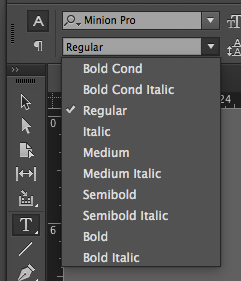
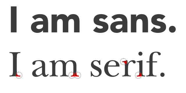
    variation- the way text is displayed. EX. Width, Weight, Posture, Stress, Contrast, Serif or Sans Serif
    orientation- location on the page, is it isolated, is it aligned a certain way?

            Space – white space frames objects and text to give it emphasis, also used to break up sections.

Quality of Typography Rules: (Quality of Typography Checklist )
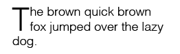
No Widows, No Orphans, and Fixing Hyphen errors. These tend to break up the legibility of the text and distract the reader from the content. Also shows a lack of attention to detail.

History & Standards (2/3)

  1. Explain the difference between typeface and font: 

Typeface can be considered as the album, while the fonts roll can be considered the songs of said albums.

for example: Helvetica is the type face and Helvetica Bold is the song that belongs to helvetica. 

screen-shot-2016-12-10-at-1-49-05-pm

  1. What are the Five Families of Type? Show a visual / Listthem in chronological order:
  • Garamond – Old Style (1615)
  • Baskerville – Transitional (1757)
  • Bodoni – Modern (1788)
  • Egyptian – Slab Serif (1980)
  • Helvetica – San Serif (19th – 20th Century)
  1. What is serif versus san serif?
  • San serif is a category of typefaces that do not use serifs (small lines at the ends of characters). Serif refers to typefaces that have the feet (from Old Style to Modern typefaces)
  1. List example sof serif typefaces / List examples san serif typefaces:
  • Serif font include Times Roman, Courier, New Century Schoolbook, and Palatino. 
  • Popular sans serif fonts include Helvetica, Avant Garde, Arial, and Geneva. According to most studies, sans serif fonts are more difficult to read (because of a lack of contrast in the characters)

sansserif

  1. What were specific traits of the Phoenician alphabet?
  • The specific traits of the Phoenician alphabet where there were no vowels and the Phoenicians read from right to left. It consisted of 20 simple markings.
  1. What were specific traits of the Roman alphabet?
  • The specific traits of the Roman alphabet where they added the “Q” and the “F” to the adopted Greek alphabet.
  1. What are the four types of alignment?
  • Centered
  • Flush Left, Ragged Right
  • Flush Right, Ragged Left
  • Justified
  1. What is a style sheet?
  • Paragraph and Character styles (see below) that establish fonts, leading, kerning and other customizations you wish to have for each category of text in your project. This gives a standardized look throughout all your documents and keeps your strategy for hierarchy consistent.

screen-shot-2016-12-01-at-6-29-36-pm

  1. What is a drop cap, where is it used, what does it look like?
  • Drop cap are large capital letters used at the beginning of a text block that has the depth of two or more lines of regular text.

screen-shot-2016-12-10-at-1-56-09-pm

  1. List the Principles of Design as mentioned in lectures, quickly define them:
  • Balance: is the concept of visual equilibrium
  • Proportion: refers to the relative size and scale of the various elements in a design
  • Rhythm: is the sense of movement and can establish pattern & texture
  • Emphasis: is defined as an area or object within the artwork that draws attention and becomes the focal point
  • Unity: creates an integrated image in which all the elements are working together to support the design as a whole. 

Typography Basics (1/3) | EXAM REVIEW

Typography Basics

• What is the baseline, meanline and capline (also, show where they are)?
Baseline is the line upon which the text lays down. Meanline is the line that defines the x-height, and is always between the baseline and cap height. Capline on the other hand is the line marking the height of uppercase letters within a font

type-anatomy

• What is a descender / ascender?

Ascender is the stroke of the letter that goes in between the meanline and the capline. Descender would be the stroke of the letter that goes below the baseline.

• What does an x-height refer to (how is it measured)?

The height of the letter “x” in the typeface is how you measure the X-height, it is also refered by the distance between the meanline and baseline.

• Define kerning compared to tracking.

Kerning is the adjustment of the space between two letter to improve the appearance. Tracking is the adjustment of the space between the letters for the whole word or sentence.

• Define leading

Leading refers to the linespace between the lines of type. The term originated in the days of metal type.

• Compare how these units measure up to each other: points, picas, inches

Points is the unit of measurement in typography ( 72 points = 1 inch. All type measured in points.) Pica is the typographic units of measurements. (12 points = 1 pica; 6 picas = 1 inch; 72 points = 1 inch.)

• In the phrase: Helvetica 12/14, what does 12/14 mean? What does is stand for?

12 is the size of the type while 14 is the leading distance.

• What is a grid, what are the benefits of utilizing a grid?

Grid is a non-printed system of horizontal and vertical lines that help the designer align design elements on the page.

• What is a gutter compared to a margin?

Gutter is the space between columns and rows. Margin is the area of the page where the text shouldn’t go, such as the borders that touch the edge of the paper, and the fold of a facing page. It’s the area that distinguishes the text area from the page itself.

screenshot2010-10-15at12-35-28pm

• List the 6 Variations of Type from our lectures and Type Book, quickly define them

Weight

Increasing volume of a letterform, i.e. bolding

weight

Width
Expanding or condensing letterforms.

width

Posture
Change in angle of the letterform for emphasis and/or variation. (Italic = cursive, oblique = artificial slant)

Anthony, Tony, Nelson

Anthony, Tony, Nelson

Stress
The distribution of visual weight in text, through the axis (i.e. the angle of the two thinnest points of a closed cursive character)
Oblique, semi-oblique, vertical

stress

Contrast
The thickness or thinness of strokes that creates contrast in a letterform.

Charles, Dario, Annemarie

Charles, Dario, Annemarie

Serif
Visual weight of a type of serif (feet of a character), i.e. Unbracketed serif/Bracketed serif/Bracketed and oblique serif.


  • Jhoanna, Alex, Annmarie, Charles, Dario

Conventions (3/3) | EXAM REVIEW

Conventions

Points to teach:

• Define thumbnails

• What does a text wrap do? What are different ways to use this feature?

• Define the term folio

• Define the term bleed

• Why is it bad to use all caps in a paragraph such as a kicker or body copy?

• Show us and define magazine’s anatomy:

– header – kicker – folio – subhead – running head – credit/byline – pull quote – caption 

• Define additional terms:

– infographics – spread (facing pages) – table of contents

• What is visual hierarchy, how does it help the designer and the audience?

• List the strategies used to establish visual hierarchy as noted in our lecture, quickly define them

• Explain the Quality of Typography rules regarding: 1) widows, 2) orphans and 3) hyphen errors


History & Standards (2/3) | EXAM REVIEW

History and Standards

Points to teach:

• Explain the difference between typeface and font

• What are the Five Families of Type? Show a visual / List them in chronological order

• What is serif versus san serif?

• List examples of serif typefaces / List examples san serif typefaces

• What were specific traits of the Phoenician alphabet?

• What were specific traits of the Roman alphabet?

• What are the four types of alignment?

• What is a style sheet?

• What is a drop cap, where is it used, what does it look like?

• List the Principles of Design as mentioned in lectures, quickly define them


Typography Basics (1/3) | EXAM REVIEW

Typography Basics

Points to teach:

• What is the baseline, meanline and capline (also, show where they are)?

• What is a descender / ascender?

• What does an x-height refer to (how is it measured)?

• Define kerning compared to tracking

• Define leading

• Compare how these units measure up to each other: points, picas, inches 

• In the phrase: Helvetica 12/14, what does 12/14 mean? What does is stand for?

 • What is a grid, what are the benefits of utilizing a grid?

• What is a gutter compared to a margin?

• List the 6 Variations of Type from our lectures and Type Book, quickly define them


© 2024 Type & Media Blog

Theme by Anders NorenUp ↑