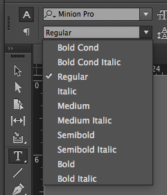
- Explain the difference between typeface and font:
Typeface can be considered as the album, while the fonts roll can be considered the songs of said albums.
for example: Helvetica is the type face and Helvetica Bold is the song that belongs to helvetica.
- What are the Five Families of Type? Show a visual / Listthem in chronological order:
- Garamond – Old Style (1615)
- Baskerville – Transitional (1757)
- Bodoni – Modern (1788)
- Egyptian – Slab Serif (1980)
- Helvetica – San Serif (19th – 20th Century)
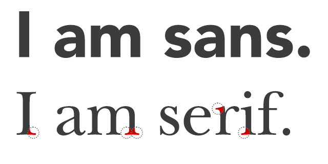
- San serif is a category of typefaces that do not use serifs (small lines at the ends of characters). Serif refers to typefaces that have the feet (from Old Style to Modern typefaces)
- Serif font include Times Roman, Courier, New Century Schoolbook, and Palatino.
- Popular sans serif fonts include Helvetica, Avant Garde, Arial, and Geneva. According to most studies, sans serif fonts are more difficult to read (because of a lack of contrast in the characters)
- What were specific traits of the Phoenician alphabet?
- The specific traits of the Phoenician alphabet where there were no vowels and the Phoenicians read from right to left. It consisted of 20 simple markings.
- What were specific traits of the Roman alphabet?
- The specific traits of the Roman alphabet where they added the “Q” and the “F” to the adopted Greek alphabet.
- What are the four types of alignment?
- Centered
- Flush Left, Ragged Right
- Flush Right, Ragged Left
- Justified
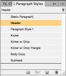
- What is a style sheet?
- Paragraph and Character styles (see below) that establish fonts, leading, kerning and other customizations you wish to have for each category of text in your project. This gives a standardized look throughout all your documents and keeps your strategy for hierarchy consistent.
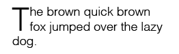
- What is a drop cap, where is it used, what does it look like?
- Drop cap are large capital letters used at the beginning of a text block that has the depth of two or more lines of regular text.
- List the Principles of Design as mentioned in lectures, quickly define them:
- Balance: is the concept of visual equilibrium
- Proportion: refers to the relative size and scale of the various elements in a design
- Rhythm: is the sense of movement and can establish pattern & texture
- Emphasis: is defined as an area or object within the artwork that draws attention and becomes the focal point
- Unity: creates an integrated image in which all the elements are working together to support the design as a whole.