Typography Basics
• What is the baseline, meanline and capline (also, show where they are)?
Baseline is the line upon which the text lays down. Meanline is the line that defines the x-height, and is always between the baseline and cap height. Capline on the other hand is the line marking the height of uppercase letters within a font

• What is a descender / ascender?
Ascender is the stroke of the letter that goes in between the meanline and the capline. Descender would be the stroke of the letter that goes below the baseline.
• What does an x-height refer to (how is it measured)?
The height of the letter “x” in the typeface is how you measure the X-height, it is also refered by the distance between the meanline and baseline.
• Define kerning compared to tracking.
Kerning is the adjustment of the space between two letter to improve the appearance. Tracking is the adjustment of the space between the letters for the whole word or sentence.
• Define leading
Leading refers to the linespace between the lines of type. The term originated in the days of metal type.
• Compare how these units measure up to each other: points, picas, inches
Points is the unit of measurement in typography ( 72 points = 1 inch. All type measured in points.) Pica is the typographic units of measurements. (12 points = 1 pica; 6 picas = 1 inch; 72 points = 1 inch.)
• In the phrase: Helvetica 12/14, what does 12/14 mean? What does is stand for?
12 is the size of the type while 14 is the leading distance.
• What is a grid, what are the benefits of utilizing a grid?
Grid is a non-printed system of horizontal and vertical lines that help the designer align design elements on the page.
• What is a gutter compared to a margin?
Gutter is the space between columns and rows. Margin is the area of the page where the text shouldn’t go, such as the borders that touch the edge of the paper, and the fold of a facing page. It’s the area that distinguishes the text area from the page itself.
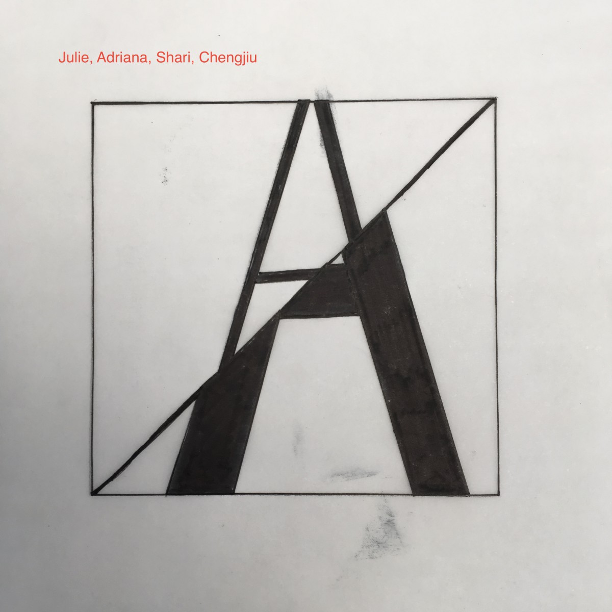
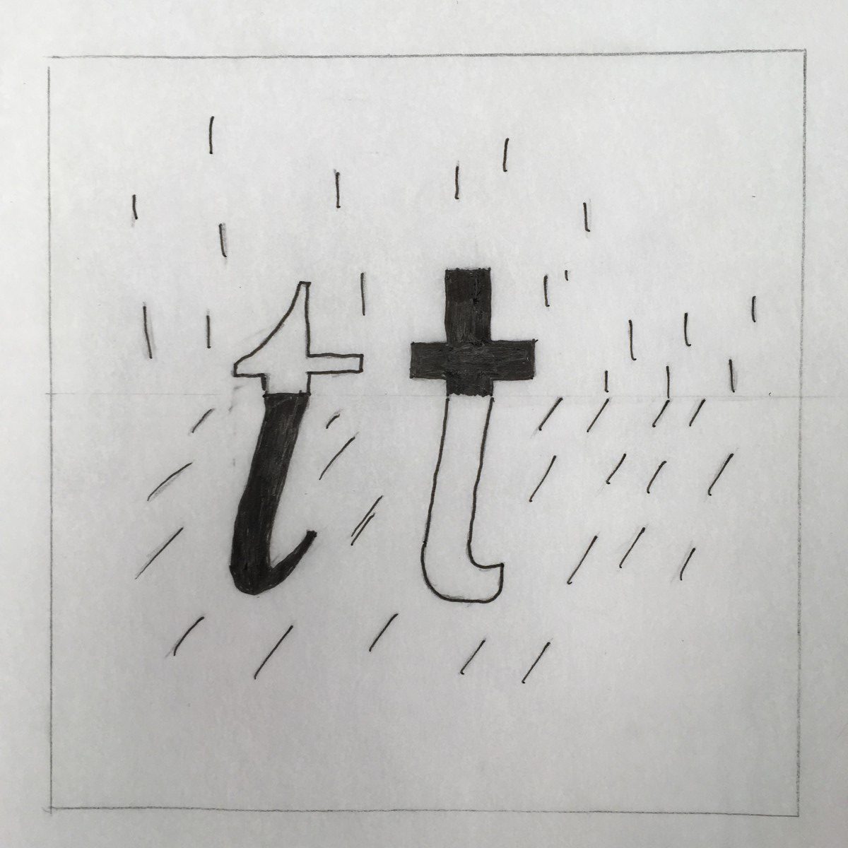
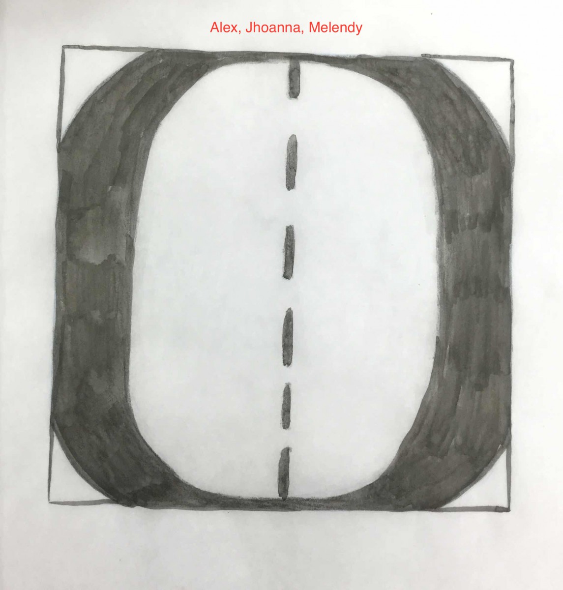
• List the 6 Variations of Type from our lectures and Type Book, quickly define them
Weight
Increasing volume of a letterform, i.e. bolding
Width
Expanding or condensing letterforms.

Posture
Change in angle of the letterform for emphasis and/or variation. (Italic = cursive, oblique = artificial slant)
Anthony, Tony, Nelson
Stress
The distribution of visual weight in text, through the axis (i.e. the angle of the two thinnest points of a closed cursive character)
Oblique, semi-oblique, vertical
Contrast
The thickness or thinness of strokes that creates contrast in a letterform.
Charles, Dario, Annemarie
Serif
Visual weight of a type of serif (feet of a character), i.e. Unbracketed serif/Bracketed serif/Bracketed and oblique serif.
- Jhoanna, Alex, Annmarie, Charles, Dario


