Thumbnails: used to plan and design the layout
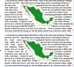
Text wrap: text that wraps around an object or shape. Can wrap around specific shapes of objects, including invisible ones. Can customize the shape around the object.
Folio: Area within the margins, where the page numbers and sometimes section head are located.
Bleed: When photos or text extend past the printable/viewable margin area.
WHY is it bad to use all caps in a paragraph such as a kicker or body copy? It makes it difficult to read and overpowers the rest of the page. If anything needs to be fully capitalized, it should only be the title.
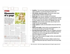
Magazine Anatomy:
Define –
- Infographics – visual representations of information, in forms of graphs, charts, interactive lists, so on.
- Spread(facing pages), – The layout of a magazine, book, page etc. Facing pages are pages that will ultimately face each other when printed/closed, so you design the layout with both pages considered.
- Table of Contents – The page(s) where you’ll be directed to the content of the book.
- Visual Hierarchy: Arrangement of content, designed to catch and guide the viewers attention.
– Strategies used to establish visual hierarchy –
Color- psychological use of colors to convey messages to the viewer, also to highlight or make something pop
typeface- fonts, different families give off a different mood/theme when looked at. Some typefaces are better for titles or bulk reading. It is good to contrast and complement typefaces to establish breaks and sections.
letter size- Importance/relevance of information, varying size in order to create subhead, pull quote, and other specific items made for organizing or pausing the flow of reading.
variation- the way text is displayed. EX. Width, Weight, Posture, Stress, Contrast, Serif or Sans Serif
orientation- location on the page, is it isolated, is it aligned a certain way?
Space – white space frames objects and text to give it emphasis, also used to break up sections.
Quality of Typography Rules: (Quality of Typography Checklist )
No Widows, No Orphans, and Fixing Hyphen errors. These tend to break up the legibility of the text and distract the reader from the content. Also shows a lack of attention to detail.

