From Jhoanna, Melendy, and Alex
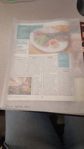
In this layout, the image imposes itself partly over the header (designating the section of the magazine). The image encourages the reader to find out more about the topic (food, restaurant).
The subheader offers both text and symbols (stars) to emphasize the importance of the restaurant’s food quality.
The layout has different typefaces–different sizes and colors, serif body, sans in headers.
The second image, diagonally placed to the first, breaks up the body text to increase interest. Overall, the placement of the images and headers are diagonally opposed, drawing the readers’ eyes down to the text, and offering a good balance.


Leave a Reply
You must be logged in to post a comment.