Class Info
- Class Date: Tues. Nov. 24
- Class Time: 8:30AM-10:00AM
- Class Meeting Zoom https://zoom.us/j/6459468086
Meeting ID: 645 946 8086
- Continue Posters.
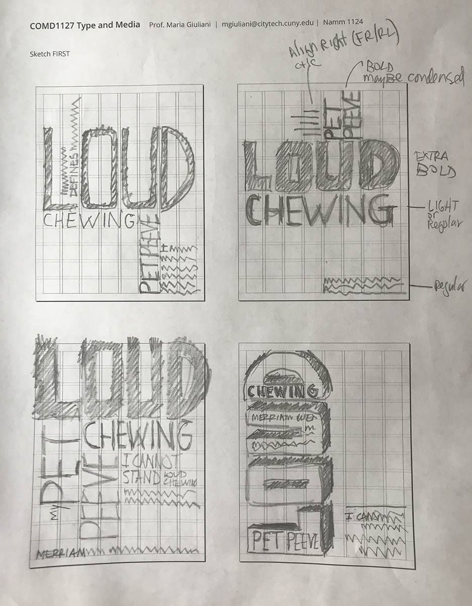
- Look at sketches and determine which are the best solutions.
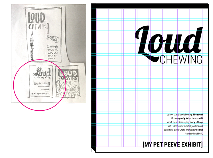
- Translate our sketches to actual designs.
Objectives
- Learn to translate sketches to actual designs (typeface selection, use of grid, visual hierarchy).
Activities
Now that we have the grid and content of your poster, it is time to design
- Create NEW Document:
- 2-page document
- size 11 x 17 inches
- 3 pica margin all around
- 8 columns / 1 pica gutter
- 12 horizontal rows / 1 pica gutter
- GO to LAYOUT>CREATE GUIDES>ADD the rows and gutter> OPTIONS>from margin
- Specs:
- Create 2 different designs (2 layouts following the same grid)
- Use type only
- TWO typefaces max. (but with extensive families ok)
- Black and White
- Follow the grid
- Emphasize your visual hierarchy
- Emphasize contrast with scale (something must be BIG, something must be small)
- Must consider and apply what was previously covered in class: Type selection and variations, alignment, word and letter spacing, line height, expression, etc.
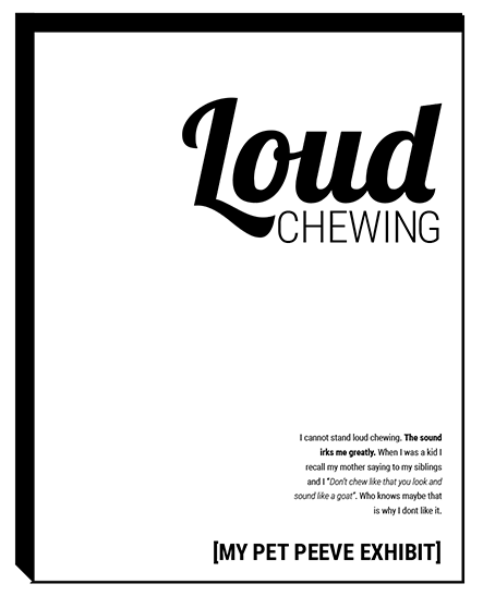
- Look at sample below with complete process:
To-Do After Class
Graphic Assignment
- DUE Next class:
- Complete two different layouts in InDesign
These will have the same grid and the same contents, but completely different layouts - Once completed take save your InDesign files. Take screenshot of your solutions. These screen shots must show the guides.
- name your files:
lastname_name_poster1
lastname_name_poster2
- Complete two different layouts in InDesign


