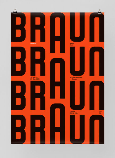
This work is the best to me because the A being a larger point size than the other letters and not being aligned to the baseline of the word braun creates movement in the poster to me.

This work is the best to me because the A being a larger point size than the other letters and not being aligned to the baseline of the word braun creates movement in the poster to me.