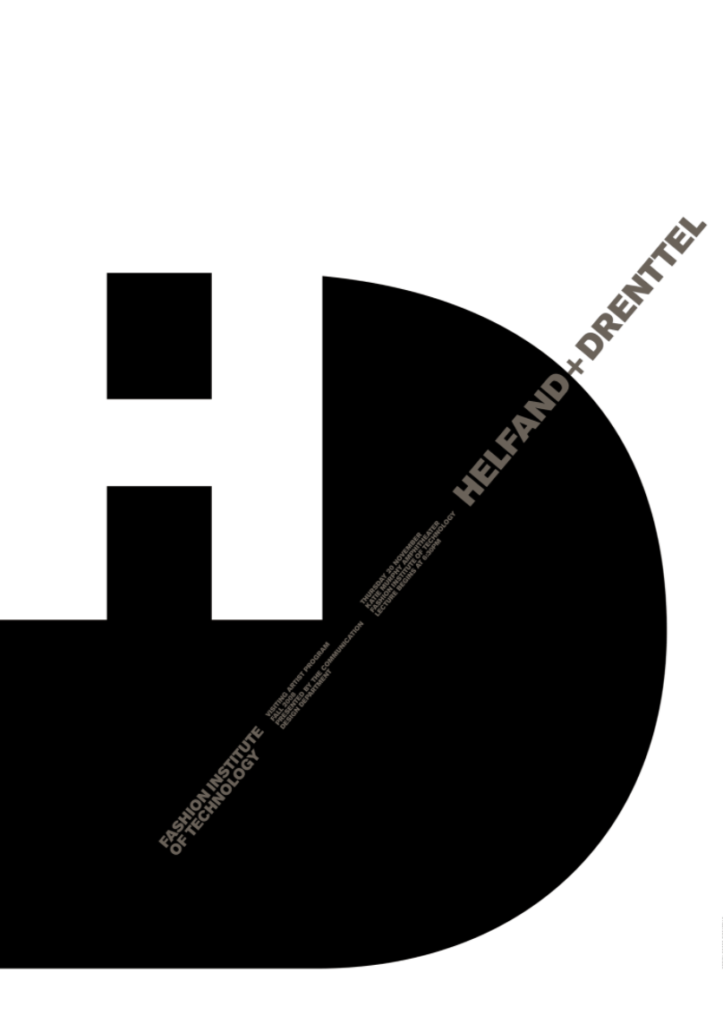
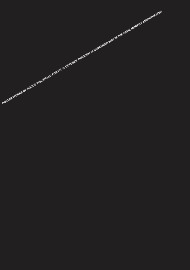
I think the poster on the left works the best. This is because there is a pretty good figure ground relationship. I also like how the grey is used for the smaller text, because it still stands out despite being a darker shade. The poster on the right works the least because of how empty it is. I can kind of understand the concept, though I feel as if it could have had a bit more detail.
The OpenLab at City Tech:A place to learn, work, and share
Support
Help | Contact Us | Privacy Policy | Terms of Use | CreditsAccessibility
Our goal is to make the OpenLab accessible for all users.
top


