The OpenLab at City Tech:A place to learn, work, and share
Support
Help | Contact Us | Privacy Policy | Terms of Use | CreditsAccessibility
Our goal is to make the OpenLab accessible for all users.
top

Our goal is to make the OpenLab accessible for all users.
Our goal is to make the OpenLab accessible for all users.
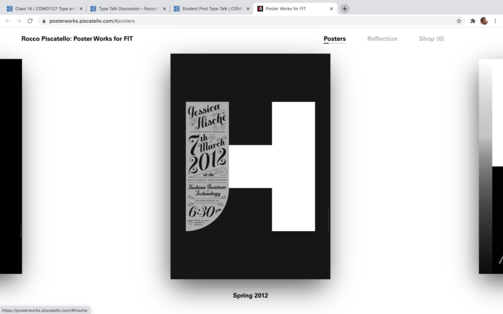
I personally don’t think this is an example of expressive typography because I don’t see a certain theme such as the ones we did in class. The fonts are hard to read and I’m not sure what the H stands for, I feel like it takes up too much space just for all the necessary info to be written on the side in a cursive font and also small.