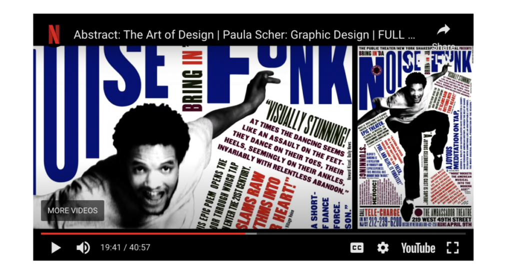
Germain_Patricia_Scher

Prof. M. Brown | COMD1127 - E038 | Fall 2022

A foundation course in typography with emphasis on using type in industry related applications from print to interactive. Students will be introduced to principles of type design and terminology
Ursula C. Schwerin Library
New York City College of Technology, C.U.N.Y
300 Jay Street, Library Building - 4th Floor
Logged-in faculty members can clone this course. Learn More!
This course is based on the following course(s):

Unless otherwise noted, this site by Maria G and John De Santis has a Creative Commons Attribution-NonCommercial (CC BY-NC) license. Learn more.
Logged-in faculty members can clone this course. Learn More!
© 2024 COMD1127-E038 Type & Media, Fa2022
Theme by Anders Noren — Up ↑
Our goal is to make the OpenLab accessible for all users.
Our goal is to make the OpenLab accessible for all users.
Leave a Reply