- Date: Thursday, December 1, 2022
- 6pm – 8:30pm, Room P-114
Topic
PROJECT 3 is due Class 29, December 15
Continue Project 3: Social Media Posts (for Pet Peeve Exhibit)
- The following text will be used for four social media posts
- The Title of your pet peeve
- And Other Pet Peeves
- See Link
- Specs:
- Use common social media square format 1080 x 1080 pixels
- The InDesign file size will be 3.5″ x 3.5″
- Set margins of your choice
- Take an abstract photo or create a texture. You will use it as background only.
- Use typefaces that relate to your PET peeve posters. These announcements partner up with the posters.

- How to use color and image
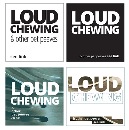
- Square 1: Black Text on White Background
- Square 2: White Text on Black Background
- Square 3: Photographic or Textural Background Choose color of typography
- Square 4: Must use color
- Look at the examples below
(Please note that your solutions must be different than these). Is the hierarchy appropriate? Are the colors and images offering the viewer an easy to read experience? Are point size, line space and letter space working in a cohesive way?
Here are some InDesign handouts that might be uselful:
How to get actual colors from a photograph and place them in the swatch panel
Objectives
Students explore contrast and legibility though use of actual color (other than black), imagery (photos), and type.
Activities
- Start assignment during class. This is the third part of Project 3
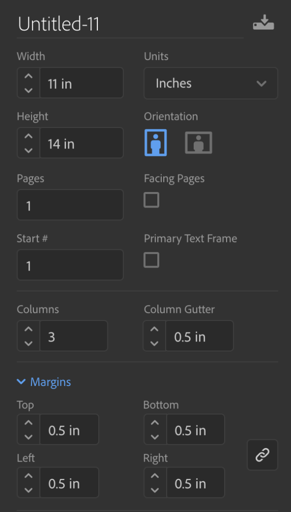
- Create a new InDesign document 11 x14 inches
- 3 columns with .5 inch gutters
- .5 inch margins all around
In this document, we will create columns that are different sizes.
To move the actual guides that are indicating your columns and gutter
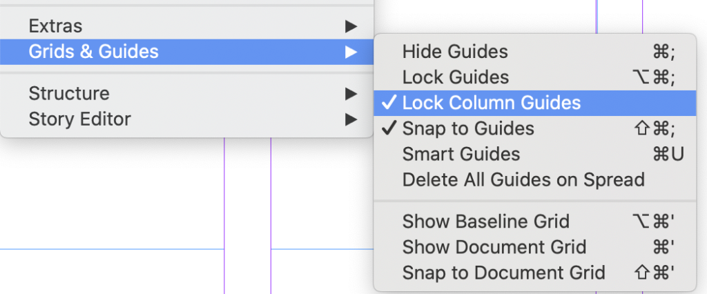
- GO to VIEW
GRID and GUIDES>
uncheck LOCK COLUMN GUIDES
- Now you should be able to move these guides
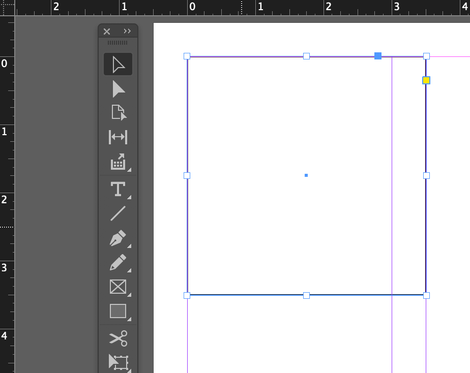
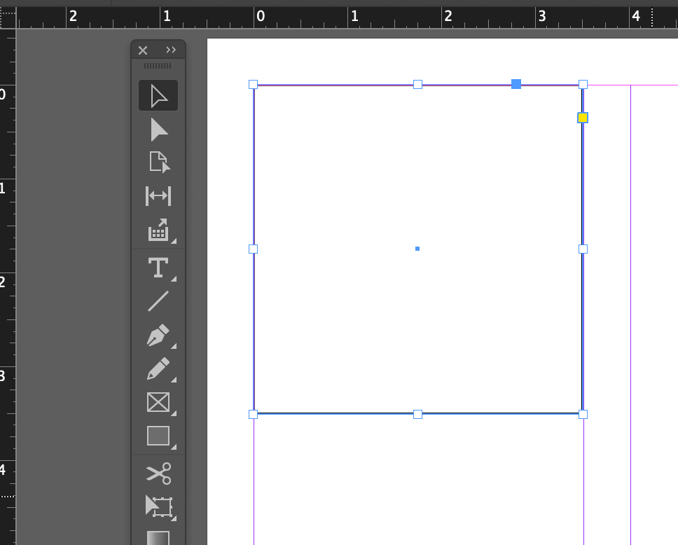
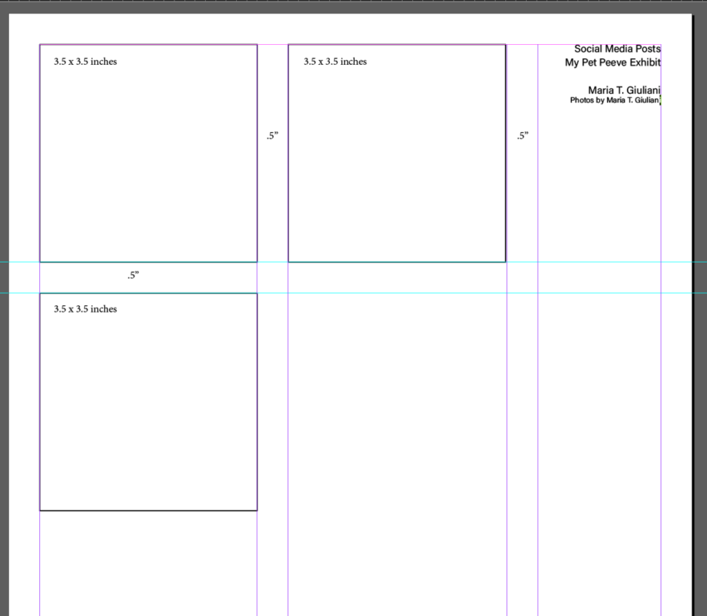
- Create a 3.5″ (or 21 pica) square
- Place square on the top left margin
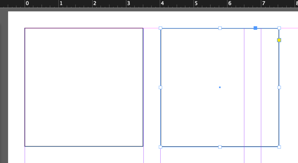
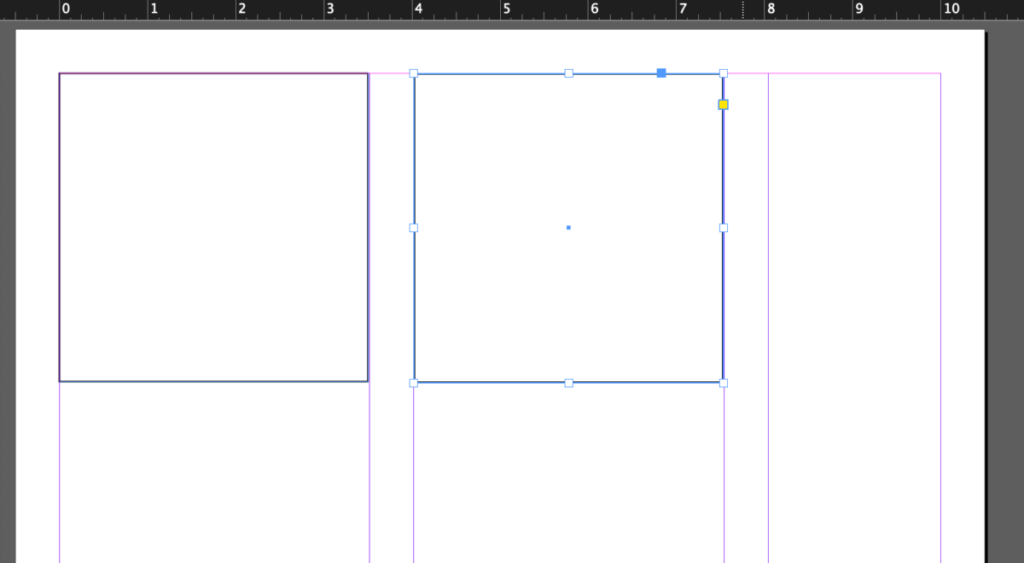
- Move the gutter guide to align with the end of this square
- Place another square on the second column
- Move the gutter guide to align with the end of this square
- Add Add 1 more square below (for a total of 3).
- This should be placed .5 inch below the top 2
- On third column add:
- Social Media Posts, your name and credit the art on 3rd Column.
- All art must be your own or a copyright free image. All art must be credited.
To-Do After Class
- Due next class:
- Complete 4 social media postings (see above specs)
- Save InDesign files
- Export page as a PDF
- Lastname_firstname_social_media.pdf
- Place in Google Drive before next class


Leave a Reply