Vidal_Alice_TC_ET
Prof. M. Brown | COMD1127 - E038 | Fall 2022

© 2024 COMD1127-E038 Type & Media, Fa2022
Theme by Anders Noren — Up ↑
The OpenLab is an open-source, digital platform designed to support teaching and learning at City Tech (New York City College of Technology), and to promote student and faculty engagement in the intellectual and social life of the college community.


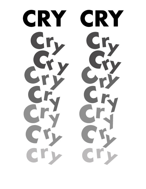
I like how the type is arranged to simulate tears falling. The color gradient is fitting and compliments the overall feel of the design. The staggered placement of the text flows across the page well and places further emphasis on the intended design.
i love the way you used the capitalization to show a dripping and sliding effect.