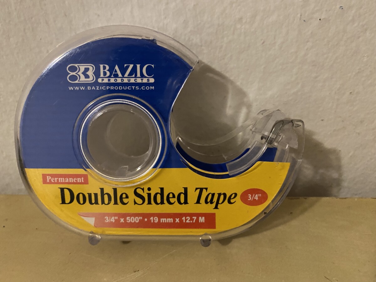
Double-sided Tape- For this packaging I found that they used all primary colors and in my opinion they clash. Most of the text is at the bottom and rather than focusing on what the product is, your eye goes to what’s in the red. Everything pops so it’s hard to focus on one thing.


Leave a Reply