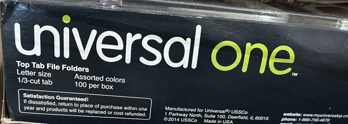
What I find most interesting about the “universal one” typeface use is the way the combined the two letter u &n to give the brand a unique feel and look. What I also enjoy about the is the color scheme which white an a like green how universal is white but the tittle above the “i” is green just to match with how they wrote the “one” in green


Leave a Reply