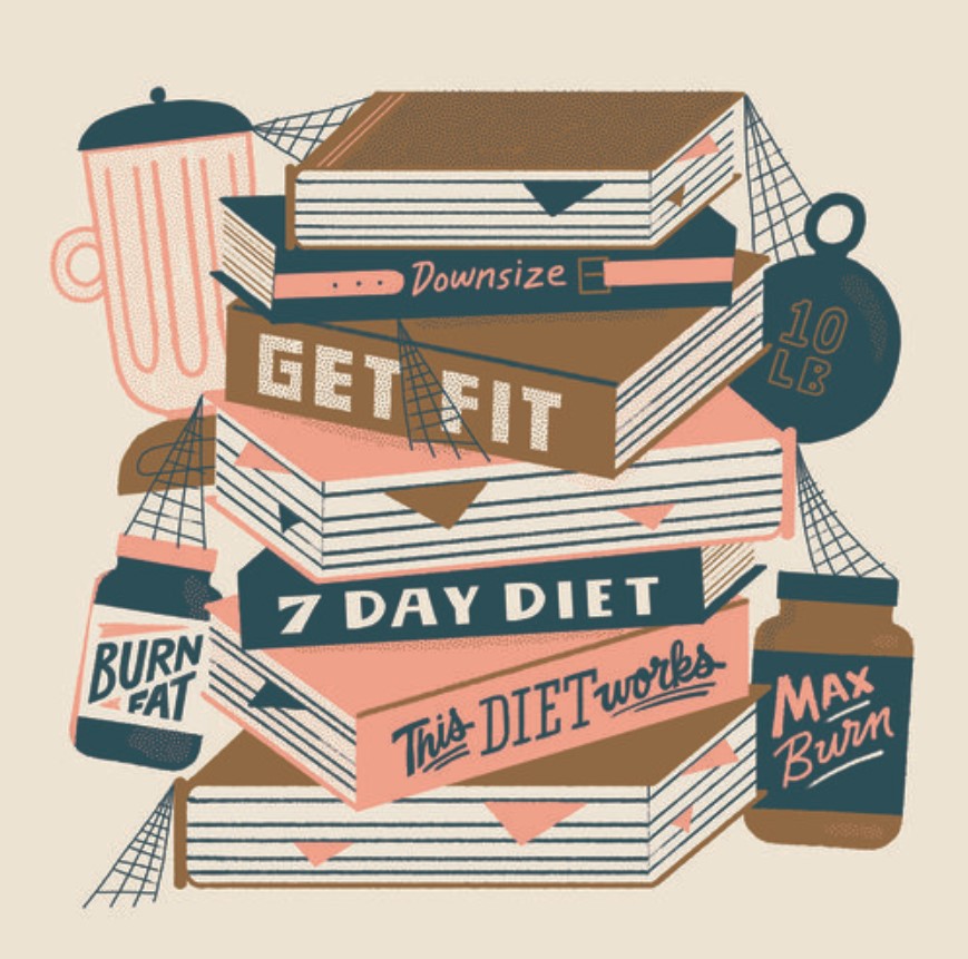
I chose the artist Mary Kate McDevitt. The illustration I chose was for the New York Times Op-Ed of healthy and simple New Year’s Resolutions. I enjoy how she illustrated the resolutions as different books and had visual representation of them such as the weights for exercising and the books on dieting. I feel like it was very clever as instead of just writing what the resolutions are she made it seem like it was something that would be in someone’s house. I also enjoy how she added spider webs as if these objects have not been touched because resolutions are known to be broken. I like the artist’s style because they use limited colors in a creative way and use it in different ways without it seeming cluttered or overwhelming. The way she shows many font with different weights and type works well since they belong to different books in the illustration.


Leave a Reply