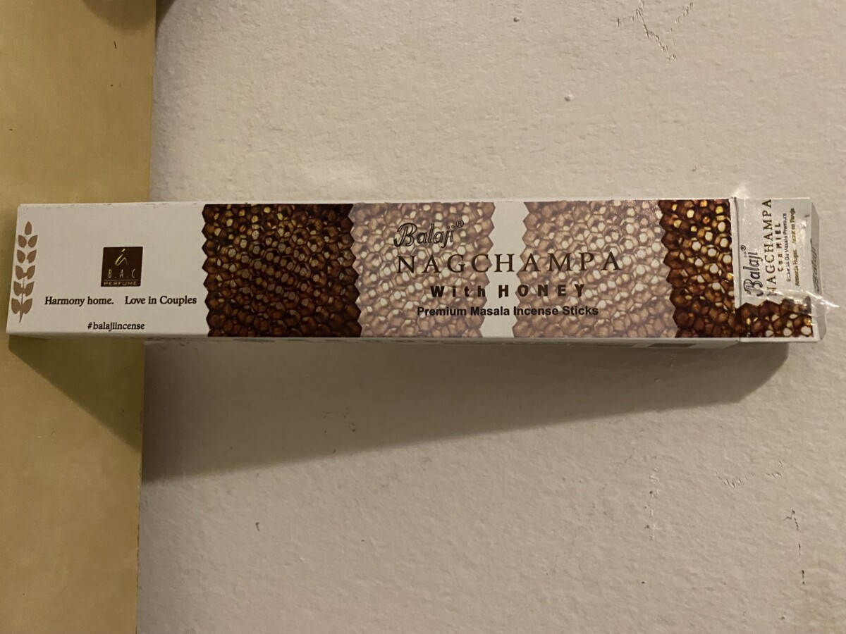
Incense Stick- For the packaging of the incense sticks you can’t really read text because of the background. The logo has stroke color but no fill making it hard to read since it blends with the background. The background fits with the product as it is honeycomb but it would have been better if it was put on the side so that the text could be in the middle with a white background.


Leave a Reply