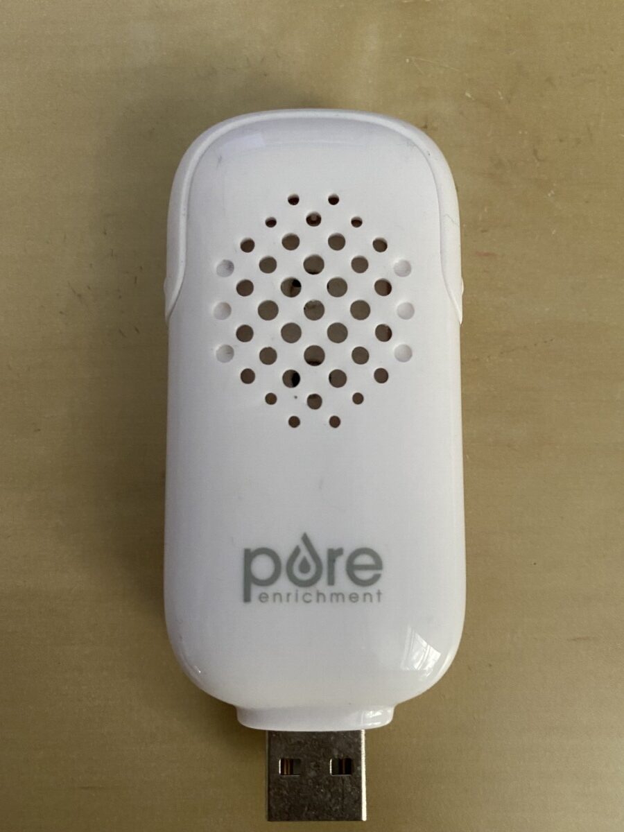
The product is called “pore enrichment” and it is an aroma diffuser. I think the branding is clever because the o in “pore” is in the form of a drop which represents the essential oil and humidity needed for the product to workThe design itself also fits the font as the holes on the device make it seem like pores.
About This Course
A foundation course in typography with emphasis on using type in industry related applications from print to interactive. Students will be introduced to principles of type design and terminology
Search this Course
Categories
Find Library Materials
Library Information
Ursula C. Schwerin Library
New York City College of Technology, C.U.N.Y
300 Jay Street, Library Building - 4th Floor
Member Portfolios
OpenLab Help
Acknowledgments
This course is based on the following course(s):
Leave a Reply