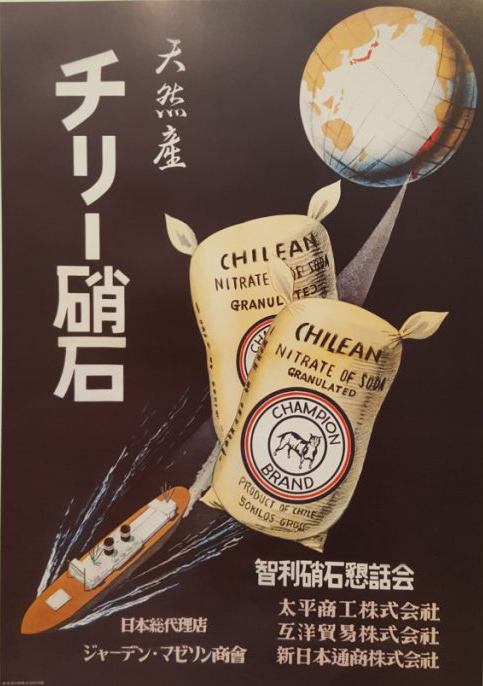
This poster looks like an advertisement . It seems that a certain food product is being promoted. This product that is being advertised in an Asian culture that is imported into Chile. The products has a Japan’s style to it, it seems. It has a circle shape and an animal logo of a cow. The flour sack are the ancient ways of storing the food product. The typograph has a design of Asian calligraphy. The Brushstroke letters that have been hand designed intentionally. The colors of red and white are the same colors that Japanese flag seem to use.
This design can be viewed as basic or some can view it as complex. We can see that the columns shown are all parallel together showing they are justified with very little kerning to it. We are also able to tell that the letters shown are parallel to each line give this clean and organized feel to it. Though something that can be pointed out are the high number of widows in this design piece which is something that should be fixed by them. And based on the composition of the work, we see that the page is split into 2 very large columns. Portions of the writing can be seen as a bit of overwhelming with all the different parenthesis and other marks on it. The basic composition and design is well thought out, there are many things that can help make it appear even better. For example, illustrations would be a big benefit for this piece since everything seems so dull and boring, and this would help bring variety into the page.
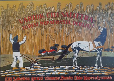
This work does have a similarity to that of old advertisements back then. From what i was able to gather, the language of the type face could be Russian or maybe French. Though the color scheme of the advertisement seem to remind me more of a Russian background and culture more than of a French one. With the majority of the colors being mainly yellow and also red. Its interesting to note though how the wheat is really covering most of this advertisement, really making it the center of attention. Based on the illustrations it seems like this ad is related to farming, whether it be for equipment or something related to that. It is worth noting that the color scheme of the man and the horse seem to have a resemblance. And with them having a similar color scheme we see that there is a connection between the 2 of them and we can tell that this would likely be meant for farmers in areas maybe around Russia.
- Jay Garcia


Leave a Reply