For this project, it took me a while to adjust my mind set on what I was going to do. I have done some sketches which can be seen in other posts, and done several attempts on how I was going to complete this piece of art. I have done similar things, however, this one was very challenging. I thought my theme on Disney’s movie, Alice in Wonderland was going to simple and mad. However, when I started working on it, it made me realize maybe this was a bad idea. I managed to work things out on making more sketches and used Adobe Illustrator. Since I had Raster and Vector course before this class CDMG 1111, it made me easier to work on it and my skills helped me out a lot. After getting critiques from my peer’s plus my professor, it pushed me one more step higher to complete this project. After I finished fixing the project, it made me thought to myself, “Wow, I did a good job. It took a while but it looks good.” Overall, this project was challenging and helped me improve myself on every aspect from sketching ideas, working on illustrator, and revising.
Cat Final
Humpty Final
Teapot Final
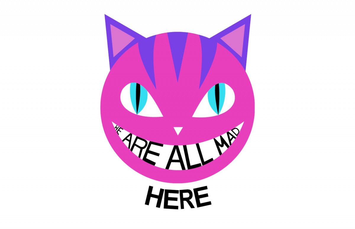
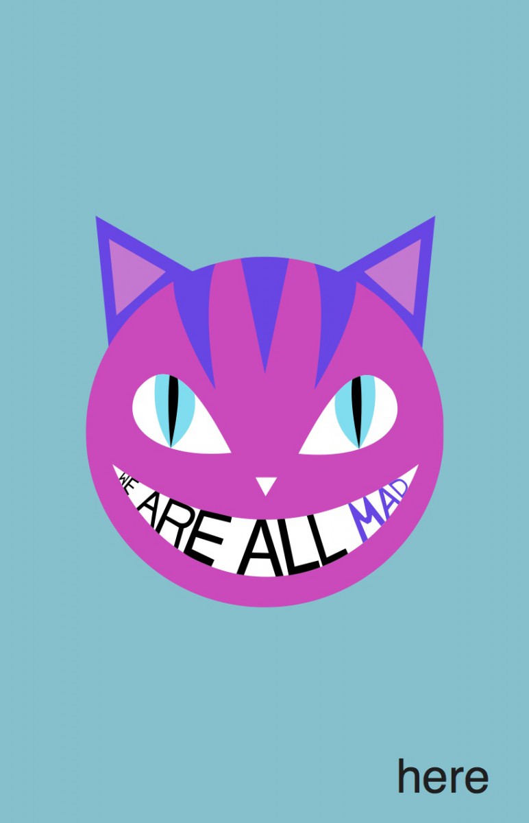 My first quote project concept is Cheshire cat with the quote “We are all mad here.” in its mouth. It wasn’t very difficult to make it since I was used to working in Adobe Illustrator. However, I had some difficulty putting the type in the mouth. I used Helvetica and tweaked it a little to make it fit in. However, that first I had all of them in black color. After getting feedbacks from my peers, they had great ideas on making my first project expand.
1. Make the word “MAD” into the color of Cheshire cat stripes.
2. Make the word “HERE” isolated from the image and the type
It turned out very vibrant and stands out to the audience which I am proud of. Above all, I had no trouble editing this and I like this the most out of three projects.
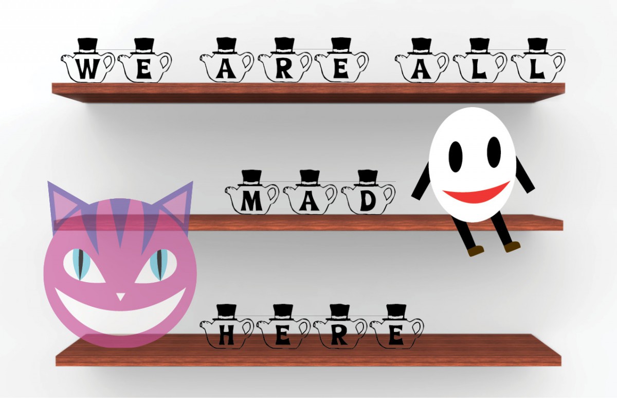
 My second quote project was somewhat difficult on where to place the character. I had trouble where to place the character, Humpty Dumpty. I had him sitting down the middle shelf on the right at first. However, it didn’t work out very well since the quote was “We are all mad here.” from my peer’s suggestion to place him dangling from the crooked shelf caught my attention. I immediately made the shelf tilted in Photoshop and fixed Humpty into falling position. Using a typeface that found from previous class made a perfect match for my project. I also had difficulty choosing what color will make the whole project attracted. I used dark tone than the first project since it was bright and vibrant. I had a concept on this however, this was a progressed concept where taking my peers idea and embedding it onto. The concept is Humpty Dumpty is falling off the self because of the madness.
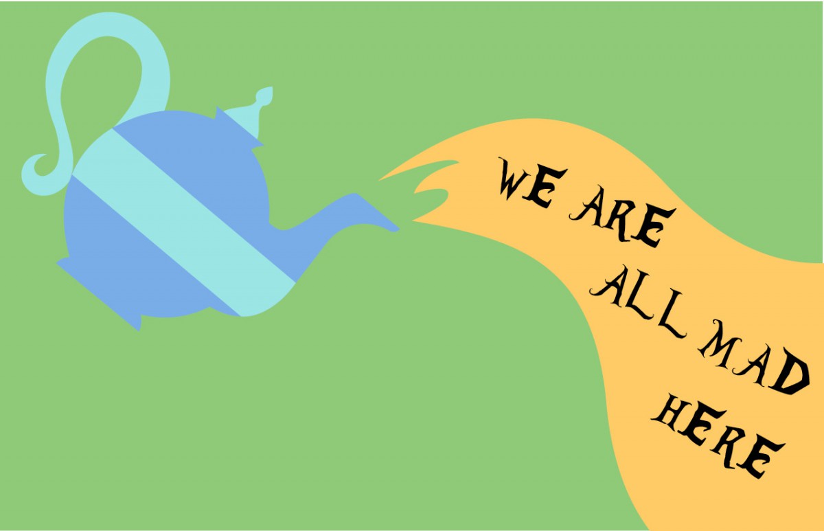
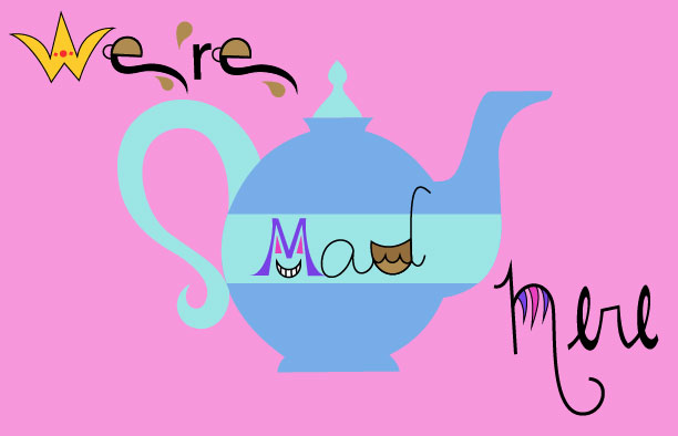
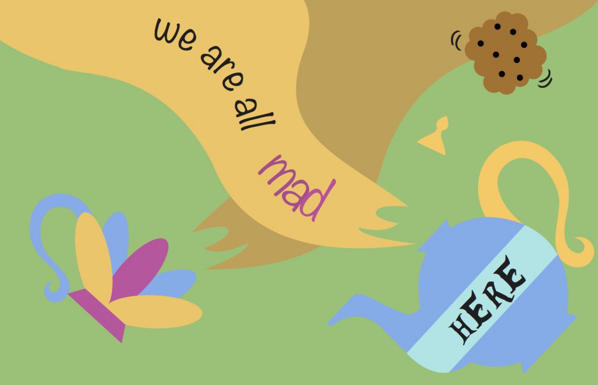 My third and final project’s concept is Backwards Madness. This was the most difficult piece that I put it together. It can improve definitely, however, every artist says “Art is not a completion.” It was difficult since my original illustrations were opposite to what I have finished. I was so lost that my professor helped me a lot in this particular art. I manage to make the tea from the teapot backward, meaning the flow of the gravity is opposite. Making the tea fell upward, which should be down. I used that idea and made the quote also go through as the tea flowed. I wouldn’t say that this is the best pieces that I completed, however, I took this challenge and I am glad that it worked out.
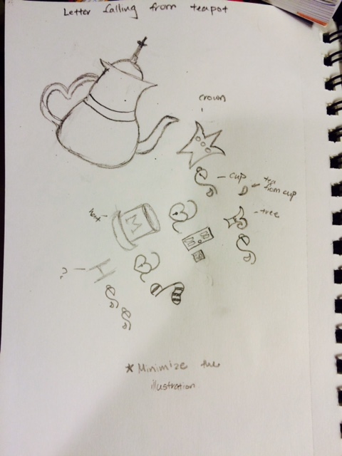
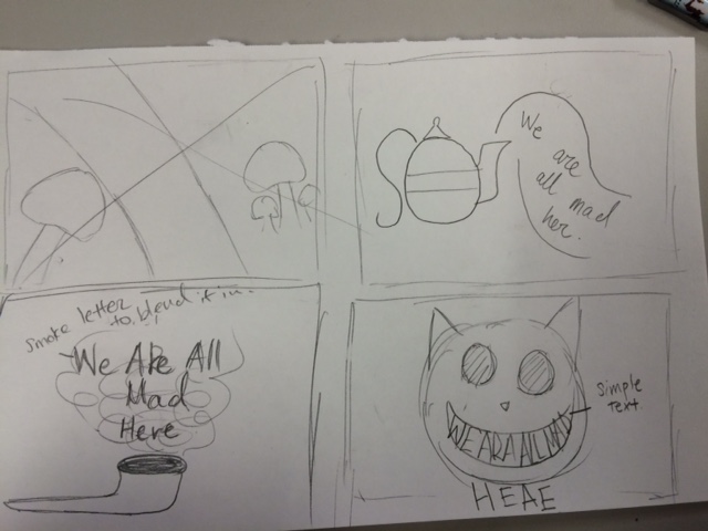
Below is my progress to the final ones
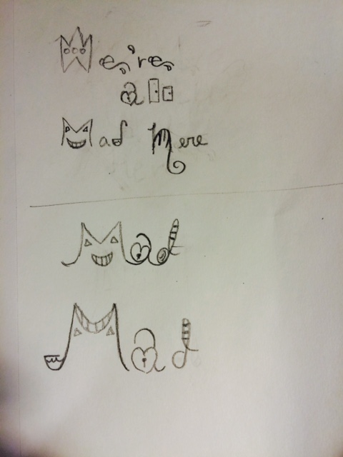
These are my quote logo sketch. My concept for my quote is Alice in Wonderland. I chose the famous quote, “We are all mad here” My focus on the first drawing is words coming out of the teapot. My second focus was on a cheesier cat. White, I was working on it, I noticed that I used many illustrations that the quote itself was off focus. I managed to make it more simple on my second attempt.
Phase 1: Working to getting Critiques
These are my three enhanced visual quote project. I still need some fixing to do, since there is more illustration to show then the quote itself. I think there are too many things that cluster the page. Plus the arranging of the words can be fixed also. I hope that I am going to get good feedback to fix my project. I think that my third visual quote is more powerful than the other. My concept is Alice in Wonderland. I chose this concept because I am a huge fan of this story.
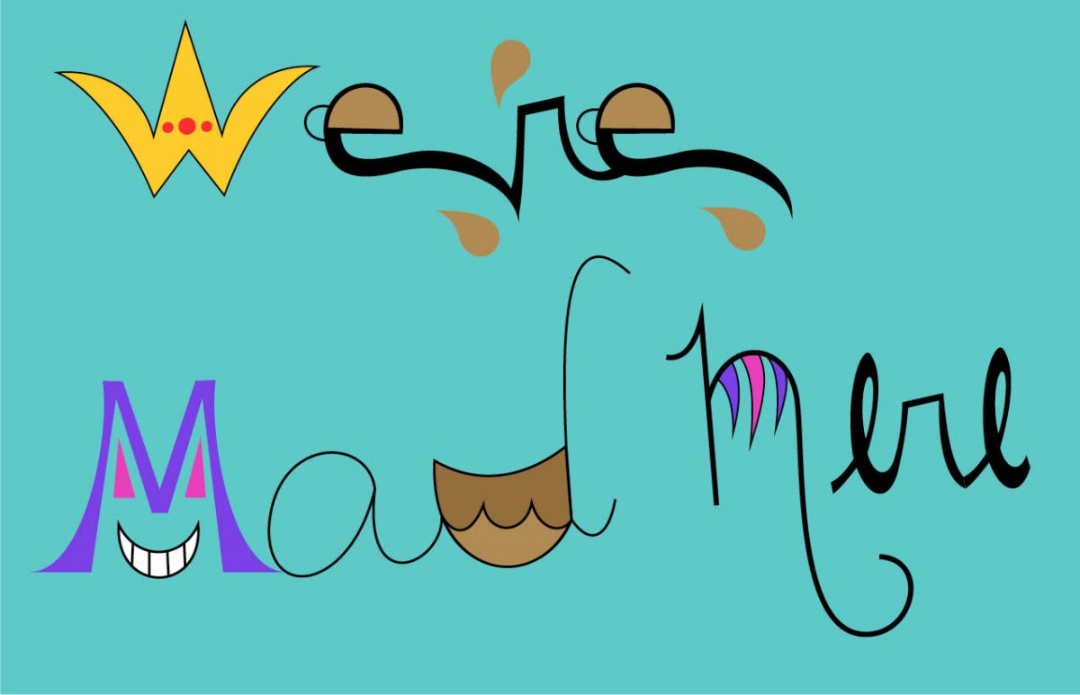
We’re Mad Here 2
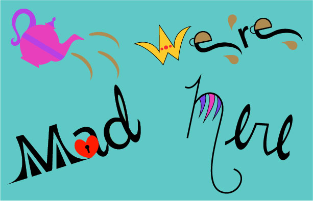
We’re Mad Here
We’re Mad Here 3
Phase 2: Not working, re-sketching
For the visual quote project, I decided to do it from the scratch. When I looked at my previous creation, there was some flaw that I did not like. Including the concept of what I was trying to do. I thought out making the typeface as a design, however when I look what I have now it does not work very well. So I decided to take another approach that it might actually work. The image below is my new idea. Instead of making the typeface as a design, I decided to add the original image that supports the idea of the quote.
Phase 3: Working on Illustrator and Receiving Final Critique on it
I managed to change my quote and went for the different approach. Using both image and typeface. I tried to work on my second quote, but I need something to complete it. However I am struggling what to do with it, so I am going to wait for the critique next week. I am hoping that my classmate can help me with these work. The work I like the best is the first one.