
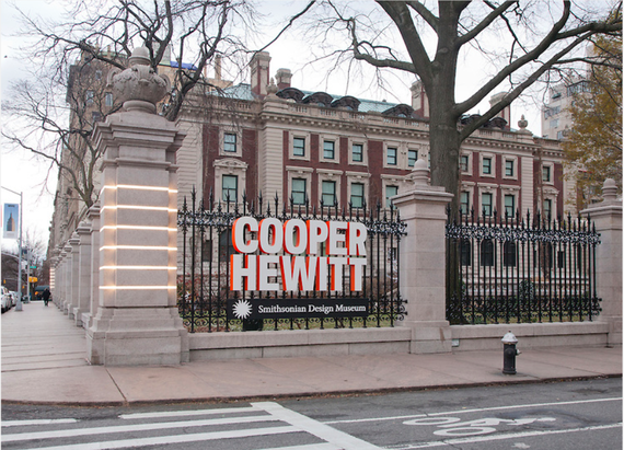
The Cooper Hewitt museum is known as the inspiring exhibition to designers around the world. It has groundbreaking technologies and friendly digital resources that visitors can collect references from designers to connect their passion in art industries. There was a 2015 National Design Awards Gala celebration recently with David Stark décor and Design in the Classroom challenge kit bags designed by Todd Olham. Made it page on the Cooper Hewitt Design Journal called, Beauty. Designed by Kimberly Varella who founded her studio Content Object in Lod Angeles in 2013. (Pg.10) From my experience as a designer when I entered this museum, I saw dynamics and structures in each design. There was various artwork that connected to our studies in Digital Media class. These are the three designed that caught my attention from the visit to the museum.
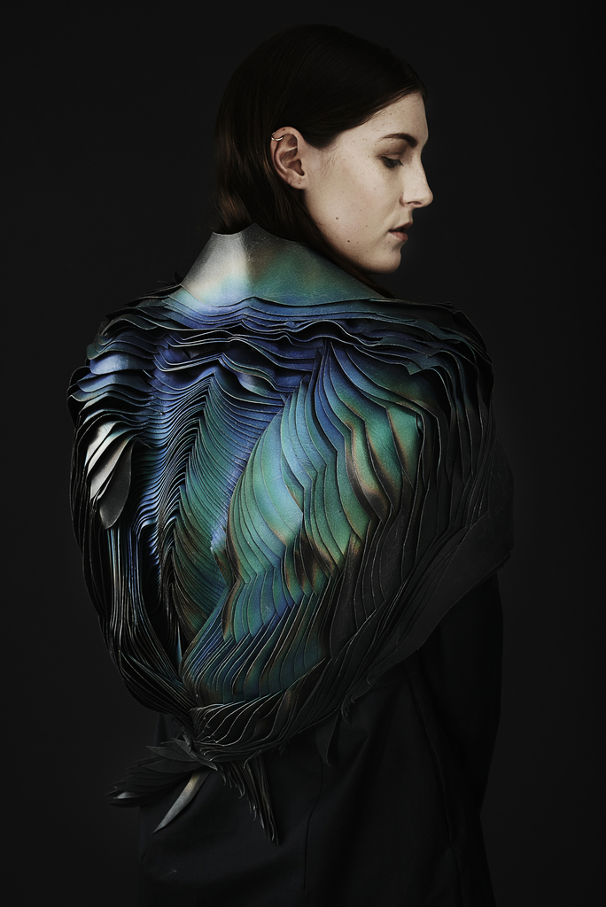 Lauren Bowker and TheUnseen
British, b. 1985
Jacket, The Scarab, from Air Collection, 2016
Leather, heat, and wind reactive ink.
Image: Here
Lauren Bowker founded The Unseen in 2012, she studied chemistry and textiles at the Manchester School of Art. During her studies, she developed a color-changing ink, which response to the changing environment. She used this material to show how biological and chemical technology can be put into pieces to show the transformation on the “Way the world sees fashion”. This special ink was added to the leather jacket, “putting the piece into a state of flowing metamorphosis as it reacts to heat and wind pressure”. According to her discovery. This amazing discovery and knowledge made and changed her way to approach a new design that led to this magnificent piece. Including the way, she applied to use analogous and cool color, which the black backdrop made contrasting. It’s ecstasy draws designers to wonder how she manage to pull this off, and not only makes other designers interested in art but also into chemistry which she used for this design. From my perspective when I saw this work, I thought that it was a some sort of pop art that was applied to her naked back. Making it as if she has exotic bird wings, from a tropical island. Including the cutting and the layering of its material is carefully put, so that the analogous of blue to green makes it so vivid and attracted to our eyes.
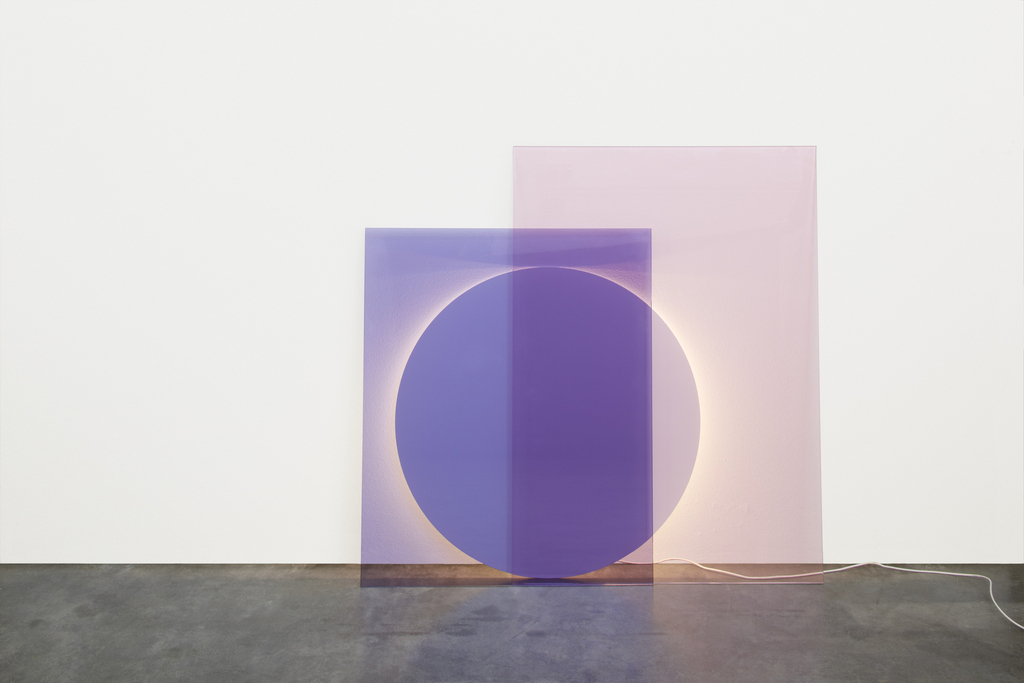 Andreas Engesvik and Daniel Rybakken
Norway, b. 1970 and b. 1984
LT04 COLOUR Floor Light, 2014
Powder-coated steel, laminated glass.
Image: Here
This art caught my attention, because of this round and square shaped pink laminated glass can illuminate different degrees in light and shadow. It is created from the various combination that can be made. I also like this piece of art, because of the user controls how much or little light is needed to meet the needs any given situation. This is also an example of a subtractive color model, since mixing color meaning results in darker and tends to turn black eventually. It also shows how layering cool and warm color mad the layered part darker which it also contrasted between them.
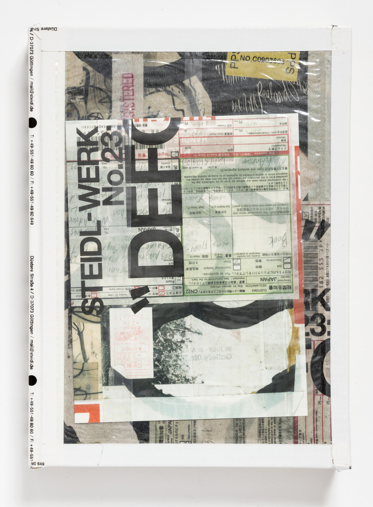 Theseus Chan
Singapore, b. 1961
Magazine, STEIL-WERK No.23: MASAHO ANOTANI “DEFORMED”, 2015
Die-cut offset lithography over silver foil on paper.
Image: Here
This piece by Theseus Chan caught my attention since I am into typography. His way of layering complex typographic treatment really inspires graphic designers like myself. The use of various sizes and density of typography made it clear to pop out. His mixing of the surface created by, fluorescent inks, unusual shipping materials and foils made it intriguing. The anticipating tension builds up as flipping each page. He added, “special processes heighten the magazine’s object quality.” This art made is clear that he has control in his art, he knows where he wants to place the typography and the materials all together to make this wonderful piece as a final.

