During my internship at Churches United for Fair Housing (CUFFH), I had the opportunity to work as the lead graphic designer and art director for CUFFH Youth. This experience allowed me to develop brand identity, design marketing materials, and collaborate closely with my coworker. I gained valuable insights into community organizing, learned the importance of effective leadership, and contributed to the organization’s mission of promoting affordable housing and social justice. Overall, my CUFFH internship was a transformative experience that strengthened my design skills and passion for creating positive change.
Author: Angy Vasquez
Internship Experience Reflection
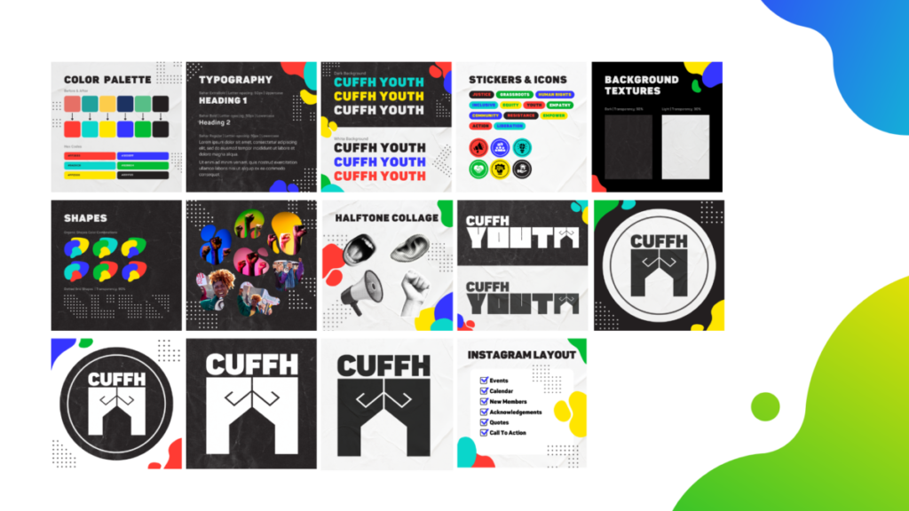
I believe this internship experience was highly successful, particularly in terms of maintaining a balanced workflow and effectively navigating through any obstacles or differing opinions from my boss and coworkers. It provided me with valuable insights into my personal design process while also considering and integrating my coworker’s design process. This allowed us to establish a healthy work relationship and ensured the smooth progress of the project. Throughout the internship, I demonstrated strong leadership skills by assigning roles to my coworker, providing feedback, and offering ideas whenever they faced challenges. It made me feel like a true art director. Moreover, the experience felt akin to freelance work as our boss granted us creative freedom in organizing our work time and generating ideas for CUFFH Youth.
This job opened my eyes to the responsibilities and intricacies of art direction. I take great pride in the leadership role I assumed during this internship. My coworker has expressed appreciation for my punctuality, consistent completion of assignments, proactive communication, willingness to share opinions, initiative-taking, and commitment to creating cohesive designs. However, I recognize that there are areas for improvement. Specifically, I need to work on managing my time more effectively to prevent burnout, as I tend to exhaust myself easily. Nonetheless, I am proud of my ability to respectfully disagree with my boss when I felt that certain ideas were not suitable for CUFFH Youth. Despite my boss not being from a creative background, I took on the responsibility of educating them on why certain ideas did or did not work. For instance, when they suggested incorporating illustrations in the logo for inclusivity, I explained that a simple and iconic logo would be more recognizable and versatile for use in flyers, social media posts, and profile circles. Additionally, I emphasized how the ambiguity of the iconography allows it to represent diverse individuals without highlighting race, ethnicity, or religion.
Overall, my internship experience as an art director provided me with valuable opportunities for growth and the development of essential skills in leadership, communication, and creative decision-making. Collaborating closely with my coworker, we established a clear creative direction that aligned with the project goals and the desired brand identity. I successfully demonstrated strong leadership skills by assigning roles and responsibilities, offering valuable feedback and ideas to overcome challenges, and fostering a collaborative work environment. I emphasized the importance of maintaining design consistency and paid careful attention to detail, resulting in cohesive and visually appealing visuals for CUFFH Youth. Additionally, I took on the responsibility of educating my non-creative boss, effectively explaining design principles and advocating for solutions that would best serve the brand. These experiences allowed me to showcase my abilities as an art director, making a meaningful impact during my time with the company. I am grateful for the valuable skills and insights I gained through this internship, which will undoubtedly contribute to my future success as a designer.
Ethical Design Guidelines: Entry 2A/2B

2a) In my previous creative endeavors, I have often drawn inspiration from other artists’ work and utilized their creative content as a reference for my own projects. Specifically, when working on illustrations, I would occasionally use photographs as reference pictures to grasp the proportions and realistic elements of human figures. To ensure proper credit, I made it a point to acknowledge the photographers or sources of these reference images in my portfolio or design process presentations. By acknowledging the influence and impact of their photography on my artistic style, I aimed to give credit where it was due and highlight the collaborative nature of my creative process. Moreover, in the realm of UX/UI design, I frequently turn to platforms like Pinterest to gather inspiration and create mood boards for my projects. As I draw from a variety of styles and visual elements found on Pinterest, it is crucial for me to cite and attribute the sources from which I derived those ideas. This not only acknowledges the original artists but also provides a clear connection between their work and my design choices. By explaining why I chose certain styles from the mood board and how they contributed to the success of my designs, I aimed to demonstrate my ability to synthesize diverse influences and apply them in innovative and effective ways. By giving credit to the artists and sources that have influenced my work, I aim to uphold ethical standards of integrity and respect within the creative community. Properly crediting the original creators not only honors their contributions but also fosters a culture of collaboration and appreciation.
2b) I believe that the Fairey Copyright case was necessary to establish clear boundaries within the artist and designer community and to discourage plagiarism while promoting a culture of crediting and uplifting fellow creatives. Intellectual property rights play a crucial role in protecting the originality and creative contributions of artists. By addressing the case, it highlighted the importance of seeking proper permissions and licensing when utilizing copyrighted material. The case’s outcome helped reinforce the message that artists and designers should respect and acknowledge the work of others that influenced their own creations. It serves as a reminder that giving credit to the original creators not only demonstrates integrity but also fosters a stronger and more supportive creative community. By recognizing the contributions and inspirations of others, artists can build upon previous work, push boundaries, and develop new and innovative ideas. Establishing boundaries through legal cases like this helps maintain a fair and equitable environment for artists and designers. It encourages individuals to engage in responsible and ethical practices when utilizing external sources or references in their creative endeavors. By preventing plagiarism and encouraging proper crediting, the case promotes a culture of collaboration, respect, and continuous growth within the creative community. In a world of AI generating art, a case like the Fairey Copyright case becomes even more crucial. With the rise of AI technology, the boundaries of creativity and intellectual property are being challenged in unprecedented ways. AI algorithms have the capability to generate artworks that closely resemble the style and content of existing pieces. This raises concerns about the originality, attribution, and ethical use of AI-generated art.
References:
- Richard, Grefe. “Guide to Copyright” AIGA. PDF. New York City, 2001`
- Richard, Grefe. “Use of Illustrations” AIGA. PDF. New York City, 2001`
- Fisher, William et al. “Reflections on the Hope Poster Case.” Harvard Journal of Law and Technology, vol. 25, 2012, pp. 244.
Ethical Design Guidelines: Entry 1A/1B

1a) When it comes to sourcing images, designers have several options to ensure ethical practices. They can utilize original content, obtain licensed stock images, or adhere to permissions and copyright laws. Designers are encouraged to prioritize the use of original images, which can include custom illustrations, photographs, or project-specific graphics. This approach helps prevent copyright infringement and promotes a distinctive visual identity for the project. If original images are not feasible, licensed stock images from reputable platforms can be used, with designers respecting the associated licensing terms and conditions, including proper attribution if necessary. Designers should also be well-informed about copyright laws, obtaining necessary permissions, understanding usage terms, and appropriately crediting original creators. Fair use principles should be considered where applicable.
Regarding my internship experience, the company provides us with photographs taken by their personal photographer. Therefore, we do not rely on stock images. They prioritize authenticity for the non-profit’s image by featuring recognizable individuals in the posters, demonstrating the presence of genuine members and establishing the non-profit’s credibility. For our brand project, we were specifically instructed to create illustrations instead of using photographs. This approach eliminates the need for individual permission and addresses potential privacy or legal concerns. Illustrations offer a more efficient and inclusive way to represent diverse cultures and people. As for the handling of company trademarks and logos, our internship allows us permission to develop a new logo for their youth program. However, it must align with the branding of their existing logo. This aligns with the principles of trademark and brand protection, emphasizing the importance of designers safeguarding company trademarks and logos from unauthorized use or infringement. Designers should avoid designs that dilute or misrepresent the brand, while respecting the intellectual property rights associated with the company’s visual assets.
1b) Confidentiality and non-disclosure agreements are essential legal mechanisms to safeguard sensitive information. Designers are responsible for understanding the significance of maintaining client confidentiality and protecting their interests. Ethical boundaries necessitate a clear comprehension of what information should remain confidential, appropriate handling and security measures, and when client consent is required for sharing project details. Balancing confidentiality with the need for transparency, designers can explore avenues to discuss their work and share insights while respecting client confidentiality and safeguarding sensitive information. In my internship, there was no non-disclosure agreement as the objective is to establish the non-profit’s youth group identity. Engaging with the community, particularly teenagers in the nearby neighborhood, is vital to tailor the designs effectively. Gathering their input and feedback is crucial, necessitating open communication and sharing design ideas to ensure their needs and preferences are considered.
References:
- “Non Disclosure Agreement.” Scribd, www.scribd.com/document/91894008/Non-Disclosure-Agreement. Accessed 8 June 2023.
- Richard, Grefe. “A Client’s Guide to Design: How to Get the Most Out of the Process” AIGA. PDF. New York City, 2001
- Richard, Grefe. “Use of Photography” AIGA. PDF. New York City, 2001
Project 6: Poem In Color
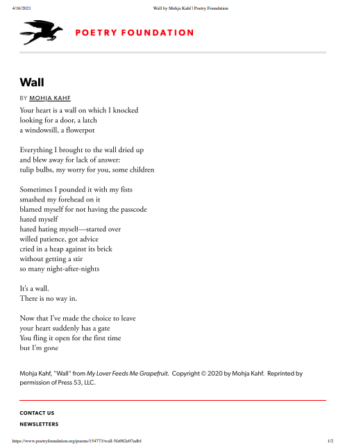
Poem Inspiration 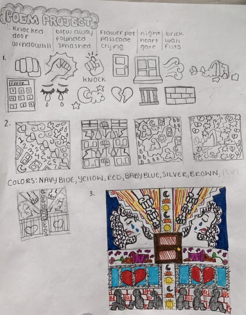
Pattern Thumbnail Sketches 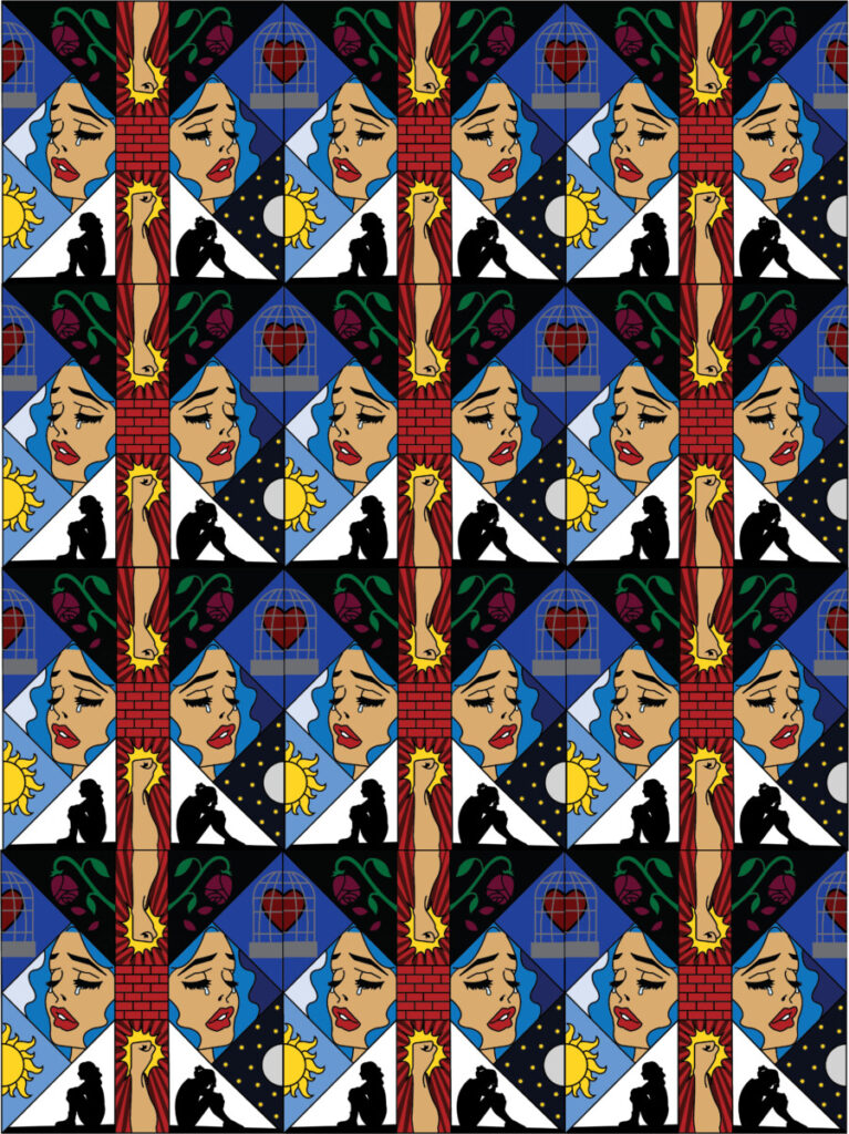
Final Poem Pattern Portrait
In Project 6, we chose a poem that will inspire us to create a pattern. We wrote down key words that were significant to the theme or meaning of the poem. We then drew imagery that represented or demonstrated the word. With that collection of different images, we composed 5 different thumbnail sketches. I combined the ideas of each thumbnail sketch and made my final sketch that will then be transferred into Adobe Illustrator. I decided towards the end to change the format or grid system of the pattern. I made triangle shapes and reflected them to form a diamond argyle pattern. I wanted my poem to have comic book styled art in order to make my piece appear more dramatic and tragic, which mirrored the emotions of the poem I chose. The color palette I developed also induces sad and angry emotions similar to those expressed in the poem. I used different desaturated blue hues along with vibrant reds and yellows.
Project 2 Gordon Parks

Thumbnail Sketch 1 & 2 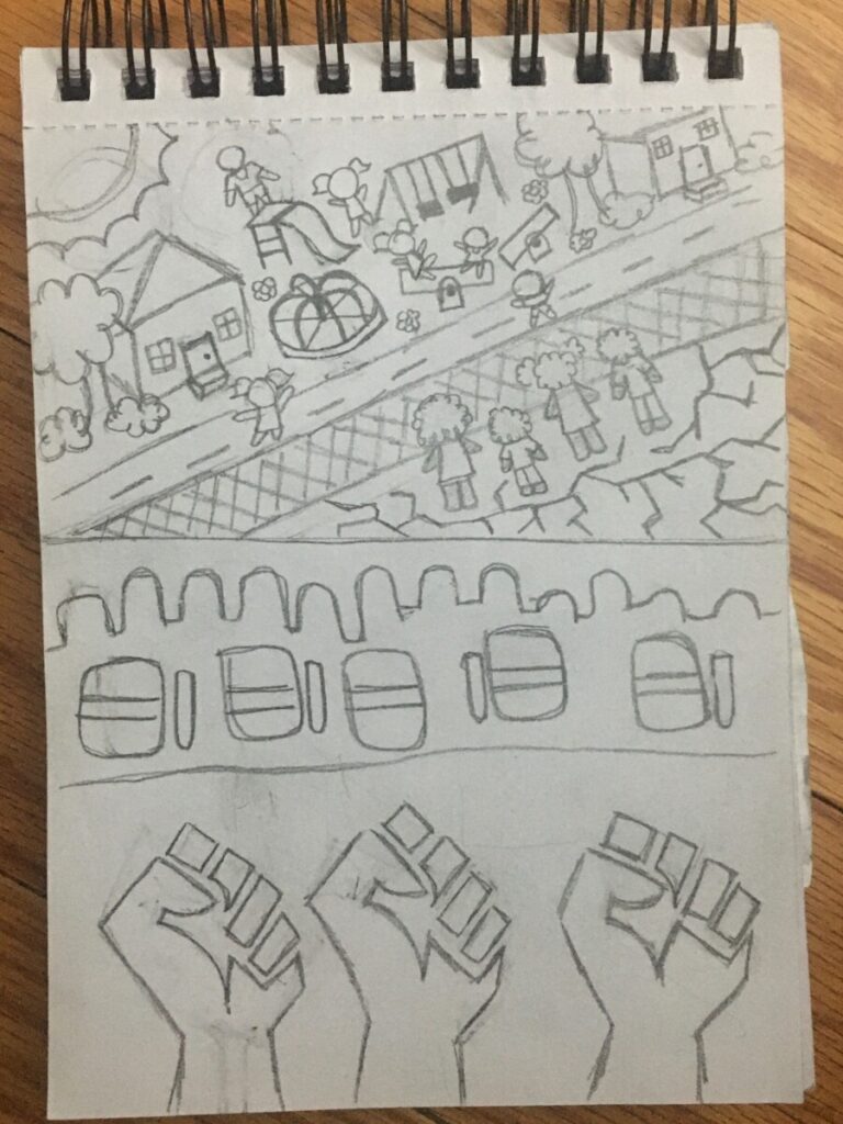
Thumbnail Sketch 3 & 4 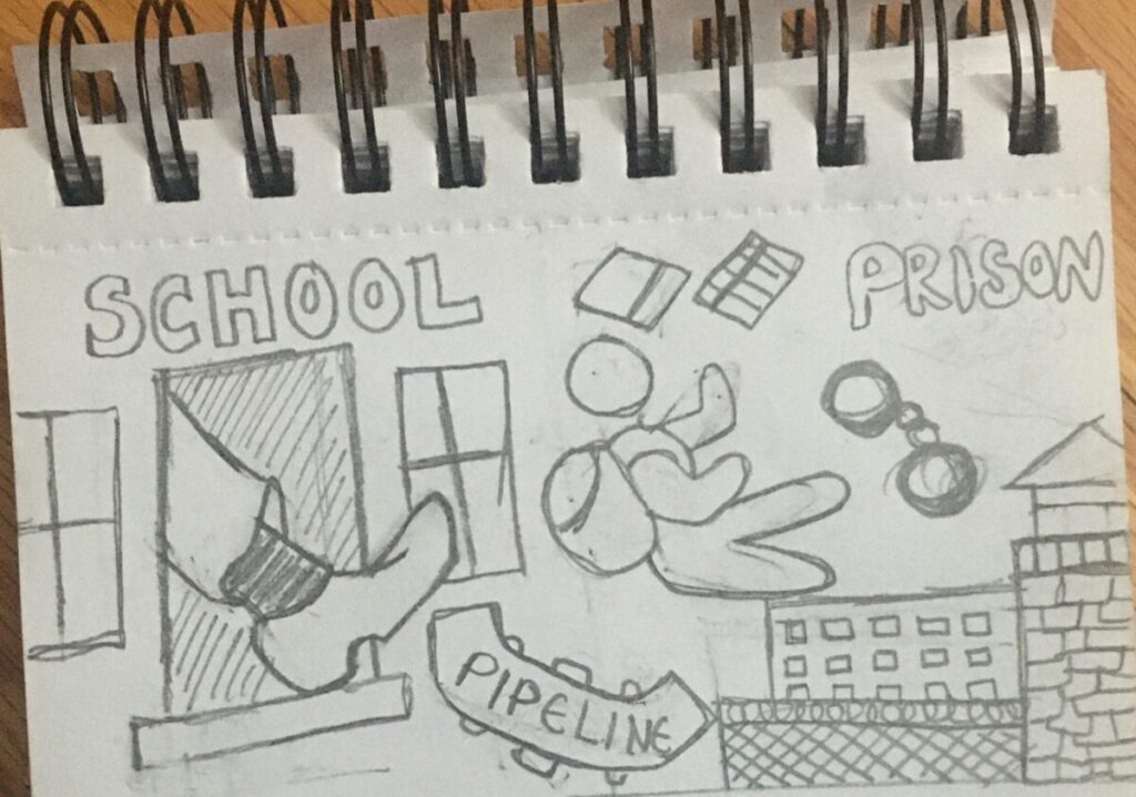
Thumbnail Sketch 5
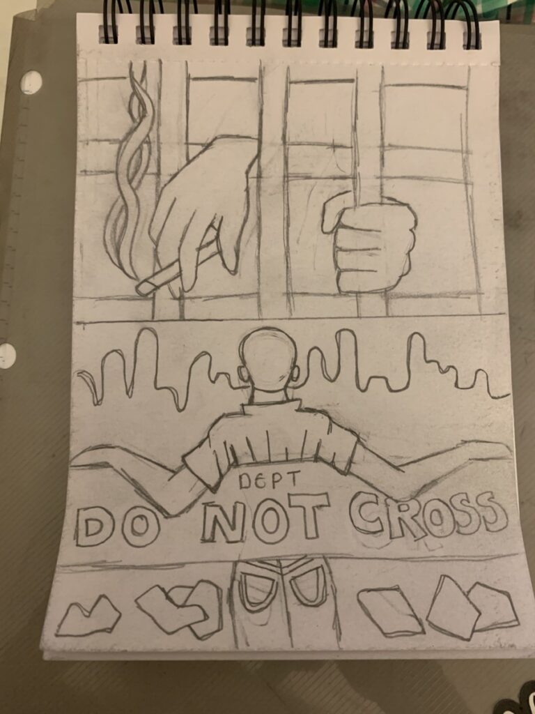
Thumbnail Sketch 6 & 7 
Thumbnail Sketch 8 & 9

Final Gordon Parks Portrait (Before) 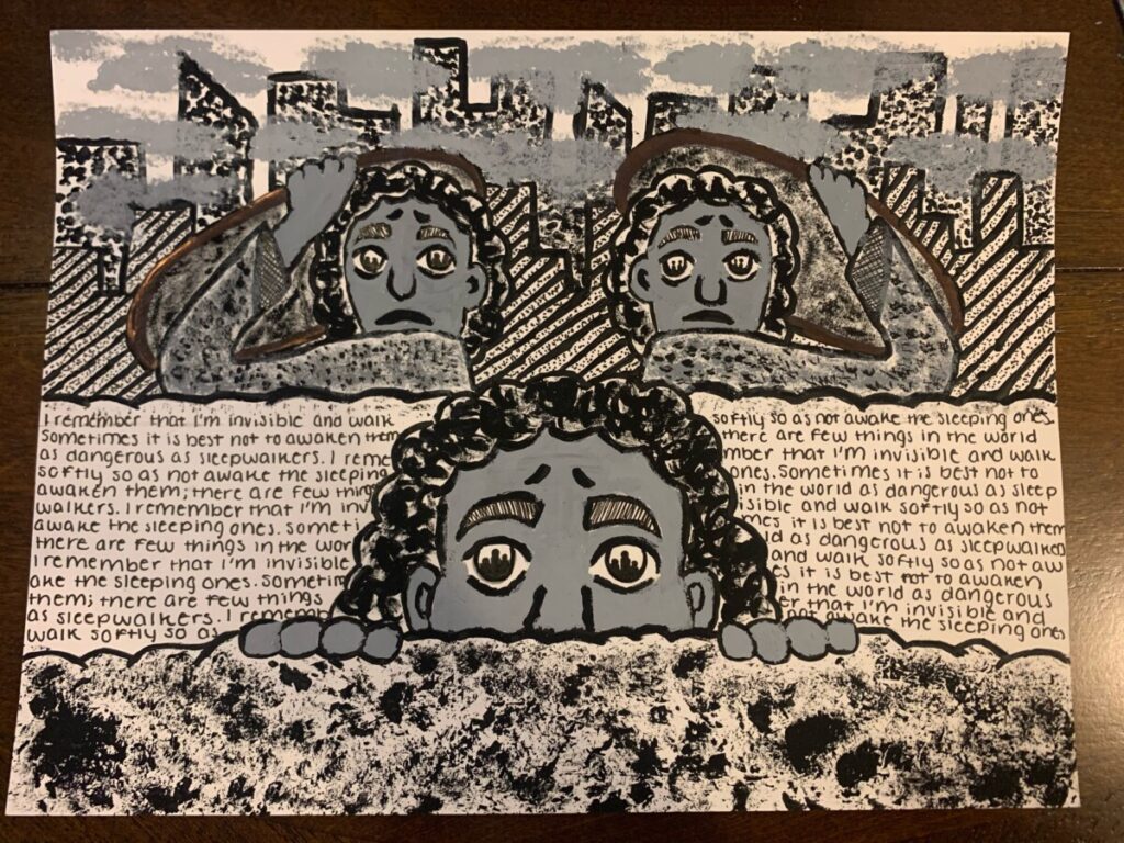
Final Gordon Parks Portrait (After)
In Project 2, we created designs that address themes relating to Gordon Parks’ work such as poverty, racism, and discrimination. For our first 5 thumbnail sketches we drew illustrations that represented racial injustice, while the next four sketches are illustrations that mirror his photographs but in our own art styles or interpretations. We then chose our favorite sketches and expanded it onto 9×12 Bristol Paper. We then gathered different materials like tissue paper and bubble wrap to use as mediums for creating numerous textures and patterns. My illustration is a recreation of Gordon Parks’ famous book cover named the Invisible Man. I made the man into a black woman, especially when there is not enough representation for black women. This demographic is the most mistreated because they struggle with both racial and gender discrimination. I wanted my piece to show how black women constantly live in fear and feel the need to hide themselves or be ashamed of who they are.
Project 1: Found Shape & Figure Ground
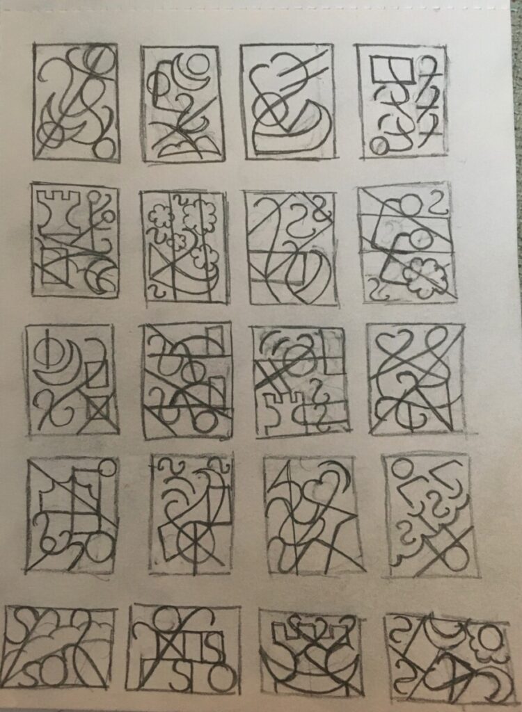
20 Found Shape Thumbnail Sketches 
Final Found Shape Portrait

5 Figure Ground Reversal Thumbnail Sketches 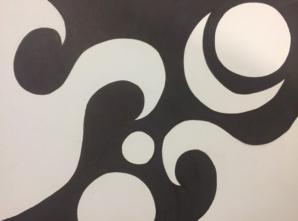
Final Figure Ground Reversal Portrait
In Project 1, we observed a painting we were interested in and drew lines or shapes that resembled those of the art piece. We then combined the lines and shapes to create even more diverse inorganic abstract shapes. We then utilized those same lines and shapes from the painting to make a figure ground reversal portrait, where the shaded black form a shape and the left over white space also forms a new shape.


