Some terms of Typeface
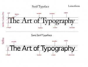
Typeface: The letters, numbers, and symbols that make up a design of type. A typeface is often part of a type family of coordinated designs.
1- Serif: Small decorative strokes that are added to the end of a letter’s main strokes. Serifs improve readability by leading the eye along the line of type.
2-Ligature: Two or more letters tied together into a single letter.
3-Ascender: The part of lowercase letters (such as k, b, and d) that ascends above the x-height of the other lowercase letters in a face.
4-Descender: The part of lowercase letters (such as y, p, and q) that descends below the baseline of the other lowercase letters in a font face.
5-Baseline: The imaginary line on which the majority of the characters in a typeface rest.
6-x-height: Traditionally, x-height is the height of the lowercase letter x. It is also the height of the body of lowercase letters in a font, excluding the ascenders and descenders.
7-Sans serif: A type face that does not have serifs. Generally a low-contrast design. Sans serif faces lend a clean, simple appearance to documents.
8-Capline: The imaginary line which represents the uppermost part of capital letters and some character’s ascenders. A line marking the height of uppercase letters within a font.
9-Counter: The enclosed (or partially enclosed) space within letters such as ‘c,’ ‘e,’ S,’ ‘H,’ and ‘g.’ Often confused with “bowl.”
10-Meanline: The line on which the top parts of most of the lowercase letters set (not the ascenders).The top (imaginary) point of all lowercase characters without ascenders.


