Typography is the most subject that gets my attention when I walk in streets or travel somewhere. Here are some samples of typographical signs I have noticed in streets of NYC.
1- A/X logo sign of Armani Exchange retail store.
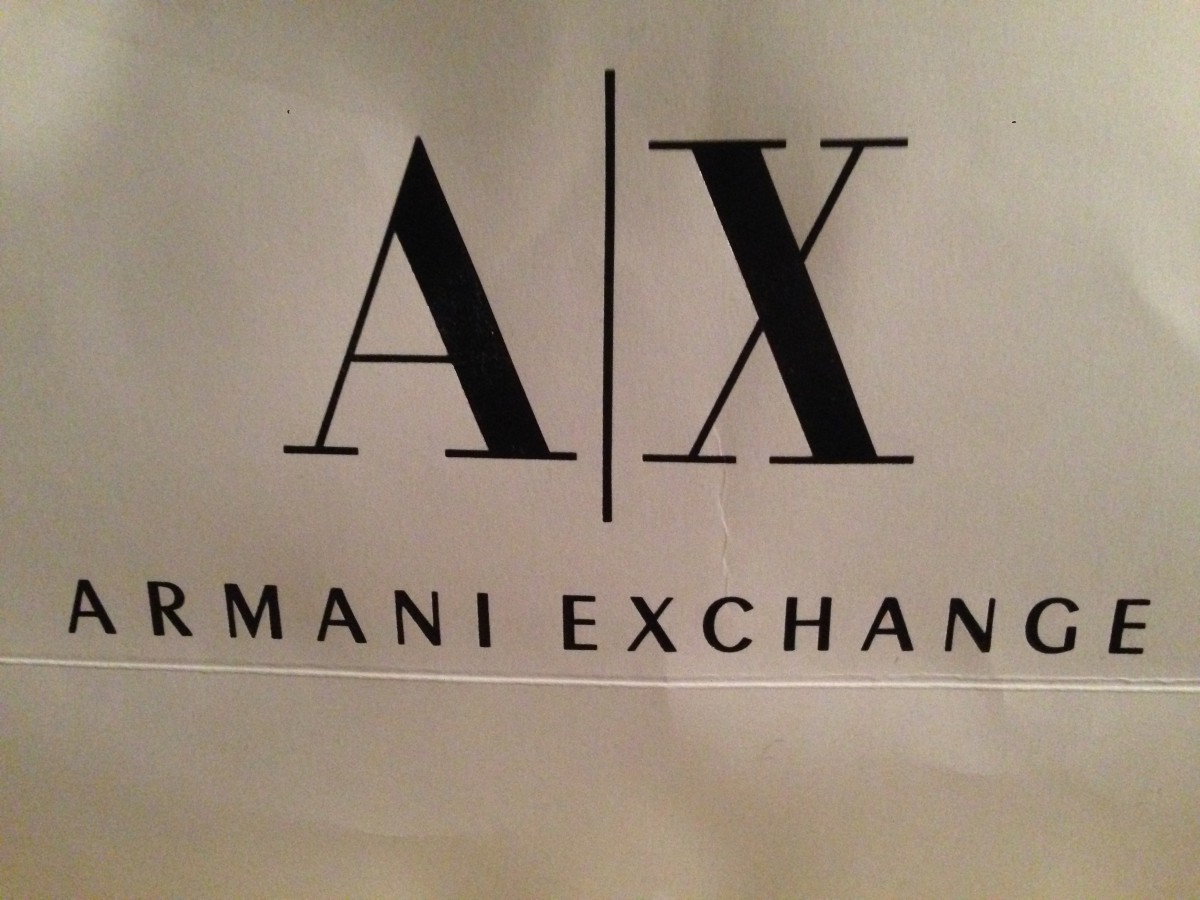
The typeface is used to make this logo, is Bodoni typeface. As we know Bodoni typeface is from Transitional typeface style or modern. We can see the high and abrupt contrast between thick and thin strokes. There is the vertical axis and horizontal stress.
As most of Armani logos use the same basic black and white color palette. This gives them a natural, striking and classier impression.
The sub-line of Armani Exchange here is sans serif typeface and I think it is bold font here.
2-The logo sign of Apple Bank for Savings.

The American Typewriter typeface was used here to make this logo. It is also known as ITC American Typewriter. It is classified as Slab Serif typeface.
The logo is white color made on black background to show the contrast as well as to be more legible and distinct.
I have noticed that this typeface is also used to make I love NY famous logo.
3- Duane reade logo sign of Pharmacy.
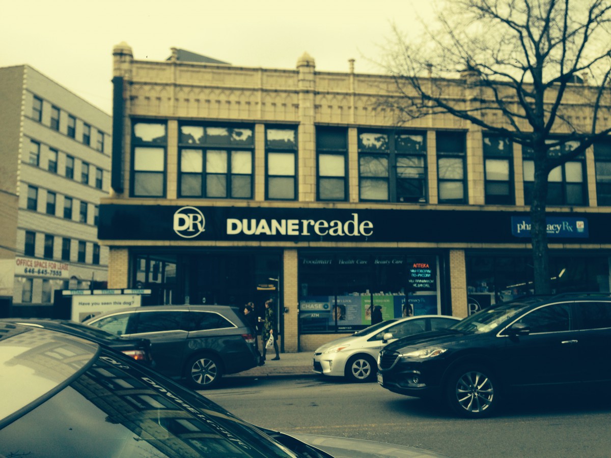
It is word mark logo that is combined of using two different typefaces for the sake of showing contrast.
I think it is the Didot typeface that is used to make “reade“. As we know that Didot is from modren classification typeface so I think it is ranged between Bodoni and Didot although Didot is more suitable in that situation.
Duane is made of Sans serif typeface which is more like proxima or gill sans. That contrasts with reade as it is serif typeface.
Another contrast is in weight of fonts; Duane is bold and reade is regular.
The color is used here for both is white color on black background to so another contrast by color.

