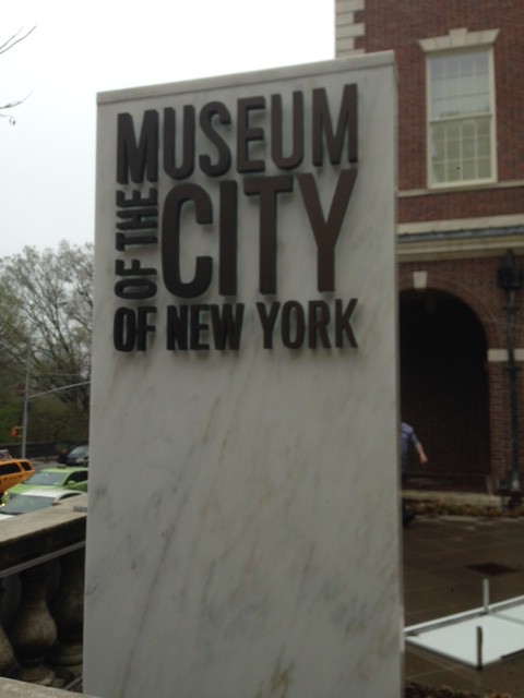
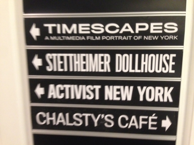
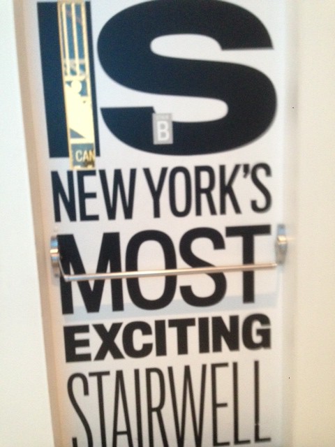
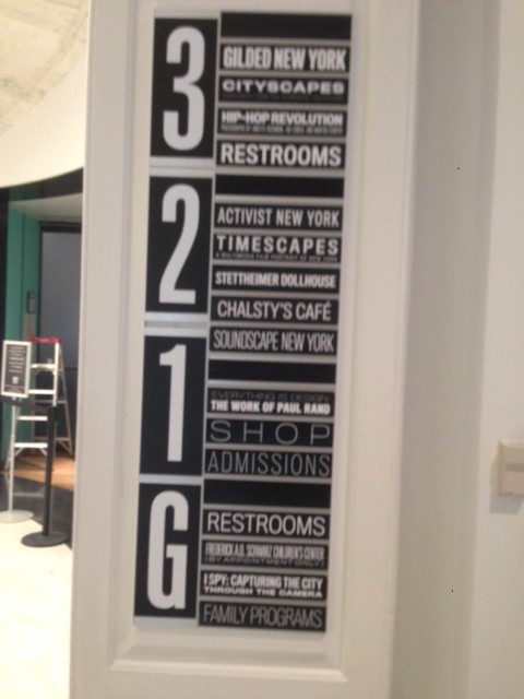
Our trip to the Museum of the City of New York was to see Paul Rand’s work in “Everything is Design” show and also the Hip-Hop Photography exhibition. First of all, The Logo of “the Museum of the City of New York” caught my eyes as well as the inside museum typography on walls and doors. All these white and black colors of sans serif typeface are so nice on theses labels and well organized.
As typography is the subject that more I am concerning about, my entire concentration was about it and how the design interacts with it. So the three works I picked up, are from Paul Rand’s work:
1- Poster of Kaiser Frazer car company, designed by Paul Rand 1949
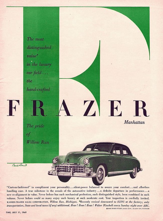
The first ad, we notice that Paul Rand had paid attention to the green F which is set in Bodoni typeface. The purpose of using Bodoni typeface to indicate to the transition from old to new time I think. Even the green color is more connected to freshness and stylish kind of a thing. We can see the alignment is very clear of The Green F letter and Frazer to the text at the bottom. The use of 2 colors of green and black is so effective and simple as well as more powerful to show the proximity and contrast.
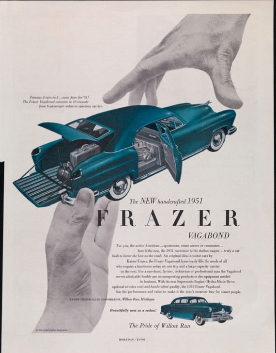
In the second ad of Frazer car company we see different style and different color it have been used here. It looks more like an article in a magazine or newspaper. The main title in the middle. There is usage of two colors blue and black as well as the Bodoni typeface was used here. I like the idea of the two hands and two colors to show the unity and simplicity. The alignment is very well done here and the images are away from edges.
2-Advertisment of Kaufmann‘s Department Store, Pittsburg, PA 1948.
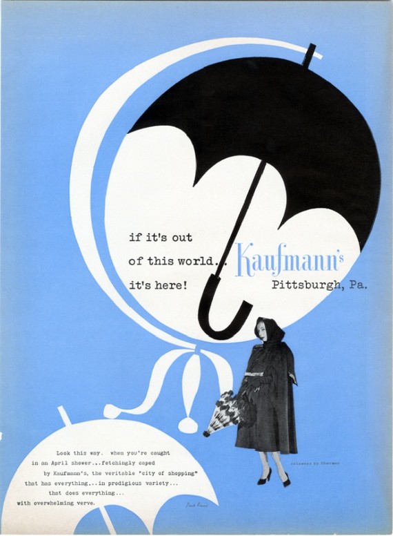
Paul Rand designed this poster in a very nice way. starting with typeface here which is slab serif. But the Kaufmann’s typeface was different and i think is more like Bodoni and decorative kind of. The use of black , white and blue colors were very effective and show simplicity as well as powerful impact.
It seems to me that Umbrella was used twice as a repetition and emphasis of the winter products. I think the black umbrella was set to cover the globe ball and “this world” was used as a reference to that showing the universe and famous store. The blue is symbol of cold. The woman is very stylish and make very strong effective to the advertisement.
3-Coronet Brandy Magazine ad 1948.