This is my personal Logo that I created in indesign cs6.
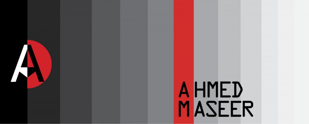
The idea of making this logo, is to merge the two initials of my First name AHMED and Last name MASEER (AM). By using the pen tool and direct selection tool, I pulled down the middle of the bridge of A letter to make it close to the letter M. Then I cut it vertically into 2 haves with black and white colors for each half. Surrounding by Half of Red Circle to make the black half of logo more visible and leaving the other white half as contrast to the black stripe.
The Myanmar Sangam MN Sans Serif typeface is used to make this logo.
and for my name I used OCR A Std Sans Serif in black color.
The idea behind using gray shades is explained in many ways. As I like gray color, I have read a nice article about the meaning of the different levels of gray color which very close to our lives. The link below gives you general idea of what I am talking about:
http://www.bourncreative.com/meaning-of-the-color-grey/
But in this particular situation I used gray shade and black color as a reference to black and white TV to give this kind of contrast. The red stripe, that align vertically on my initials, is to make legibility and to show the richness of letters.
In addition to that, Red color is a symbol of good luck in Asian culture. Also I used the red stripe on my initials as translation to my half part of red circle with black letter of my Logo.

