Internship Journal #9 Taking Initiative

With no disrespect to photographers, but it doesn’t matter how good the master shot is every photo must eventually go through editing in post.

It’s all started when the Saint Kenneth site launched and I browsed through the photo collections that I noticed something. That somebody the photos we had put up on the site were too washed out. Maybe it was was from the scanner but the colors weren’t as vibrant as the originals. I brought up my concerns about it, not by actually saying anything but by taking a screencap of the image from the site and modifying it myself.

After showing the result to my boss he agreed that the photos were not as good as they thought. He even commented that my modified images were even better that the originals, but I had to stress that I was only putting the color that was washed out from the camera flash.  That is if the camera made the model too pale I had to put the color back on her skin. So he had Dan send all the images to me and I corrected them and now they’re on the site. And I can finally rest easy knowing that sub-optimal work won’t be displayed on the site.

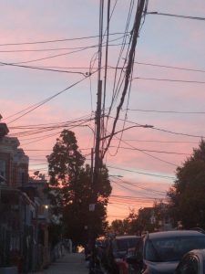
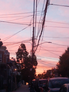
Here’s an example on the left of how the camera can wash out the colors and on the right is an example of putting the pink back into the sky.

Free Drawing Programs, Alternatives to Photoshop

As an illustrator I work primarily digitally, having studied graphic design for the last 4 years I know the Adobe Suite fairly well at this point, Photoshop being my main drawing program. However Photoshop’s upfront cost/ subscription model is not exactly ideal in the long run so I wondered if there were alternatives that I could migrate to someday.

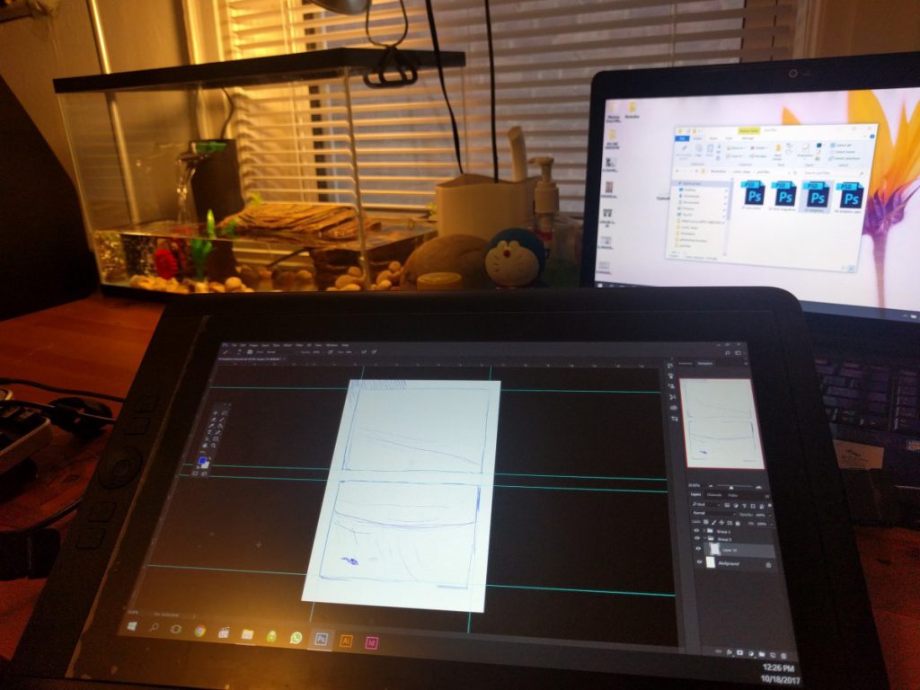
To start I am using a 13hd Cintiq on a Acer Aspire gaming laptop while running the very latest version of Photoshop on the Creative Cloud Photography Subscription plan. ($9.99/month)

Photoshop

I like Photoshop, it has served me well. My personal style doesn’t require much out of a drawing program. I like rough lines and flats mainly. Since this is my bare minimum I’ll also look at other programs so see how well they suit my work flow.

@Ratbodega on Instagram. ( fully hand drawn in Photoshop)

I also like making comic pages in Photoshop. It is a long process to set up a page but by this point I’ve developed my own methods of making this work. By far the most heavy process is in adding text, which tends to enlarge files when not rasterized. So I’ll be looking to see if any program makes this easier.

For the purposes of testing these programs to see how well they match my personal workflow I will essentially be replicating the same drawing in every program. The process is Sketch -> Line art -> Flat colors and a flat color BG, which sums up

Medibang: Available on PC, Mac, iPad, iPhone, and Android

Easy to pick up and learn, everything you want in a drawing program. Especially streamlined for making comics. My 20 minute drawing doesn’t show off all the capabilities of the program but I believe that Medibang one is a good contender for ideal Photoshop drawing program replacement, along with its partner drawing program Jump Paint. Highly recommended especially for collaborative comic projects as Medibang was designed specifically for that purpose.

Fire Alpaca:  PC only
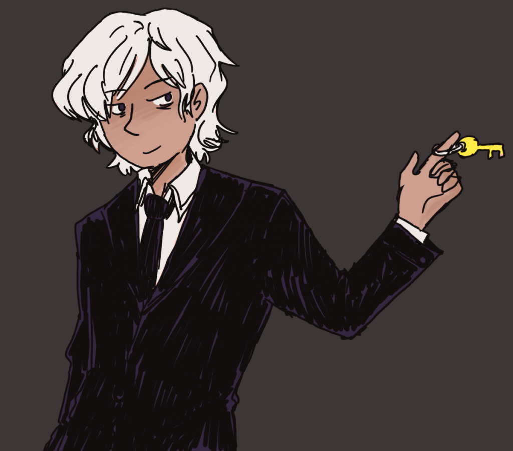
Drawn on Fire Alpaca, took less time because I didnt have to spend any time learning the program.

Whoever led me to believe Fire Alpaca was a unique program needs to do some research. Fire Alpaca is essentially the same as Medibang. They have the same work space, same tools and my opinion is the same. However Fire Alpaca is for PC only and lacks the collaborative cloud features and does not have the same amount of cross platform options. Since Medibang and Fire Alpaca are essentially the same program i’d say it comes down to personal preference, I recommend you prefer Medibang.

Krita: Pc only
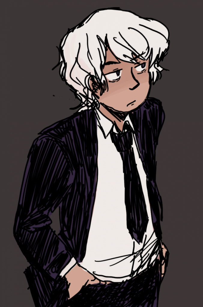
Drawn in Krita

Very good drawing program with great tools and lots of painting potential. Krita can be used to make comics as well but not with the same ease as Medibang. the right click brings up a handy tool and color wheel menu. I’d say its best features are its large pool of brush options. There is nothing wrong with Krita but there also isn’t much else that makes it stand out. I give this program high marks, would recommend.

GIMP: Pc Only
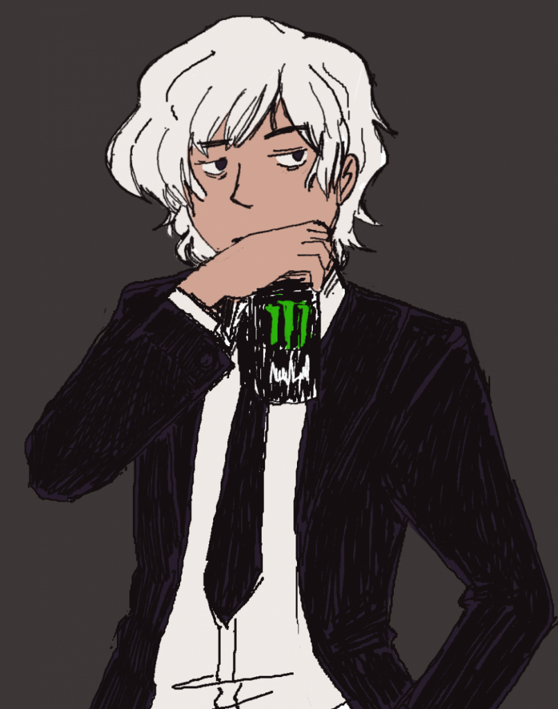
least favorite of the bunch

Not as good as i thought it would be. I suppose its a decent image editor and functions well as a beginner drawing program. Doesn’t seem to play nice with pen pressure. Tools dont seem to have their own setting so if i use a large eraser i have to readjust the tool size when i switch to brush. transform and select is a major part of my process and GIMPS tools are very clunky and found myself unable to get into a good work flow. To sum up GIMP feels like a program I’ve already out grown.

MS Paint: Free with any Windows PC

this is a joke entry but I spent an hour on this

Paint is Paint. No layers, no gods, yet somehow has better select and transform tools that GIMP 2, and a surprising amount of undos. Do not recommend for professional work unless you’re a professional MS Paint artist.

Honerable Mentions: One time payment programs

ClipStudio: (Trial version. requires one time payment of $60)
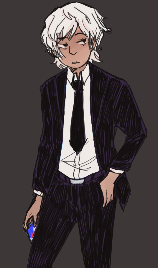
clip studio, trail version. wont let me save files so low quality screen cap

I lied when I said i’d only be doing free programs. I lot of buzz has been made of Clip Studio becoming availible on the Ipad pro. While I was unable to get my hands on an ipad pro a trusted peer tells me that Clip Studio is comparable to Photoshop as a drawing program. I was able to use the free trial of the PC version, which comes with limited features. Formally known as Manga Studio, Clip Studio offers some of the best drawing tools among these programs and comes the closest to my personal style. It also has dozens of features made specifically for those who make comics. So for a free trial I’ll put this at the top of my list for programs i’d buy.

I’d add that the iPad Pro version is just as versatile as the PC version with all functions included, but requires a $8.99 subscription fee.

Paint Tool Sai: (31 day free trial that expired years ago, one time payment of around $50)
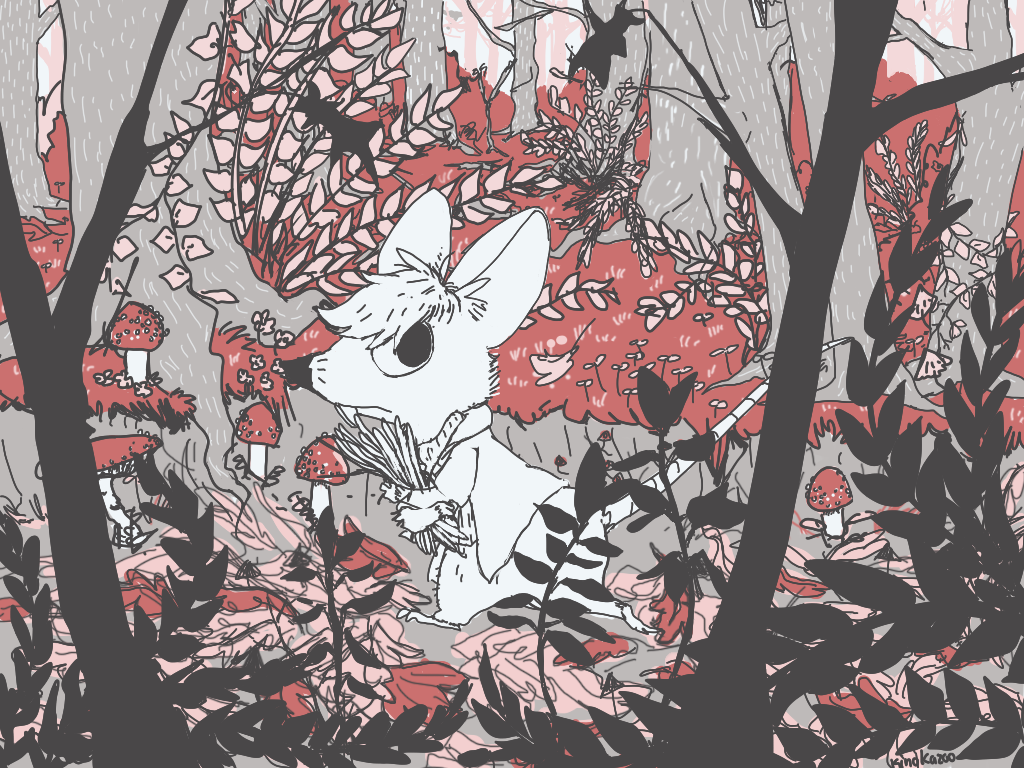
Drawn in Paint tool Sai- 2015,

I used to use this program quite often before I decided I didn’t want to have illegally torrented programs on my computer anymore. Not after…the incident. However I cannot recommend this program enough, among all the programs I’ve used, this one actually had one thing that none of the others have; good default basic brushes and the ability to create highly customized brushes. Which makes it ideal for any kind of illustration.

Conclusion:
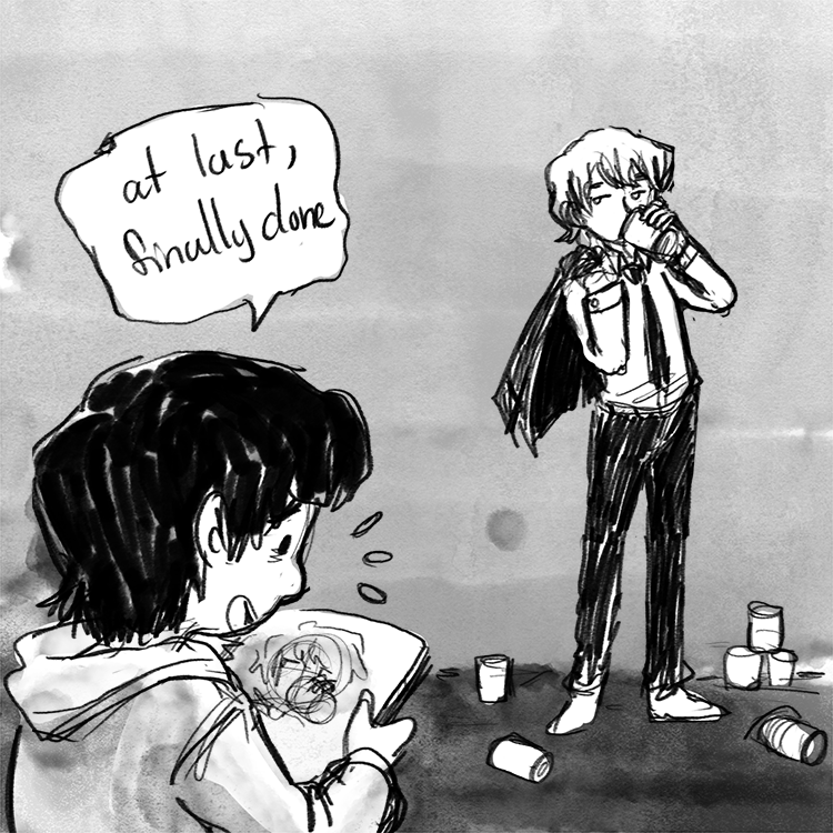
drawn on photoshop

Maybe its the Stockholm syndrome talking or maybe its actually good but I still like Photoshop best. It’s export functions are immensely handy to use. Not to mention it’s built in PDF presentation maker means I can easily put together a PDFs from multiple image files. The brushes that came with the 2018 version of Photoshop, which I was able to upgrade to for free through creative cloud, have out classed nearly default brush set in any of the free programs. (with the exception of Krita but i’d have to spend a considerable amount to time creating and modifying brushes until i get something I like). Clip Studio and Paint Tool Sai are the only comparable ones and they’re paid programs. Photoshop can be slow so having a light weight drawing program to use is essential. In the end due to Photoshop steep upfront cost I’d recommend Medibang to anyone on a budget and if youre invested enough, probably Paint Tool Sai and Clip Studio.

Internship Journal #8 New Skills

A Brief introduction on Fashion Illustration.

So one day my supervisor comes up to me and asks me if I knew anything about doing technical fashion illustration. I say no but that I can give it a shot, i usually pick up things quickly if its explained to me straight forwardly. I get the assignment with some direction when it comes to technical illustration, I’d say the illustration part is easy but the technical part is not as easy. Having to figure out the exact measurements for, hypothetically speaking a shirt pattern, was also part of the assignment. The point of technical illustrations is to convey information in the most accurate and objective way possible. So in a way its a welcome break from having to constantly create ideas from scratch.

due to the particular item being an unreleased design, here is the office turtle Flash

From what my supervisor told me, I did a decent job, this particular assignment was meant for the factories to see exactly what the the design is supposed to look like. So while I’m not an expert at technical illustration I can definitely say that I wouldn’t mind doing it again.


Internship Journal #7 Work Culture

The company is new and quite small. the space is open and quite cozy. Most days coffee has already been prepared and after a quick cup everyone is ready to start the day. The office is filled with many amenities that the Director made very clear I was free to use whenever the mood struck me.

my workspace

The first few days I was encouraged to get myself acclimated to the office. Although I was pretty eager to get to work, time spent not working is time being wasted. That’s something I tell myself when I feel my productivity starts slipping. So I spent some time setting up the computers and bringing myself up to speed on what was expected of me.

Overall looking forward to what kind of assignments they’ll give me. I even brought in my Cintiq because that’s how I work best in my illustrative workflow.

Breaking Free from Google Docs. Reviewing JotterPad

To start I write constantly. I have many projects on the back burner. Many documents that need to be written. Comic script drafts, story ideas ,heck even school assignments. I don’t use the computer since I find I easily distract myself on it. Instead I like to write on my phone since i can only have one app open at a time and I can write on my commute.

For years I’ve used the Google Docs app. The biggest features in its favors are that It connects and syncs up instantly across all my devices. Being able to share my documents with anyone is also a great feature. The ability to download and upload files and edit them instantly is also a handy feature. However for as long as I’ve been using the app, I’ve started seeing some flaws that continually grate me. Some such as;

  1. it doesn’t have a dark mode. Dark modes are easier on the eyes and look cooler.
  2. Clunky and slow with big documents.
  3. everything is sorted by whichever one was last edited so older things always get pushed to the bottom.
  4. you cannot organize anything into folders within the app. you can in google drive but the folder organization doesn’t carry over into google docs. I have so many files without any kind of organization its just chaos send help.

Needless to say any kind of app that has a dark mode is on the top of my list. Any app that also doesn’t also have the flaws that Google Docs has is also a winner in my book.

JotterPad: Only for Android. nice modern design. Free to download, has more features pay walled.

  1. Starting with the best feature which is the reading mode. That way I don’t accidentally click on the text while scrolling and bring up the keyboard. Best thing I never knew I needed.
  2. Its has a great organization system which is what I call the bare minimum, folders.
  3. Connects with Google Drive, and Dropbox. so i can upload and edit documents from Jotterpad.
  4. has a Dark mode.

. Downsides:

  1. .txt files only.
  2. Dark mode is pay walled.
  3. Files cannot be viewed or shared with other easily.
  4. Google Drive connectivity is pay walled. (free for seven days)

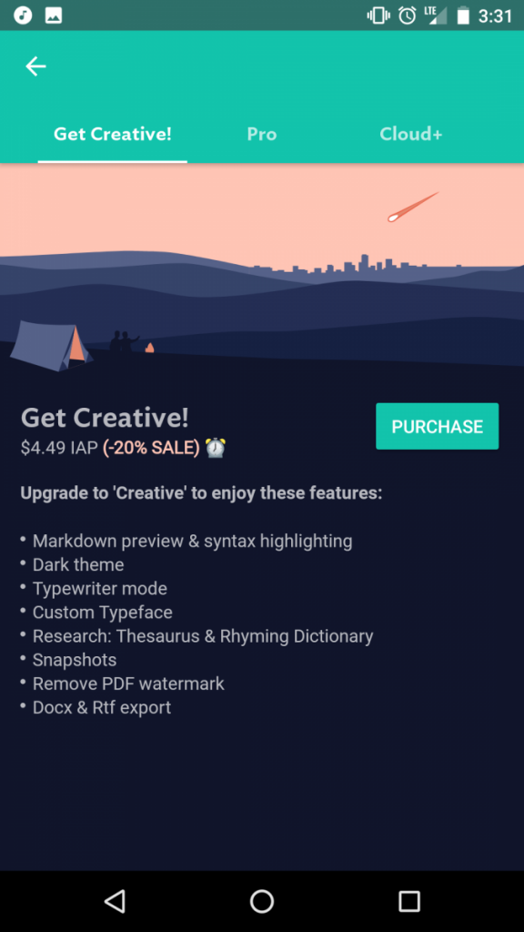
for five dollars I wont have to protect my eyes from a blinding white background

I like the app, it runs smoother and looks good. Fits a nice amount of text into the screen. tried out the seven day free trial of google drive connectivity and the transition was sloppy but still worked. Overall good, not perfect but pay walling dark mode? who do they think they are?


Internship Journal#6: My Role

Saint Kenneth is high end fashion design company and while my work doesn’t have much to do with fashion at the moment I am not at liberty to disclose the nature of the projects I am involved in.

I found this Internship on Internships.com it was the only Illustration internship that didn’t explicitly involve fashion. I included my Portfolio site, and a link to Senior Project a comic I created called The Wayward Blues. About a few days later a received an email for an interview and the next week I went in for an interview The interview was very relaxed and more casual than I expected.

Supervisor was particularly taken with this piece

My Supervisor Kenneth Lee asked me to describe my artistic style and i responded honestly by explaining that i haven’t yet grown into my style. He appreciated my honest self assessment. We talked about the future of the company and how I will be contributing to it. After reviewing my comic he explained that he could see how passionate I was about my work and how prolific I was. He wanted to work with talented and passionate people and offered me the position and I took it right away. He gave me a tour of the office, which was very small. The work environment was very relaxed and I could see myself doing good work there.


Society of Illustrators

Burlesque Sketch Night: Super Hero vs. Villains!

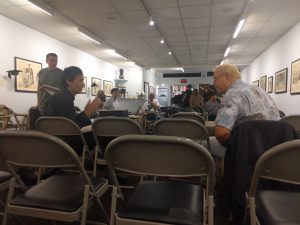
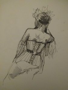
the Society is a place where artist and Illustrators gather together to practice their life drawing skills.Skill ranges from beginners to long time masters.  Usually when drawing everyone is silent but during breaks there is much small talk. Much of the conversations are about technique and comparing processes. This week the models were dresses as superheros, in honor of the NY Comic Con. Personally I haven’t had much practice in life drawing so the experience was good for me as an artist.

model dressed as Poison Ivy.


New York City Comic Con

On Thursday October 5 I attended New York City Comic Con. Mostly for panels about the industry. The event itself is very crowded and personally i didn’t enjoy the “con experience” i don’t exactly get what I’m supposed to do in the exhibit floor, without any money to spend it doesn’t interest me. Not that i had the time to see it as all the panels I chose to attend were basically back to back.

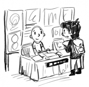
made some time to visit my favorite artists at the Artist Alley, felt like I was bothering them because I couldn’t buy anything. very awkward.

Panel no1: Breaking into Comics the Marvel Way:

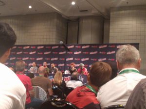
a panel of true professionals

For this panel, there were six pros working in Marvel comics that spoke about their experiences in the industry and how they ended up working at Marvel. I was particularly interested in Irene Strychalski who is the penciler (artist responsible for the layout of the page) for the current run of the Gwenpool series. She talked about how she went from animation work to doing her own comic projects and eventually being noticed by the editors to be given a spot on a series. The main message I got was to be prolific, have completed projects and above all else contact editors nonstop!

Panel no2: Here Lie Dragons & Eternal Beasties

panel of YA writers that i’ve never heard of for books i’ve never read. went into this knowing nothing, left with a new reading list.

Admittedly i went to this panel to kill time, but the subject matter was interesting enough, with an ongoing comic project that I both write and illustrate I thought i’d get something out of the panel. They talked about story themes, world building and how to connect with your audience. very insightful.

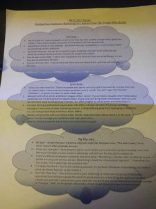
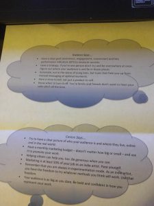
Panel no3Finding YOUR Audience: Marketing 101: A Step-by-Step Workshop

This one was very informative, coming from a panel of self started artists. They talked about the projects that got them noticed and how they went about doing it. From kickstarter projects to online publishing. The biggest take away was that it was very important to have a concise hook for your project: if it doesn’t sound interesting right away to your potential audience then you’ve lost them. I need to work on my projects blurb based on the examples they gave. In the age of the internet having a small dedicated following can support you if you can reach them!

They also left us with this handout handy tips:


Internship Journal #5: Saint Kenneth

Saint Kenneth is the place I ended up interning, a high end fashion startup. As a startup there is very little about them so far but they have big plans for the company’s future. Their focus is on high end fashion, but they also do some non profit work for animal welfare. I work as an illustration intern, there is another illustrator but i haven’t met them yet. Their main headquarters is in France, but they also have another location in Queens where I will be working. The staff is very small, I was told it was at most 10 people, but I have only met three of them so far. Everyone is close with one another, possibly due to the small size of the company.

two very important team members

Internship Journal #4: The Interview

First interview of the week was for Saint Kenneth. I’d say it went pretty smoothly they were very excited about my work. They seemed very passionate about what they do and I can get behind that mentality. Since they made it very clear that they wanted me to use for Illustration I was very excited to work there. There aren’t many places that ask for illustrators so I’d be remiss to not take it. So I immediately jumped the gun and and accepted the first moment I could. As of Monday Oct. 2nd I am doing a Illustration Internship at Saint Kenneth.

now i just have to cancel all the other interviews i scheduled