Category Archives: Internships

Collaboration: GlobeScope

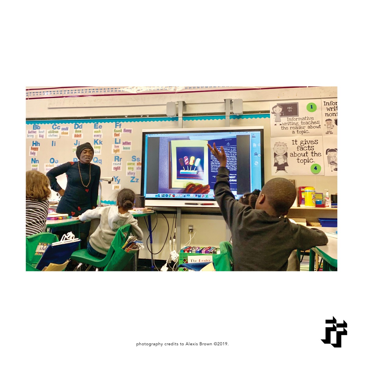
My supervisor, Harely, advised me to reach out to a Frankin Furnace Artist under our fellowship named Gary Coblin. He’s starting a business called Globescope Arts and Entertainment which revolves around artists with no recognition or opportunities due to their disabilities. Gary had reached out to be to meet in the office and I consulted with him one on one on his pitch.Gary has all the research and a ten year plan but wants to update his logo and start-up a website. Afterwards I was placed under his Globescope fellowship as their non-paid graphic designer but Franklin Furnace would pay me instead by allowing me to use their hours to work with him. Within the next week into this, Globescope logo has been updated (ever so slightly) and I have in the works of developing his website further. Every Wednesday, I will continue to work on Globescope’s website and other social media platforms. The following Wednesday, he came in to meet with me to give me a review of the logo and what he thinks so far about the website. He wanted the incorporate mostly purple and having a bold yet simple font that is also modern.

Gary had sent me his original logo which did not even have his brand name on it. It was just an icon of a hook and a hand with a purple and white gradient behind it. When I checked his current website, which has now been shut down until the relaunch and will be completely new, there was no grid, five different colors of purple, multiple different fonts, his brand name was not aligned with the icon. His brand name was a serif font that he had decided to use based on Wix.com’s default font but did not like.

(original “logo” [icon])

(updated logo)

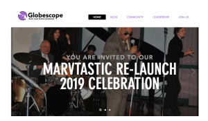
(website in progress)

Creative Application: Adobe Premiere

The next creative application I had used at Franklin Furnace was Adobe Premiere. I had used about five creative applications which was Adobe InDesign, Adobe Premiere, Microsoft Excel, Microsoft Word, and their DataBase (maybe that one is not so creative, but was a first time experience). Now yet again you’d think I would know this one as well but ironically I had to entered a course at City Tech on video producing and I had no experience. It gave me an opportunity to learn outside of the class room and get a head start from my classmates on the basics of the software since it was a beginners class. My second supervisor, Jenny, actually had a step-by-step instructions on how to use the software: from the pre-sets, to in-and-out, to fixing any audio issues, and especially, she stressed, exporting. These videos were very old and I had to edit them where any static or color bars were removed, and any unnecessary audio like a long beep or loud static was also removed. This was a team effort made with another intern who also went to City Tech, Annabelle, since we both came in on different days and only one computer in the office at premiere along with the hard drive that had all these archived video. We had to add the title of the artist and year of the performance as the introduction and add the FF logo. The instructions told us how long the introduction should be, the exact transition to use (dissolve to black) and when the logo should come in. For the introduction, it was a template made on Adobe Photoshop which was had to edit for each videos title, artist ad year to then be exported into Adobe Premiere. When then add the transfer data into an Microsoft Excel sheet to keep track of who edited which video and if it had been uploaded to Vimeo. There was also specific instructions for adding a title, privacy setting, and audio caption to it. We had to edit and upload these videos as apart of one of our grants needed to fund this non-profit organization.


I have attached a link to one of the video that required editing and to see more just search Franklin Furnace on Vimeo.com (https://vimeo.com/franklinfurnace) 

(yeah, I know…pretty old footage)

(screenshot of the Photoshop template)

Creative Application: Adobe InDesign

While working as an intern at Franklin Furnace, I used applications such as InDesign. Of course this is the typical adobe application for designers but for me, I hardly used it and it may be the software I use the least. I had to design fliers for Franklin Furnaces upcoming event that showcased multiple artist. This gave me a great opportunity to primary practice my use of the grid because that’s something I lacked skills on. I was given 7 images by another supervisor that worked there along with all the information for the flier. I used a 3 column by 4 rows grid. It does not seem like much compared those who consistently use grids but this was the most I’ve possibly used ever. I also had to make print outs and hand them out to students on Pratt’s Brooklyn Campus. Since I got an opportunity to work with grids, photographs and text, I made multiple copies and had my supervisor pick which one I should print. These were the top two of all five; they had chosen the second one. I was told the posters came out great but if I really wanted feedback to be nit-picky to arrange or flip each photograph in the direction of the text (as displayed in the second one). I was told since the photographs face the opposite direction, It leads the eye in another form straying off the page or just not to the text.


Field Trip: Cooper Hewit Museum

On May 8th, my Internship class had took a field trip to the Cooper Hewit Museum. We expose two floors of multiple galleries, series and exhibits. We first entered into the Rebeca Méndez Selects series which explored different kinds of birds, sounds, textures (such as feathers) and more. Her purpose behind this was to focus on the tragedy history of Aztecs and scientifically study birds in nature. It also displayed old documents and books such as the Florentine Code. She created clothing and a side-wall (block printed on paper) of patterns of nature and birds. You were able to get a visual of birds flying around the ocean while listening to an audio as well allowing you to hear them, the ocean and any sounds of nature.

(Side-wall: block print on paper)

(Bird specimen)

(Video: CircumSolar + Strata Drums)

My favorite spot we went to in the museum was the Process Lab. I loved getting an opportunity to explore different color palette, textures, patterns, paper porcelain (kitchen utensils), and hearing about the brand itself.


(Color)

(Textures + patterns)

(Kitchen utensils)

(my palette!)

These were just two series! but of course there’s many more. Also, the museum has two methods that I found really interactive. The first being they give a pen where you can use it to save work digitally and login with a code later on to access it. Another thing, with this pen (or even your finger), you can go to this kiosk and search for art. They’ll have random art works flowing around and if you grab it with the pen, you can get more information on it. Also it allows you to create your own sculpture, furniture and add color to it using a grid.

PS: They also have really cool chairs by the bathroom! It spins as if you’re going to fall off but you don’t. 

Networking Event: Pratt Institute Digital Media Series

At Pratt institute, the Department of Digital Arts Lecture Series is a seasonal series organized by the Department of Digital Arts. The series features critics, artists, and curators of digital art. The guests include both emerging talent and established pioneers in the fields of digital animation, motion arts, interactive artwork, and digital imaging.

At the series I attended on February 20, an artist named Will Rahilly hosted. He displayed  work he’s done based on animation, videography and sounds. He broke down his creative process on how he goes about things. For him, he does a lot of spontaneous ideas, concepts or commissioned. For example, he had a cake for a photoshoot and it sat in his fridge for weeks and he decided to use it for recreational purposes. He demonstrated how he was able to record sounds at any place and time to put it to use in videos. For example, he voice recorded a broken printer and found a concept/animation that he could add it to. He focused mostly on how we can create our own sounds instead of finding audio online. I was inspired by a lot of his concepts because it was beyond creative. Also, because I am learning motion graphics and it gave me ideas toward transitions and sounds

Check out his website: willrahilly.com/ to get a better visual and view of portfolio.

FF SeqArtKids: Session 4

Session Four: Memory

During session four, students listened to a recording of Judy Garland singing, Somewhere Over The Rainbow from the musical film, The Wizard of Oz. There will be a brief discussion of the interpretation of the song. Students will be taught how to strengthen self-awareness through imagination. They will be guided to review of the meaning of “negative space” and will be directed to complete the drawing assignment without leaving any negative space. The in class drawing assignment was to make the students draw a rainbow and what they think will be at the end of the rainbow. Table 3 imagined a leprechaun at the end of their rainbow and Miss Brown drawn an example to display to them step by step. Max envisioned gold pots all around the rainbow. Mia sought money with her face on it (“Mia Bucks” she called it), at the end of her rainbow. Cameron recalled the remix of The Wizard of Oz called The Wix and recreated a scene of a yellow brick road leading to her rainbow. Students did great today!


Franklin Furnace: SeqArtKids Session 3 + Day in the FF Office

Session Three: Memory

During week three, trying to get each student to all stay attentive after being on the playground was the challenge. We wanted to use as much time as possible to give them enough time to get to the drawing activity. We read a book to Miss Montagna’s class called “The Delicious: The Life and Art of Wayne Thiebaud” which discusses and shows how Wayne Thiebaud expressed his memory through art. Following this, we asked the students to share a memory they have had in the past. We also asked them to what a pattern is and how to identify patterns. Leiman shared a story of the time he went to the pizzeria with his grandfather. Max shared a story of the time he went to the mall with his family. Peyton shared a story of the time she went to iHop for her birthday. After hearing some of the student’s memories, we had them close their eyes to get a strong visual of their memory they plan on drawing. Once they’ve gotten the visual of their memory, students begin to draw in landscape perspective. As each session passes, I gain more insight on how to be an art teacher and how to deal with children.

In the FF Office:

After teaching at PS20, I must head to the office to make copies of the children’s work. I must write journal entries on each session as well. I must criticize each lesson and the overall program and give feedback for improvement.

Summary

I am grateful for both opportunities as an Assistant Art Teacher for SeqArtKids and as a Graphic Designer under Globescope. Along with already doing Graphic Design for Franklin Furnace. I have and get to continue advancing my skills with communications, InDesign, arts + crafts, and developing creative skills.


SeqArtKids at FF: Session Two

Session Two: Senses

During week two, we reviewed the five senses with students and what they perceive beauty as. Students were asked to fill out a questionnaire asking their five senses. After helping student in the class room, majority of student figured out at least 4/5. Touch/feel was the most unknown sense for these six year olds. Out of the whole questionnaire, student could not really define beauty. Majority of male student wrote “I don’t know” and majority of the female students wrote “pretty”. Main objective was to teach them beauty is an endless list of qualities or what you see yourself see it as. It can be defined in any way and there is no wrong answer.

Moving forward in the class since Valentine’s day was approaching, we read a book to the students on different feelings called “In My Heart: A Book of Feelings (Growing Hearts).” Each student had to draw in their drawing pads how their heart was feeling. Most students were feeling happy and drew a cheerful heart. A student, Caleese, drew her heart happy and along side she drew herself hugging the heart. Once this task was complete, they were given hearts and cards to paste, draw and write in for their Valentine. I had drawn an example and put it up on the Smart board for students to have a reference. Of course students needed help with their spelling and that was the biggest thing with writing how you feel and a card for valentine’s day. It was a consistent task having multiple students at a time seeking help. Eventually I had just written in my sketch pad the main words they needed help with such as: “dear, valentines, angry, from”. This way if multiple students needed help with spelling I was able to just reference to my sketch pad and have them copy it.

At the end of each session, I must take pictures of the students artwork and through out class, of them learning. These pictures are essential for our grant, fellowships, and to be funded as a non-profit organization. I then edit those images in photoshop and then add a boarder + the FF logo using InDesign to each image.

SeqArtKids at Franklin Furnace: Session One

Session One: Self-Portraits

FF has a SeqArtKids program where we visit schools in Fort Greene such as P.S20 that do not have art classes or teacher. It is a 10 week program where I will be assisting Miss Rogers during lectures, helping student with spelling, and developing imagination and artistic skills further During session one of ten, we introduced self-portraits to the students of P.S. 20 (first grade class). The class begun on the rugs as we asked the students what a portrait was. The responses we got did confirm they knew a portrait was of an individual. They were given mirrors to admire and observe themselves. We encouraged them when they did their self-portraits to not forget to add elements that represented them. Also, we discussed what negative space is and to try to keep the page full of colors with no blank space. A student, Max, is a big fan of the cartoon Ben 10 and made sure to represent that by adding a Ben 10 wrist watch to his self-portrait. Another student, Ikará wanted to represent how much she loves the color pink by shading her shirt that color on her self-portrait. The objective was teaching students about portraits and what we can identity about a person from it.


Intern Life at FF

At the internship at Franklin Furnace (FF), I’ve learned that a non-profit business has a lot of aspects to it. A main aspect is how it is funded. Non-profit could be funded if they create their own fund like my internship does called the Franklin Furnace Fund. They also have grants as discussed in my previous blog. These grants ensure they make money off of interns without having to paying us. Another factor is how they are able to draw in all these artists to preform and even get to sell their work for museums/exhibits. FF has a fellowship program that can get you in as an artist once your application is approved. The artist at my job are next level definition of a UNIQUE artist. Interns are in charge of ensuring our archives are in order, named properly and in the data base, vimeo, excel or in the office. Artist will physical art work gets their work packaged into a box and labeled for storage. Performing arts are recorded for the footage to be uploaded on vimeo.

In terms of being an assistant art teacher the other day I am there in the week, I must write journal entries explaining what we have done week by week and how it can be improved. I also make worksheets for the students, print, and make copies of their work. The original pieces of work stay at FF in our archive for their SeqArtKids program.