Working in Color: The basics

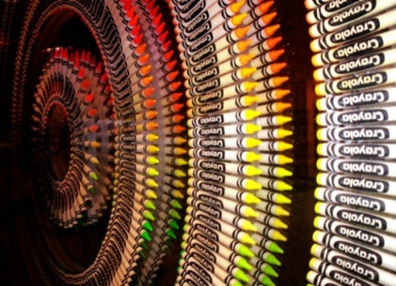
Color is one of the most powerful aspects of making art. Almost everyone who loves to create can remember the childhood excitement generated by a brand new box of crayons!

1466032830041

Everyone has a favorite color, artists and non-artists alike.  Our relationship to color is one of the most powerful relationships we have as a species. It is intrinsically connected to how we relate to our world. And so of course it is one of the most powerful aspects to consider when making art.


Color Temperature

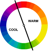
 Much of our relationship to color is based on instinct. For example, we see colors as warm or cool based on our physical response to them.

1466033269032

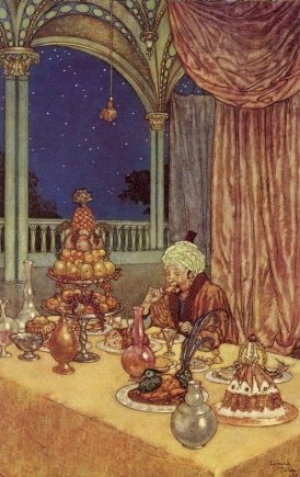
Warm things are warm colors (such as fire, the sun, hot coals, and in this case hot food.)


1466033283844


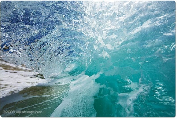
and cool things are cool colors (such as water and ice, which as blue or bluish).


1466033301650


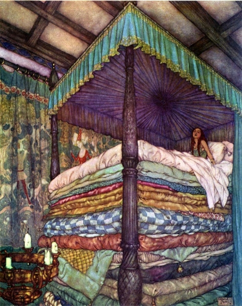
Interestingly warm and cool colors also create a sense of perspective and depth when we look at an image. Warm colors tend to advance towards us, whereas cool colors tend to recede away from us.


In these two images note how early 20th-century illustrator Edmund DuLac uses this trick. In the first image of The Princess and the Pea he creates a sense of incredible height, as the cold blue-purple recedes from the viewer, effectively raising the height of the bed canopy. And in the second one, A Palace of Wonder, a sense of depth is created between the warmth of the interior space and the cold dark outside.

1466033989719 1466034009733


COLOR AND CULTURE

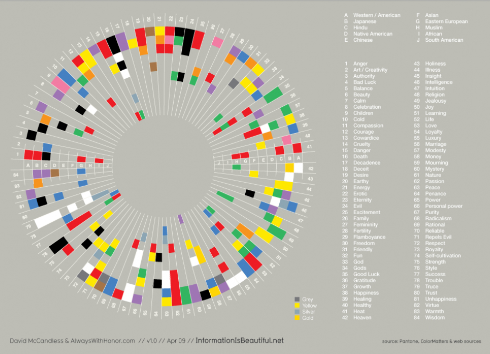
However, a great deal of our reactions to color are not innate, they are in fact cultural. For example Black and Death are associated in many Western cultures, in many Eastern cultures it is associated with white—its direct opposite.

Take a look at this info-graphic. Note how many color associations change, depending on where you are in the world. However also note how HOT and COLD or Color’s Relationship to Temperature do not.
It is however important to understand your target market and the culture that they come from, because culture has a strong influence on the development of cultural-color associations in childhood building the adults eventual perceptions of color.

It is however important to understand your target market and the culture that they come from, because culture has a strong influence on the development of cultural-color associations in childhood building the adults eventual perceptions of color.


Throughout this module and the next we will look at these basic reactions we all have to color and learn to compose in color effectively. We will build on what we have learned regarding composition, concept, point of view, and value and we will see how we can use these reactions to color to aid us in our ultimate goal, telling a great story through narrative illustration.


However, before we can do that lets be sure we have down the basics.

NEXT STOP: The Color Wheel

Concept in Illustration

Class

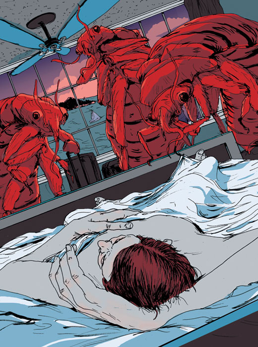
Find an editorial Illustration you admire. Such as this amazing illustration by Mike Byers on the topic of Bed Bugs.  🙂   Read the subtext about the illustrations and where / how they were used.  Analyse what metaphors they chose to illustrate the subject matter. Observe the way the artist has conceptualized their subject.

Pay attention to what methods they have used:


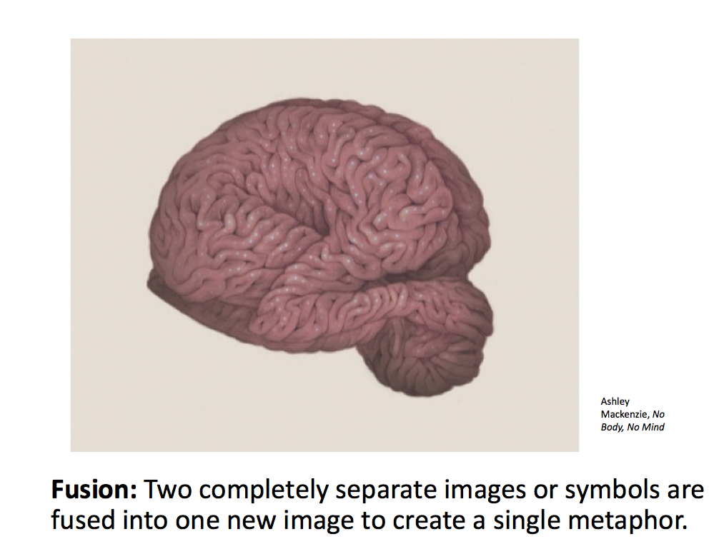
Fusion

Juxtaposition

Replacement

Exaggeration

Symbolism

Displacement

Period Imagery

Style


Here’s a few places to start looking:

https://society+of+illustrators+competition+editorials

http://theinspirationgrid.com

https://www.creativebloq.com


But most of all, just look.


SARA

Project 3 – Editorial Illustration

Featured

EDITORIAL ILLUSTRATION

Hello Class!  Here is the Lecture on Editorial Illustration and Visual Metaphors.


Project 3: Editorial Illustration Overview:

For the next project you will be creating an editorial illustration for use to accompany an article in a magazine, printed or online.

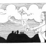
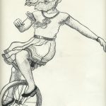
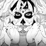
The illustration must be created using a limited palate of black, white, and 1 other color and should be made using a combination of traditional drawing / inking skills and digital coloring.  Final art should be made to fit the real magazine’s specs. (Approx 9” x12”)

Final work will be judged on the uniqueness, clarity and cleverness of overall the concept, utilization of composition, skillful use of media, use of a full range of value, and of course overall technique.


IMPORTANT You MUST post your article and response in OPENLAB in order to meet project deadlines. 

DUE next week: PROJECT RESEARCH including your Article, your written response, facts and visual research, Brainstorm, and Thumbnails.

Editorial Assigment PART 1


Master Study : The Art of Albrecht Dürer

As the only way to represent value in printed books was through the use of line, we can easily see how the art of printmaking and that of pen and ink illustration are deeply linked.

To see an amazing example of this idea in action, let’s look at the German Renaissance printmaker Albrecht Durer (1471–1528). Durer demonstrated the true mastery that could be achieved in inked and printed line art. Through expert understanding of line and value, he created depth, volume, and mood.

As you examine the following images, take careful note of Dürer’s use of hatching, crosshatching, and stippling in these images. Consider the incredible sense of volume achieved, and the quality of light, created through masterful use of line.

Pen and Ink Illustration: an Introduction

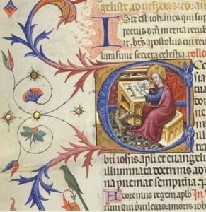
We can trace pen-and-ink illustration’s roots back to the very earliest illuminated manuscripts.

An illuminated manuscript is a manuscript in which text is supplemented by additional decoration. The earliest known examples come from the Byzantine Empire, from 400 to 600 CE.

1472596584762

Illuminated manuscript

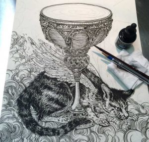
But regardless of the antiquity of the medium, pen and ink are used all the time by contemporary illustrators, with a spectrum of different results.

1472596592999

Yuko Shimizu Work Process Shot

Illustration and the Art of Printing

Illustration’s development has paralleled the art of printing and reproduction, with very specific moments in history periodically reinventing our medium. We can boil these moments down to a few landmark inventions:

  • the printing press
  • color lithography
  • photography
  • digital printing
  • digital media

Arguably, the invention of the printing press is still the most important thing that has occurred in the history of our art form.

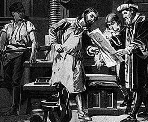
press

When Johannes Gutenberg invented the printing press, developing a movable type system in Europe between the years of 1440 and 1450, he completely revolutionized the world of human communication. He also initiated the marriage between illustration and publishing that still exists today.

1468354318083-1

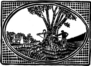
Just as type could be reproduced for print, so could images. The invention of illustrating by means of cut woodblock followed closely the invention of moveable types for printing.

1468354339982

Early Chinese woodblock print

It’s important to note that Chinese were the first by far to use woodblock printing, with the earliest known work dating back to before 220 CE. However, in Western illustration the first woodblocks date from the beginning of the 15th century and the invention of Gutenberg’s press.

Gutenberg added illustrations—usually woodcuts—to his printed books. Very soon after that, books with woodcut illustrations became commonly available.

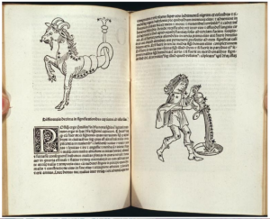
These illustrations were limited to black ink on white paper, forcing illustrators to render subject matter and to represent dimensionality using only lines, leading to the development of hatching in the pages shown here.

1468354365186

Illustrations by Erhard Ratdolt, 1488, in a book written by Persian astrologer Albumasar

MoCCA Festival of the Arts – EXTRA CREDIT ASSIGNMENT


The MoCCA Arts Festival is a 2-day multimedia event, Manhattan’s largest independent comics, cartoon and animation festival, drawing over 7,000 attendees each year. With 400 exhibiting artists displaying their work, award-winning honorees speaking about their careers and artistic processes and other featured artists conducting workshops, lectures and film screenings, our Festival mission accelerates the advancement of the Society’s broader mission to serve as Manhattan’s singular cultural institution promoting all genres of illustration through exhibitions, programs and art education.


EXTRA CREDIT TRIP ASSIGNMENT :

Go to the show and look at as many different kinds of work as you can.  

Choose one creator whose work you admire.  Interview them about their work, inspiration and career. Find out how they approach their work, their process, and how they got started in the industry.  Take a picture with that creator and their work.  Write a blog post and share it on open lab.  Be sure to credit them and share their social media info with the class.

Tag your post as Discussion, Title: MoCCAfest interview: ____creator’s name____ 

DUE: Tuesday April 10th


Student Examples MIDTERM

MIDTERM

MIDTERM PROCESS BOOKS

brandy ortiz – Brandy’s process book

amir tamang – atamang_processbook

Dana Moreno – DanaMoreno_Midterm_Processbook

Jessica Hernandez – Jessica Hernandez_Process Book

Heather Parton – illustrationmidterm

FINAL SUBMISSIONS FOR PROJECT 2

Hello Class!

Please submit your Project 2 Final Submissions for grading and print.

If you ALREADY submitted part of your work last week, YOU MUST STILL UPLOAD IT HERE TO BE GRADED!

Please keep in mind that the DROPBOX LOCKS Tuesday March 27th at 11am!


You are required to submit:

  • 11 x 17 Black and White Poster Design, pencil sketch, Ready to Print.
  • at least 3 Value Studies (Can be traditionally shaded pencil sketch or a digitally shaded sketch.)


SUBMIT YOUR WORK HERE