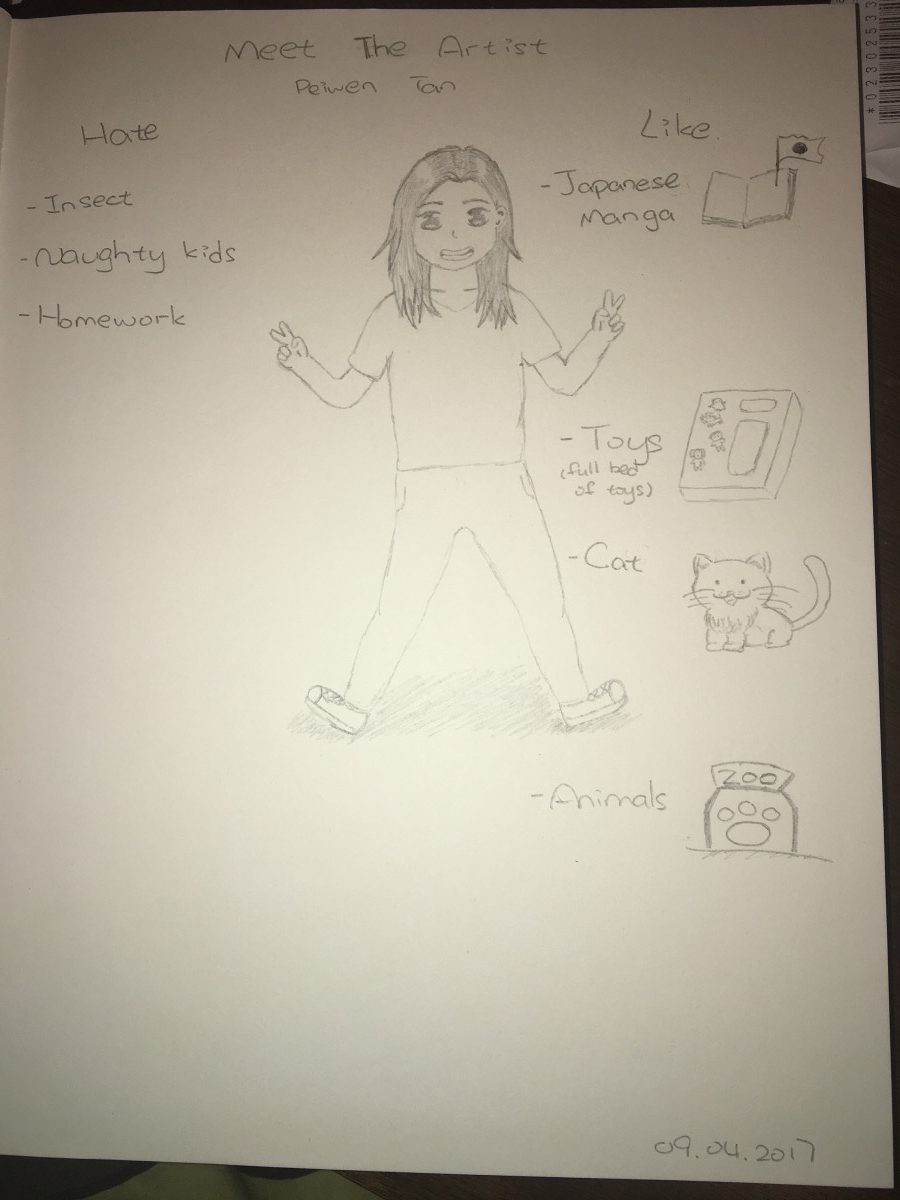
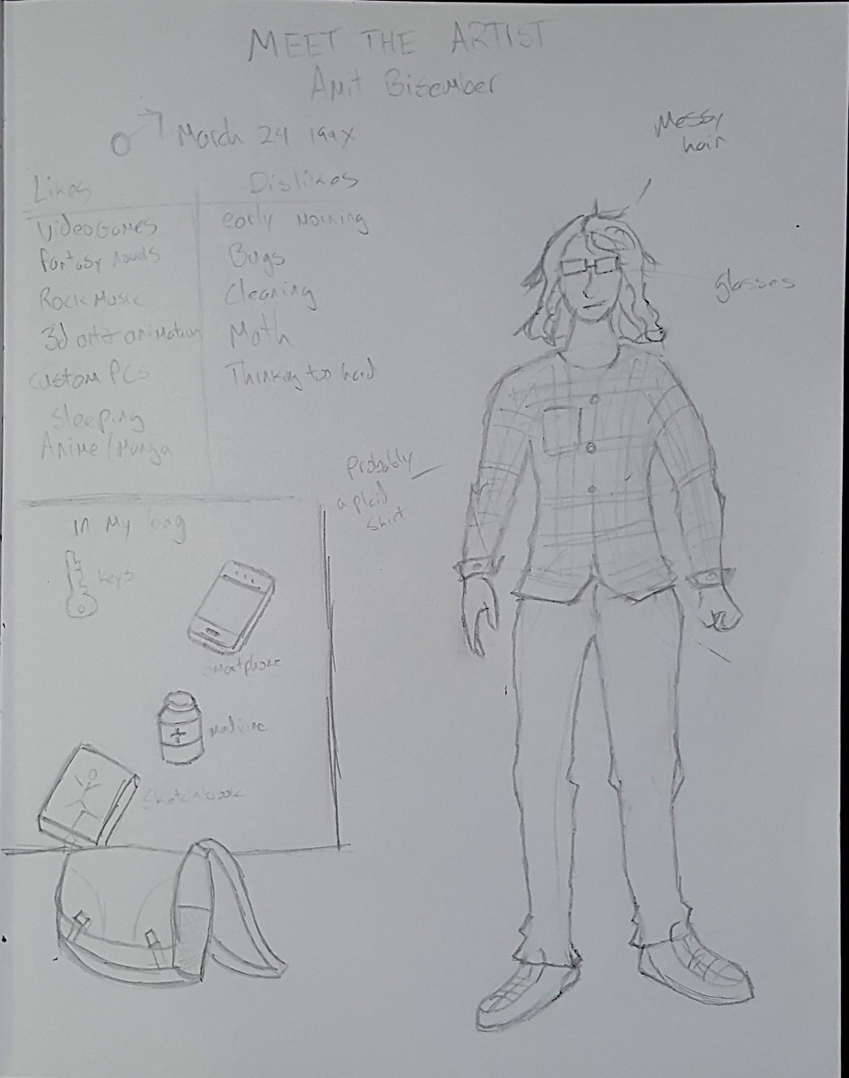
Week one-Meet the artist
Week one-Meet the artist
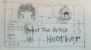
Week 1 sketchbook Meet the artist drawing
Last week you sketched things that might be in your final art… Now go deeper! This time fill your 4 pages by drawing careful studies design elements that may be in your final.
This could be a wave pattern or a skull from several different views, a crowd scene or a few studies of monsters – for each of you it will be different. The important part here is that you SKETCH FROM REFERENCE. For each design element try several sketches and points of view. Consider these studies towards the final art piece.
Just a reminder, here are your Sketchbook Requirements :
For this course students are required to keep an ongoing sketchbook which will be utilized a minimum of 1 hour, 30 min per page, for a total of 4 timed sketchbook pages per week.
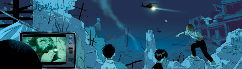
I love swords and sorcery fantasy, so my sketchbook and maybe even assignments will be related.
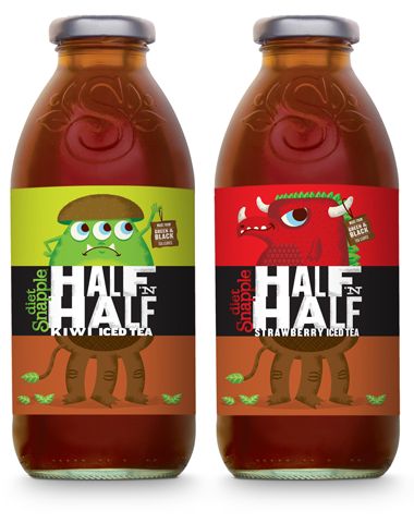
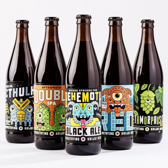
These are two beverage labels that really caught my interest when I first looked at them. The first set of labels I think are unique because of how they take the term ‘half and half’ and integrate it into the label literally. The two colorful and vibrant monster like creatures are already appealing enough.Then the addition of the text and the box that splits the monsters in half revealing the lower half of the monsters which look completely different from the top half I just think really completes everything and matches up with what the drink is literally. The second set of beverage labels also caught my attention with the colorful monster illustrations. I would never think of monsters when I think of beer or alcohol let alone colorful ones. So I think that just adding some colorful designs that even kids could be attracted to is very interesting.
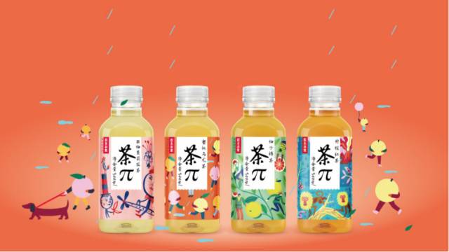
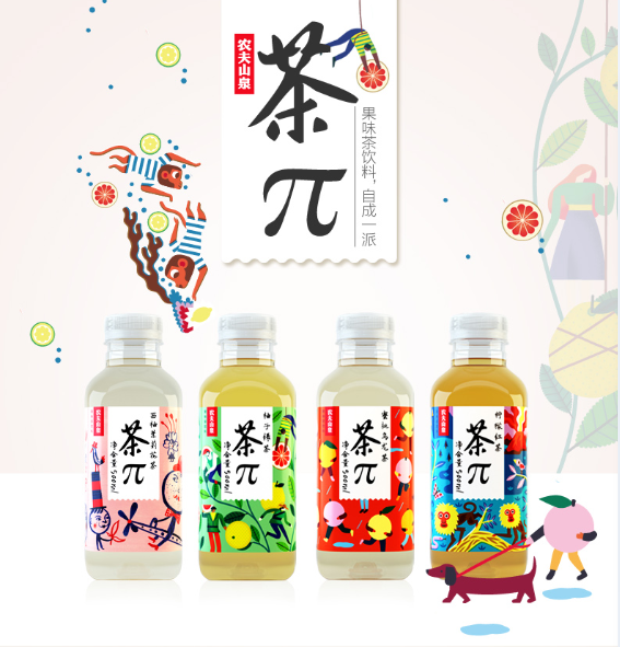
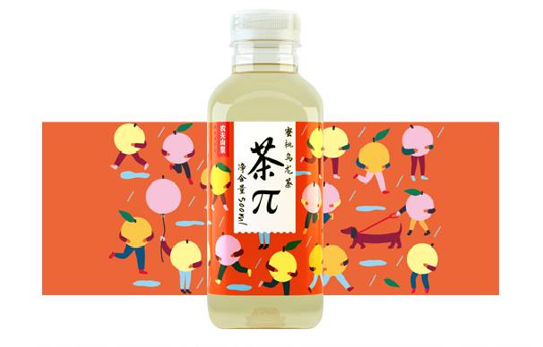
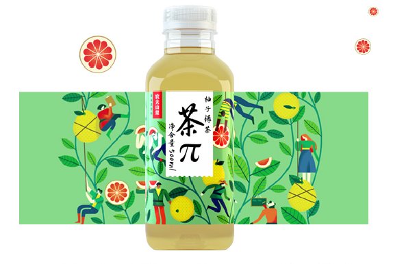
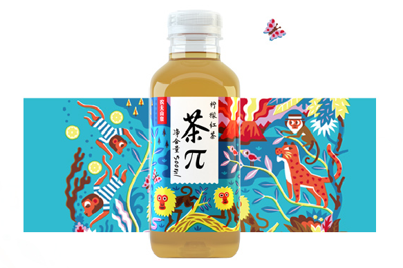
This is a new series of product names Tea ∏ from Nongfu Spring Co., Ltd. The design represents the looping energy of fresh.

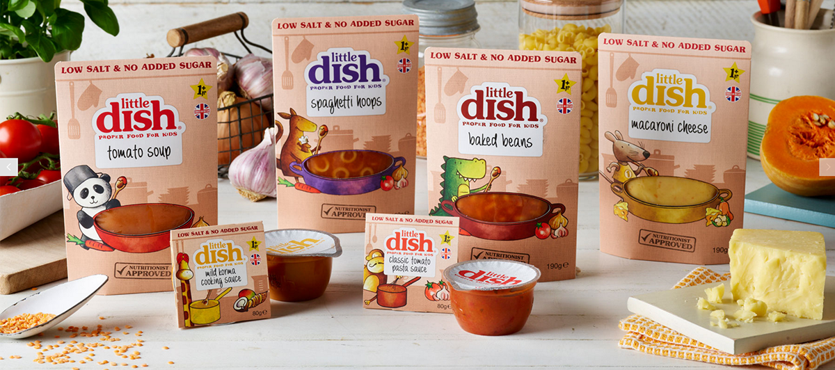
This is Little Dish design for children food. The first thing that really catch my eyes are those colors and animals. They’re cute and charming, absolutely match the target audiences “Children”. The way that present the animals are very cartoonish, that’s why I think this fits to kids.
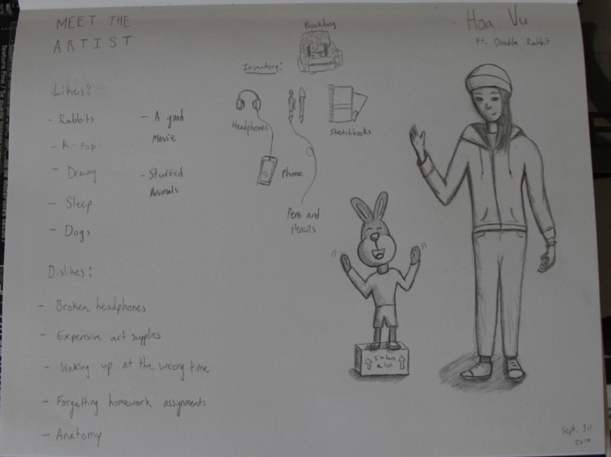
I listen to K-pop and I like rabbits. Nothing else to add really. I doodle rabbits so don’t be suprised if my sketchbook is filled with them.
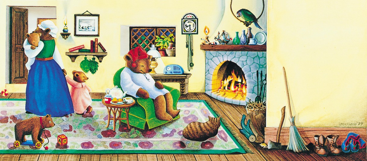
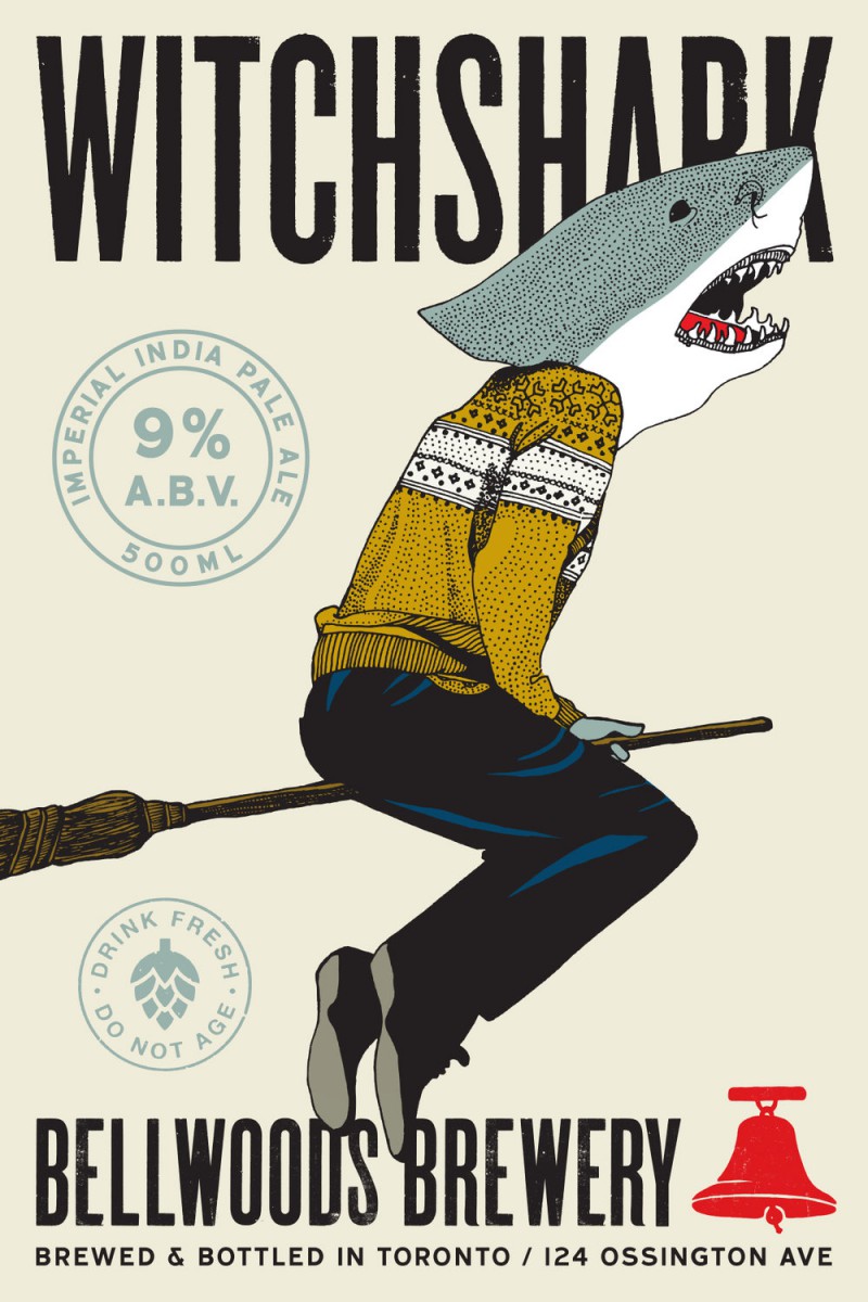
Two illustrations I admire are the Celestial Seasonings Sleepytime tea and the Witch shark beverage from Bellwoods Brewery. The color in the Celestial Seasonings picture catches my eye, I also enjoy the Idea of using a bear to represent a tea that helps you sleep since bears are known to hibernate. The artist is Beth Underwood. I also enjoy that the picture looks hand drawn rather than digital. The Witchshark beer’s illustration drew me in with its style. This style looks like older illustrations from maybe the 50s. I like the idea of using the literal name of the drink in the picture for it.
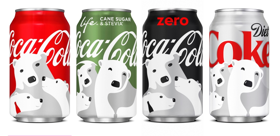
I like the Coca Cola illustration because of its lack of detail. The illustrator used lighting really well. So details like texture isn’t necessary here because we can see that they are polar bears.
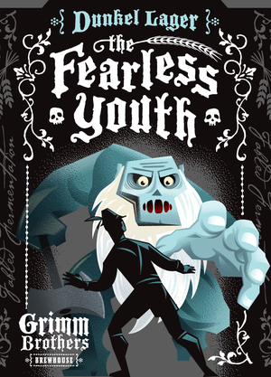
As for the Fearless Youth illustration I really liked the use of forshadow. It feels like the monsters hand is popping out and the illustration overall really reflects the title of the drink.
… that stood out for me: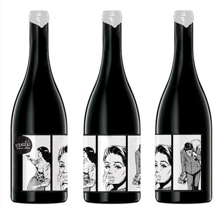
Wine label illustrated by Mash Design for Redhead Studio “Esule.”
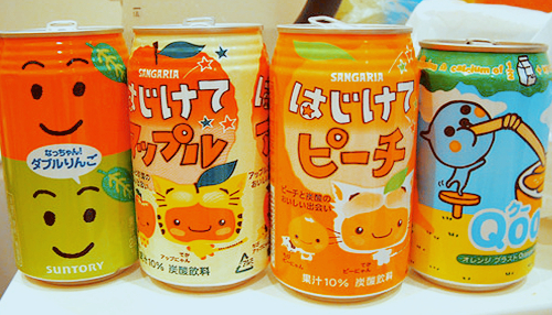
Super cutely illustrated Japanese soft drink: “Sanagria.”
The OpenLab is an open-source, digital platform designed to support teaching and learning at City Tech (New York City College of Technology), and to promote student and faculty engagement in the intellectual and social life of the college community.


