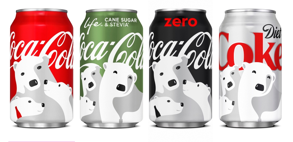
I like the Coca Cola illustration because of its lack of detail. The illustrator used lighting really well. So details like texture isn’t necessary here because we can see that they are polar bears.
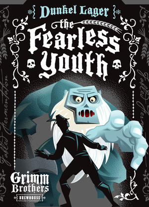
As for the Fearless Youth illustration I really liked the use of forshadow. It feels like the monsters hand is popping out and the illustration overall really reflects the title of the drink.

