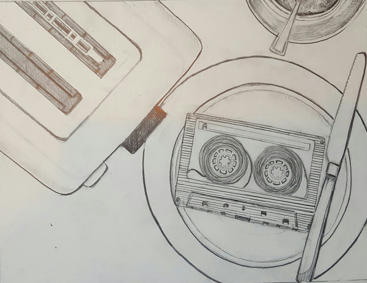
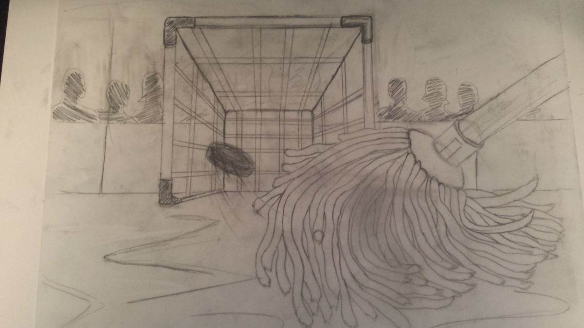
Final Pencil
Reply


Hello Class-
Here are some successful examples of Final Inked Illustrations and their Accompanying Process Books.

Dana Moreno – DanaMoreno_Midterm_Processbook
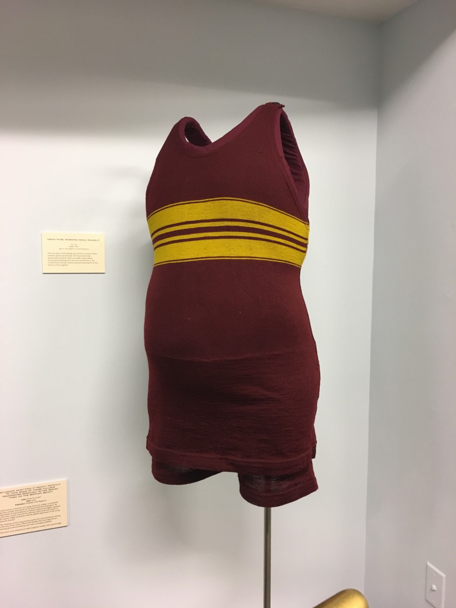
The field trip to the society of illustrators was fun and inspiring. When I first walked in to the exhibition, what catch my eyes first were the retro dresses in the middle of the room. So I took a close look to the dresses at first. I could see that they are all for rich people or “high society” people. By seeing the patterns and the crafts of those dresses, I could see people’s strong pursuing of fashion at that time. Then I started looking at the paintings on the wall. The first thing I noticed was how the artist inspired by those dresses. The dresses helped bring the illustrations to life.
Then I started to take a close look at the painting. The one inspired me the most is the “STUDENTS MUST FIND IT MIGHTY DIFFICULT TO TAKE SOME OF THESE COLLEGE PROFESSORS SERIOUSLY AFTER SEEING THEM ON THE BATHING BEACH” by Orson B. Lowell. The painting has young college women fraternized on the beach with their professors. The expression of the professors are fun and vibrant. It also makes the painting full of irony. I love how he shaded the painting with just cross hatching lines. The skill is just awesome. And the way he drew the water inspired me a lot. Because I really want to learn how to draw water. From the painting I also saw how he was inspired by the swimsuit at that time.

The trip to the Society of Illustrators was exciting to me, I got to see what illustrations from professionals looked like in person rather than on the internet. I learned a lot more by looking at the work in person, like how if someone wanted to fix a portion of their illustration they had to cut out pieces of the paper it was drawn upon. This makes sense as they would not want to redraw the entire illustration. Nowadays we might use computers for some or all of the work so correcting parts is taken for granted. I also noticed that they used pretty large pieces of paper to draw, another thing people don’t think about today since we can blow an image up digitally; this means they had to draw a lot more and in some ways this is harder.
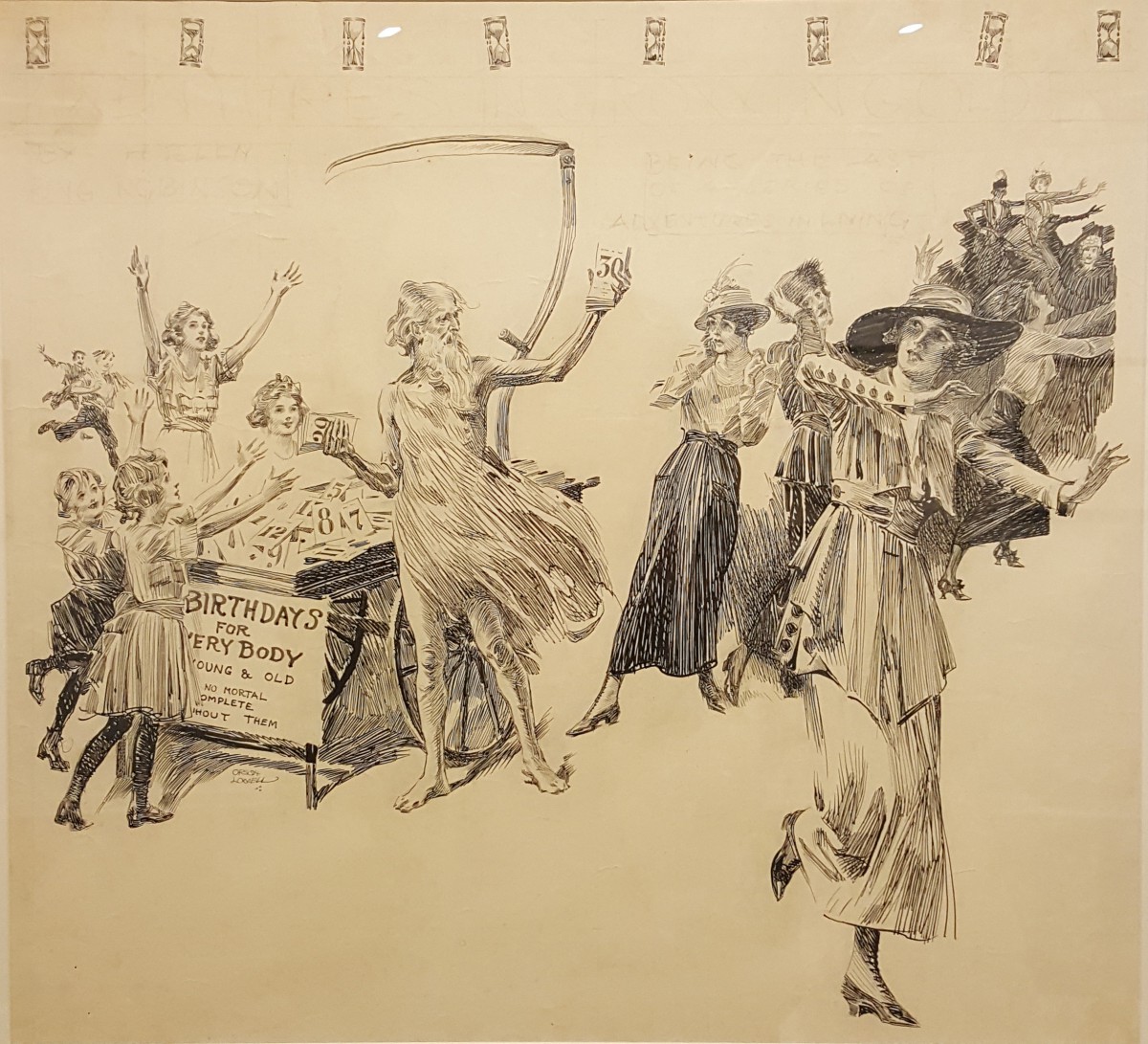
The illustration that instantly caught my attention was by Orson B. Lowell. It is titled “Birthdays For Everybody, Young And Old. No Mortal Complete WIthout Them.” Orson was a social critic with his illustrations. He liked showing people in awkward situations not in a mean way. In the image we see a man handing out paper with numbers on them which are ages. The young girls are happily taking them while the adult women are running away. This is Orson’s style where he makes commentary on what he sees around him through his illustration. I like the lighthearted message that younger people look forward to birthdays while older people try and fight ageing. I also like how he uses many simple lines to convey shading. The lines on the old man look simple enough yet they give the impression of him wearing some kind of rag like shirt. The use of different lines on the women make it seem like there is a lot of variation in their types of dress. I personally have a hard time inking in such a way but now I want to learn to do it better.
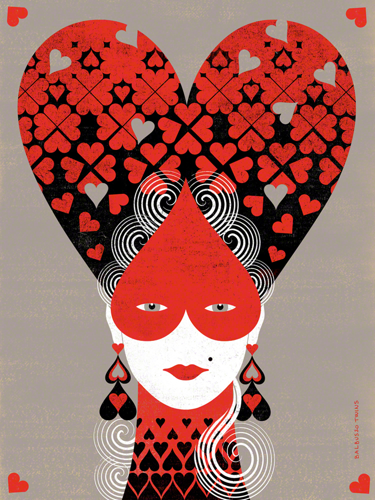
This piece interested me cause it reminded me of Alice in Wonderland, but with less wonder and more elegance. I think that the use of black, red, white and the shade of grey brings out the silhouette of the woman. The illustrators used Gouache, and some digital media. This is one installment in a four part series in which the illustrators created four high hairstyles with Queen cards symbols: hearts, diamonds, clubs, spades. The illustrators were inspired by Women’s Hairstyles of the 18th Century. This was considered as a Personal project for them.
I’ve learned that the illustrators are known as Balbusso Twins are internationally recognized award winning italian illustrators team. They have a unique signature ANNA+ELENA=BALBUSSO TWINS. Their work has been published by major international publishers and companies through out the world on various media types such as book jackets, magazines, newspapers. They have illustrated over 40 books and have received more than 60 international Awards. I saw this piece at the Society of Illustrators in New York where they have been members since 2009. they have also been recognized by Society of Illustrators of Los Angeles and have been members since 2015.
I have also learned they have a three step process when making illustrations after they gather information. theses steps differ on what medium they are doing the art for conceptual illustration or book projects. My opinion on this piece is that when I looked at it my eye wasn’t captivated in one spot but it was a whole piece. I thought the art flowed instead of having one singular object stand out.
The OpenLab is an open-source, digital platform designed to support teaching and learning at City Tech (New York City College of Technology), and to promote student and faculty engagement in the intellectual and social life of the college community.

