Product Illustrations

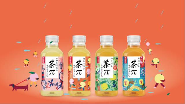
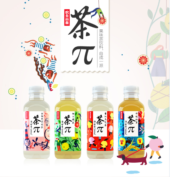
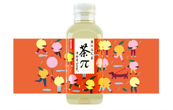
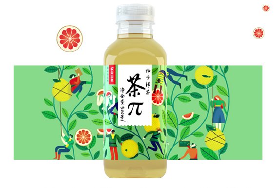
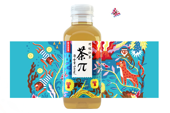
This is a new series of product names Tea ∏ from  Nongfu Spring Co., Ltd. The design represents the looping energy of fresh.


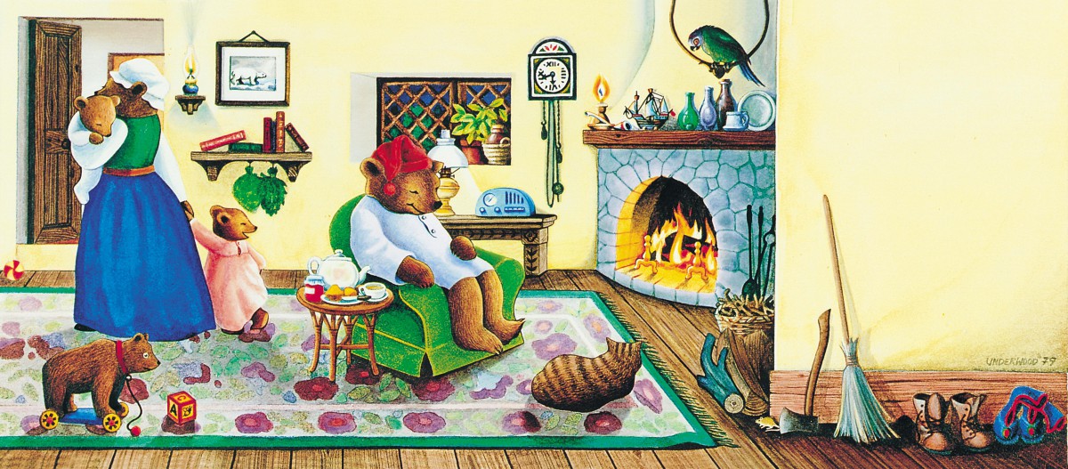
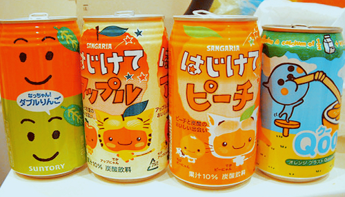
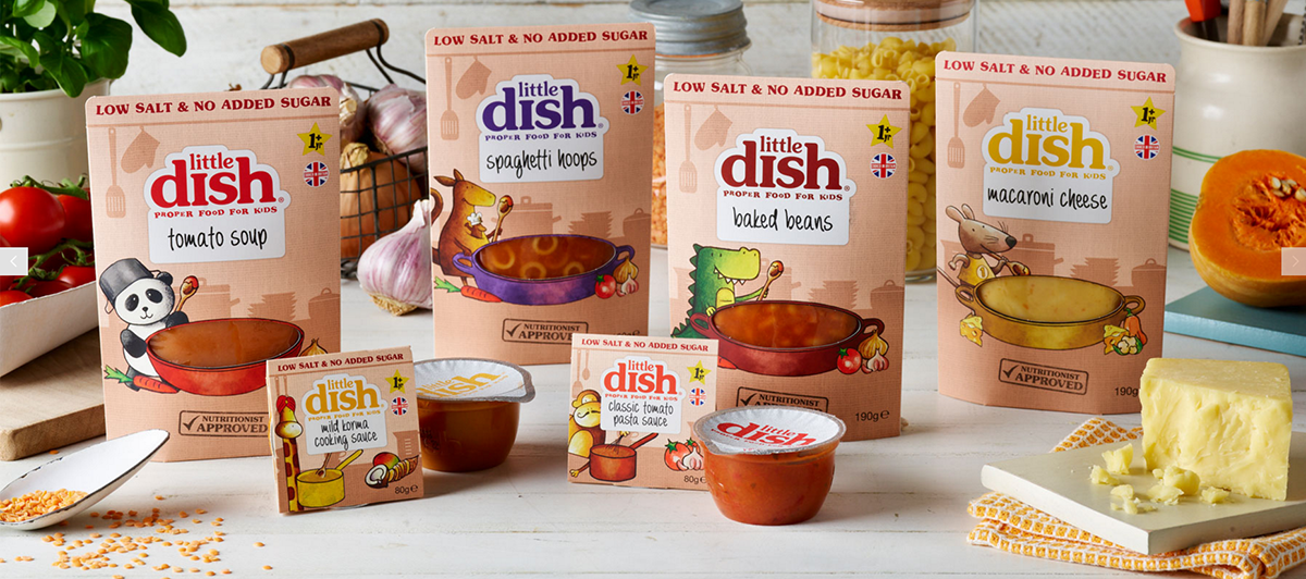
This is Little Dish design for children food. The first thing that really catch my eyes are those colors and animals. They’re cute and charming, absolutely match the target audiences “Children”. The way that present the animals are very cartoonish, that’s why I think this fits to kids.


Product Illustrations

Two illustrations I admire are the Celestial Seasonings Sleepytime tea and the Witch shark beverage from Bellwoods Brewery. The color in the Celestial Seasonings picture catches my eye, I also enjoy the Idea of using a bear to represent a tea that helps you sleep since bears are known to hibernate. The artist is Beth Underwood. I also enjoy that the picture looks hand drawn rather than digital. The Witchshark beer’s illustration drew me in with its style. This style looks like older illustrations from maybe the 50s. I like the idea of using the literal name of the drink in the picture for it.

Product Illustrations

I like the Coca Cola illustration because of its lack of detail. The illustrator used lighting really well. So details like texture isn’t necessary here because we can see that they are polar bears.

As for the Fearless Youth illustration I really liked the use of forshadow. It feels like the monsters hand is popping out and the illustration overall really reflects the title of the drink.


Illustration Labels on Alcohol Bottles

Two illustrations that I am very fond of are from these wine bottles. One is from Backyard Vineyards Wine, and the other is from Hither and Yon wine. The first wine bottle from Backyard Vineyard was Illustrated by Fabien Barral. What I like about the design was that The words looked like a garden, and was wrapped in vines, making the artwork so live like. For Hither and Yon Wine, the illustration was done by Chris Edser. I really loved the artwork there because the Ampersand or the & symbol was designed like a tattoo in my Point of View and the detail caught my attention. The Colors from this bottle label goes from Light to Dark which I really love the most

Production Illustrations I admire

Two product illustrations I admire are Molly Dookers Carnival of Love wine label and Jaqk Her Majesty product illustration. The Carnival of Love label was designed by Roberts and Mash and has a lot interesting eye-catching details. The hand drawn lettering in the label adds to the whole vintage carnival feel. The Jaqk wine label caught my eye with its seamless borders and use of light and space to really make the illustration pop.