Daisy Xia: Reading Responses Week Two

Reading 1:

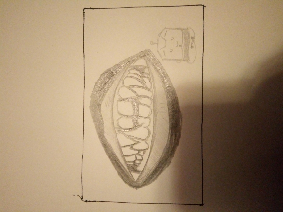
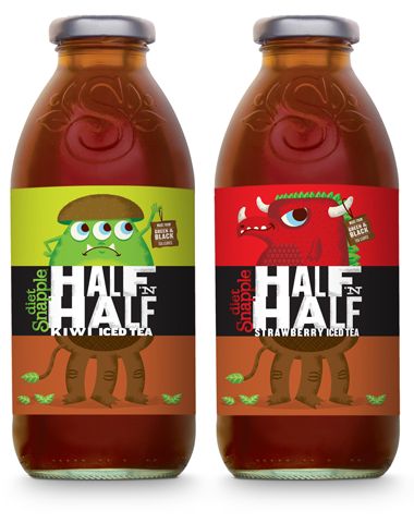
“Tired” now that is something I know a lot about. The intention I had with my Tea label is to show sleepy and tired. I wanted to give everyone the idea “Ah, I’ve felt that before” when they see my tea label. The tiredness you feel after a long day of work or pulling a all nigher to finish your homework

Reading 2:

The strategy I chose is “Be Interested” I chose this because if you are not interested in what you are designing then how do you plan on coming up with the best possible design you can think of. If your not interested then you would not put forth as much effort resulting in a design that is not as good as one you could have created if you were interested.

Reading Responses Week Two

Reading 1:
I admired the originality of these concepts. I can also relate when the author mentioned that craft beer labels are trying to reach out to you. I don’t know about you but I imagined 4,000 beer cans with hands reaching out and saying, “BUY ME!” Realizing this I figured out that to be noticed we need to do something unique. And with my label I hope that I will create something unique that out of the 4,000 or so labels that exist, mines would be noticed. I also intend to make it really witty like the 21st Amendment Brewery label or as interesting as the Off Color’s black and white label.

Reading 2:
What I liked about Jillian’s blog was how it really talked about the importance of your surroundings and how it influences your work. Jillian mentioned that she has a reference folder on her desktop just filled with inspiration and it really inspired me to steal a bunch of Google images and keep it on my desktop for all of eternity. Lastly, I liked her writing style. It wasn’t “do this and do that” authoritative writing style. It was just HER way of doing things. She even admits that in the beginning of the blog. We have our methods and I really liked how she humbly shows us her method.

Product Illustrations

The first illustration is from Gatsby Vineyards by Rhonda Boisseau. What draws me to this image is how sophisticated that illustration is. Boisseau shows how elegant you would look drinking that kind of wine with that illustration.

The second illustration draws my attention because the first bottle shows a forrest and the other bottle the beach meaning that you can be anywhere and still enyoy a glass of wine.

Product Illustrations that I admire

These are two beverage labels that really caught my interest when I first looked at them. The first set of labels I think are unique because of how they take the term ‘half and half’ and integrate it into the label literally. The two colorful and vibrant monster like creatures are already appealing enough.Then the addition of the text and the box that splits the monsters in half revealing the lower half of the monsters which look completely different from the top half I just think really completes everything and matches up with what the drink is literally. The second set of beverage labels also caught my attention with the colorful monster illustrations. I would never think of monsters when I think of beer or alcohol let alone colorful ones. So I think that just adding some colorful designs that even kids could be attracted to is very interesting.