Week 3 Reference Sketches – Hoa Vu
Reply
In Yuko Shimizu’s piece for Mother Jone’s magazine she used Google Maps as her reference. She mentions that with Google Maps she was able to digitally walk around and get reference of the buildings. This made it easier for her because she said that she wouldn’t have to sit somewhere for hours at a time and let other people see her rough sketches. With Google Maps Yuko was also able to get references of buildings that photographs or other images couldn’t get. This allowed her more freedom to move around and work on her project. Yuko used Google Maps to guide her during her drawing phase. She says that she was literately drawing while walking around in Google Maps. Lastly, she also used characters in her illustrations. Yuko mentioned one for her students and was inspired to draw a character like her. I don’t know if this would count as reference or inspiration but either way the illustration came out really well.

Reading 1:
I admired the originality of these concepts. I can also relate when the author mentioned that craft beer labels are trying to reach out to you. I don’t know about you but I imagined 4,000 beer cans with hands reaching out and saying, “BUY ME!” Realizing this I figured out that to be noticed we need to do something unique. And with my label I hope that I will create something unique that out of the 4,000 or so labels that exist, mines would be noticed. I also intend to make it really witty like the 21st Amendment Brewery label or as interesting as the Off Color’s black and white label.
Reading 2:
What I liked about Jillian’s blog was how it really talked about the importance of your surroundings and how it influences your work. Jillian mentioned that she has a reference folder on her desktop just filled with inspiration and it really inspired me to steal a bunch of Google images and keep it on my desktop for all of eternity. Lastly, I liked her writing style. It wasn’t “do this and do that” authoritative writing style. It was just HER way of doing things. She even admits that in the beginning of the blog. We have our methods and I really liked how she humbly shows us her method.
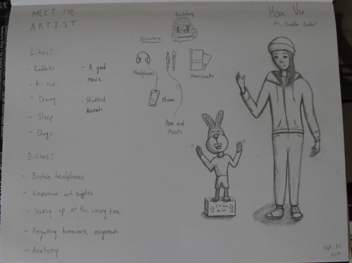
I listen to K-pop and I like rabbits. Nothing else to add really. I doodle rabbits so don’t be suprised if my sketchbook is filled with them.
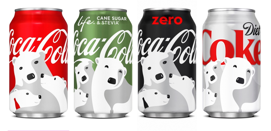
I like the Coca Cola illustration because of its lack of detail. The illustrator used lighting really well. So details like texture isn’t necessary here because we can see that they are polar bears.
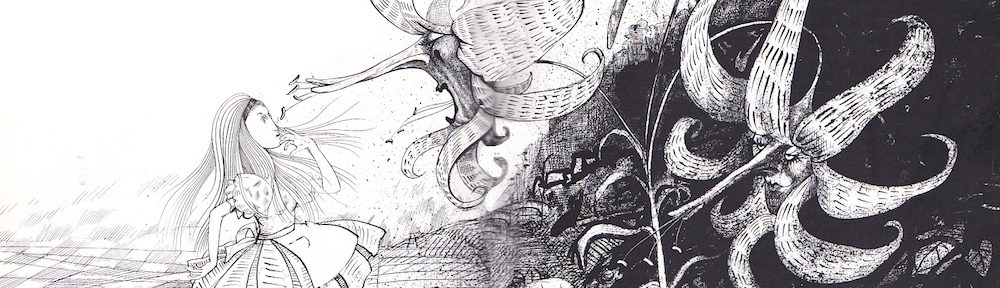
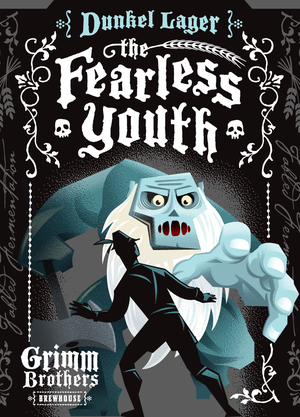
As for the Fearless Youth illustration I really liked the use of forshadow. It feels like the monsters hand is popping out and the illustration overall really reflects the title of the drink.
The OpenLab is an open-source, digital platform designed to support teaching and learning at City Tech (New York City College of Technology), and to promote student and faculty engagement in the intellectual and social life of the college community.

