Hi Professor,
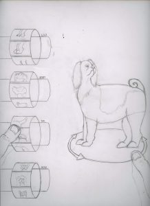
I wasn’t happy with my final pencil so I redrew it. I adjusted the entire “game” layout and I included my thumbs. The thumbs are “swiping” and “turning” the dog. And, since it’s going to be a print I thought about how people hold a magazine (at least how I hold a magazine to look at the cover) and if you can get your hands on the magazine you can place your thumbs where my drawn thumbs are and it will feel like you are holding the controls on customizing this dog.
Considering that I had to explain it that probably means it has some flaws. Can you please tell me any revisions or tweaks I should make?
Thanks!
Hoa


Hoa I LOVE the idea that you considered how a person would HOLD the magazine… it WORKS SO WELL!!!!! It really conveys your concept. Would the thumbs be a little larger in proportion? double check. Also whatever you can do to keep the background and details game like. FIX those ellipses! They look like footballs.
Be sure your dog reference for the doggy being created is REALLY good. So that you ca tell they are parts from different breeds Frankenstiened together.
NICE WORK