Class Info
- Date: Tuesday, September 26, 2023.
- Meeting Info: In person, Pearl 116, 8:30 to 11:00am, followed by Professor’s office hours from 11 to 12 in Pearl 116.
Topics
- Warm Up: TYPE TALK.
- Type Scavenger Hunt Review
- Type on a path used with a black & white photo (page 13 of book)
- PLAYFUL TYPOGRAPHY (page 14 of book)
Project 1: Pre-Reminder (Pre-minder!): Complete Book with Revisions is due on Class 11 (October 3).
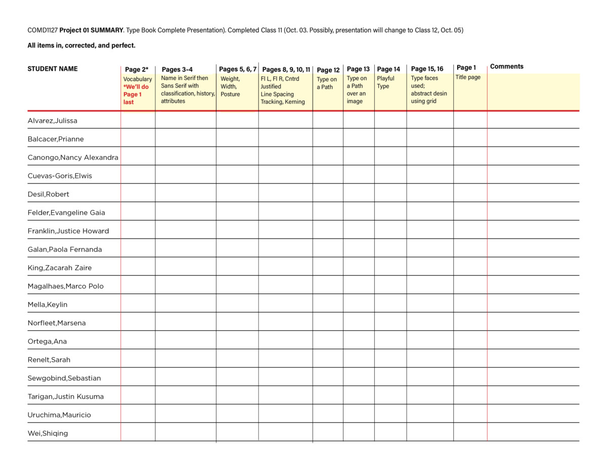
Here’s a sample of a Type Book.
The top of the chart below shows what’s on each book page/what’s due.
Objectives
- Review classification and hone skills of identification (and appropriate use)
- Continue working with Type on a Path.
- Learn about strategies and skills that will help make typography a bit more playful, eye-catching.
- Apply unique characteristics to type as it relates to a brand or logotype
- Possibly have a preliminary look at working with type in Adobe Illustrator.
Activities (3 Activities . . . 4 if you count the Warmup below)
Activity A. Warmup. TYPE TALK.
Take the “Life is a Creative Act” newsprint brochures/toolkit and look through it. The typeface is Windsor. Describe the type. How would you classify it? Read this article about the history of the face and write your thoughts about it. Post to Type Talk. Student Posts. lastname_TT_092623
• • •
Activity Number 1
Make sure the photo of your inspiration is in black and white.
(Photoshop grayscale).
Pull it into page 13. Draw a picture Box, which is a rectangle with the “X” filling it. Use Command D to enable you to navigate and pull your image into the picture box.
Insert type on a path somewhere on the photo. (Note: I’ve included research, text and photo credits, and a url. You DO NOT need to use as much text as this sample!).
Export a PDF of your page 13. lastname_path_photo_092623
Crit the Professor: Is the text readable? Note the use of bold; note sizes. What would make this page more successful or appealing?

• • •
Activity Number 2
During Class.
- We’ll examine the typography of the name brand of some food products.
- Think about placement, case, style, others attributes.
- What is different from we’ve looked at and studied so far?
- Do some quick SKETCHES of how you envision a food your chosen person might like to enjoy (or promote). Admittedly, it’s a quirky assignment, especially as it pertains to, say, Mother Teresa.
In Illustrator: We will start to create a playful solution, still using a typeface, for a food for our chosen person or group. This solution will be Black and White.
Open Adobe Illustrator and create a NEW document.
- 3.6 inches x 3.6 inches (this will match our books in InDesign)
- CREATE 4 art boards/ bleeds “0”


Next, select a typeface that might work with the food you’ve chosen and establish upper or lower case, size, and alignment. Keep all text the same size for now.

Do four variations. Make your own. Sketch first. Refine your design. Black and White only.
The link yields a handout that show to move your type with the Touch Type Tool. Touch Type Tool.
For the Touch Type Tool, you can use the key command Shift + T
__________
To get more playful, here’s a handout about using the Warp Tool, called the Halloween Warp example.
___________
In progress:

Examples. Of course, do your own designs. My chosen person-of-inspiration, mathematician Katherine Johnson, liked strong coffee according to some shallow research.
We will continue this on Thursday, September 28th. HOWEVER . . .
Save your Illustrator files: lastname_4sketches_food_092623.ai
Take a screenshot of your work, name it
last name_4sketches_food_092623
and upload it to Dropbox.
• • •
Activity Number 3
If you’ve completed, checked, and perfected page 13 and started page 14, start Activity Number 3 during Class.
Type Challenge. Post in STUDENT POSTS > TYPE CHALLENGE.
Look at the images (you’ve seen two of them before BUT THIS IS A TYPE CHALLENGE) and answer the following questions about all four of them:
- What is the Classification? Serif? Sans Serif? Novelty? What is the sub-classification? Old Style, Transitional, Modern, Slab, Script Sans (and the subsets of Sans)
- Identify the typeface. You’ll need to do a little research in the fonts on your computer and online. Look at fonts.com and/or typography.com.
For B and D, identify the main type only.
Refer to / Review the PDF about Classification of Type (in HANDOUTS in Dropbox)
Answer with the letter of the challenge image followed by your numbered answer.
A. Larry’s
1.
2.
____________________
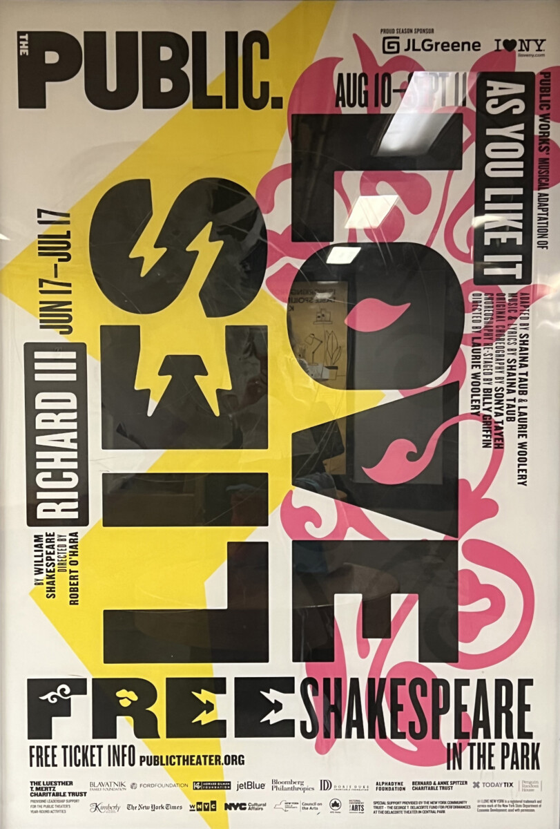
B. Public Theater
1.
2.
____________________
C. Edward Enninful. A Visible Man
1.
2.
____________________
D. Treasures of Ukraine
1.
2.


To do after class = Assignments (3 things to finish)
(1) Complete page 13 in your type book (Activity 1)
(2) Complete the steps for the food sketches in ai. (Activity 2)
Take a screen shot of your Illustrator file using the naming convention below and upload to Dropbox.
You do NOT need to export the Illustrator files and place in your InDesign document yet. Work on your designs.
lastname_4sketches_food_092623.png
AND
(3) Complete the Type Challenge (Activity 3)
See below for the bigger picture. If you’ve perfected everything and are working ahead, start to design pages 15 and 16. For 15, gather and list all the typefaces you’re using. You’ll have to add the text typefaces for page 1 later.
______________________________________________________________________________________
A Look Ahead; the bigger picture.
Project 01 Due Class 11 (October 3)
The complete content of your Type Book, page by page, will be as follows:
- COVER/Title Page (Page 1). Text will include the name of your chosen person and the subtitle “A book about principles of typography and an inspiration we love.” By Your Name. NO COLOR. NO ILLUSTRATIONS, NO PHOTOS. Graphics are OK
- Vocabulary (Page 2)
- Classifications (Pages 3, 4)
- Variation in Type: Width/Weight/Posture (Pages 5,6,7)
- Alignment (Pages 8,9)
- Leading (Interlinear Space/line height) (Page 10)
- Tracking & kerning (Letter Space; some Word Space) (Page 11)
- Type on a Path (Page 12)
- Type on a Path over a photo (Page 13)
- Playful Type (Page 14)
- “Designed by” your Name plus—extra—list the names of the typefaces and sizes you deployed in the book. (Page 15)
- Last Page will be blocks showing grid (Page 16)
CHECK YOUR SPELLING AND GRAMMAR.
- NOTE: Corrections and Typography concepts and InDesign:
- Go through your pages, make sure that they are corrected as per comments and class lectures. It is your responsibility to also have a typographically correct book, and that ALL topics explained in class are taken into consideration. For example in the Classification of Type assignment, should have correct tracking and kerning.
- Additionally we are following a grid (InDesign file). Items on your pages must follow it.
Thinking ahead: You will present your Type Book during Class 11 (October 3, 2023).
Graphic Assignments are always due the day before next class by 8pm, and must be uploaded to the Dropbox to which I invited you unless indicated otherwise. Assignments go into Dropbox. Participation Activities go into OpenLab.


Leave a Reply