Class Info
- Date: Tuesday, November 28, 2023
- Meeting Info: In person, Pearl 116, 8:30 to 11:00am, followed by Professor’s office hours from 11:00am to noon in Pearl 116.
Reminder about Refined Projects 1 and 2, if you’re refining work already submitted:
- Refined versions of Projects 1 and 2 are due by Class 28 (i.e. the night before class, which is Dec. 6) December 7, 2023.
- Project 3 is due Class 29 for final refinements. Everything must be completed by Class 29 (December 14)
- Presentation of Project 03 will occur in Class 30 (December 19)
Topic
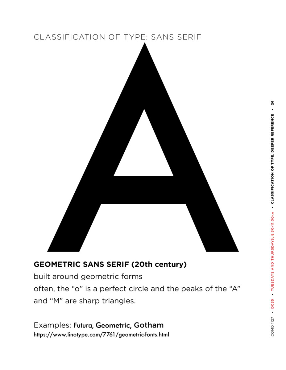
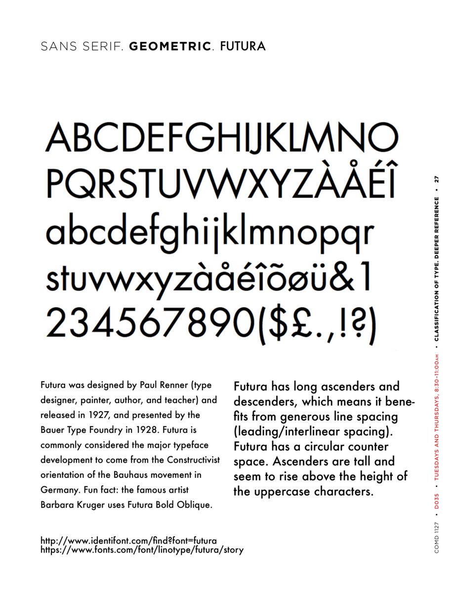
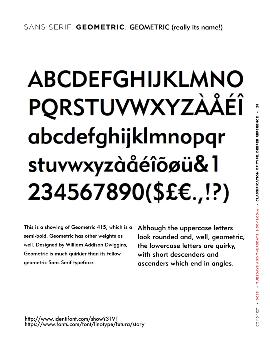
- Type Classification: Quick review on your own.Sans Serif. Sub-category: Geometric
- Project 3 : CONTINUE Posters; START Social Media Posts
Objectives
Explore contrast and legibility though use of actual color (other than black), imagery (photos), and type.
Review on your own: Geometric Sans


Activity 1
Posters
- Continue to work on your posters.
- Have a look through the website of Poster House.
- Does your poster grab attention??
- Keep in mind that SCALE is important.
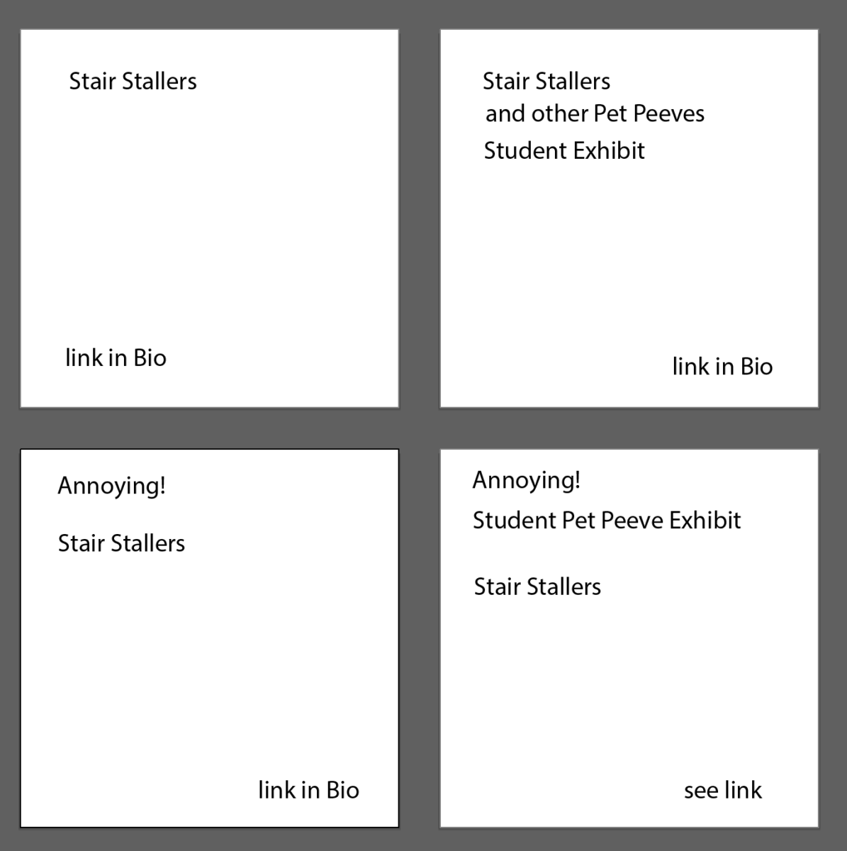
- Hierarchy is below. Note that “Annoying!” is like a flag; it declares the idea of the exhibit but it is not the main thing that annoys you. “Student Pet Peeve Exhibit” can be smaller.
- Title
- Your brief text
- Credit for any image you use, even if it’s your image
- Source of any text that you haven’t written yourself.
Activity 2
Social Media Posts: Design four posts.
Description: In addition to your posters (you’ll present the strongest 2 out of 3), Create a series of typographical posts that will be used to promote the theoretical Student Pet Peeve Exhibit (with its heading of “Annoying!”
Specs: Use common social media square format 1080 x 1080 pixels
- The margins are up to you.
- 1080 x 1080 pixels translates into an InDesign document of 3.5 x 3.5 inches (aka 3.5 inches square).
- Use RGB Colors
- Take an abstract photo (of your own) or create a texture.
- Use the imagery as a background only. Ideally no illustrations; a graphic is OK if we discuss.
- Use typefaces that relate to your Annoying! posters (i.e., your posters about what annoys you). These Social Media posts promote and partner with the posters.
- Take into consideration all concepts previously explained this semester: typeface selection, visual hierarchy, use of a grid, color and legibility, alignment, line space, word and letter spacing.
- Remember paths as well.
More Specs! Use this text on each of the four boards:
- Board 1: Your peeve | link in bio
- Board 2: [Your peeve] and other pet peeves | Student Exhibit | link in bio
- Board 3: Annoying! | [Your peeve] | link in bio
- Board 4: Annoying! | Student Pet Peeve Exhibit | [Your peeve] | see link
THE EXAMPLE BELOW OF TEXT CONTENT SHOWS THE SAME TEXT AS THE LIST ABOVE. IT’S FOR CONTENT ONLY AND IS NOT DESIGNED!!!
Still More Specs: What to do for each of the four boards:
- Square 1: Black Text on White Background
- Square 2: White Text on Black Background
- Square 3: Photographic or Textural Background Choose RGB color. For typography, remember our readability studies)
- Square 4: Use RGB color somewhere in the post.
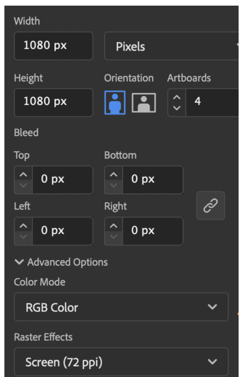
Step-by-Step (if you prefer to work in InDesign, we can talk):
- Open Illustrator
- Create new document 1080 x 1080 PIXELS / 4 artboards
- RGB color
- 300dpi for starters; 72 dpi for posting
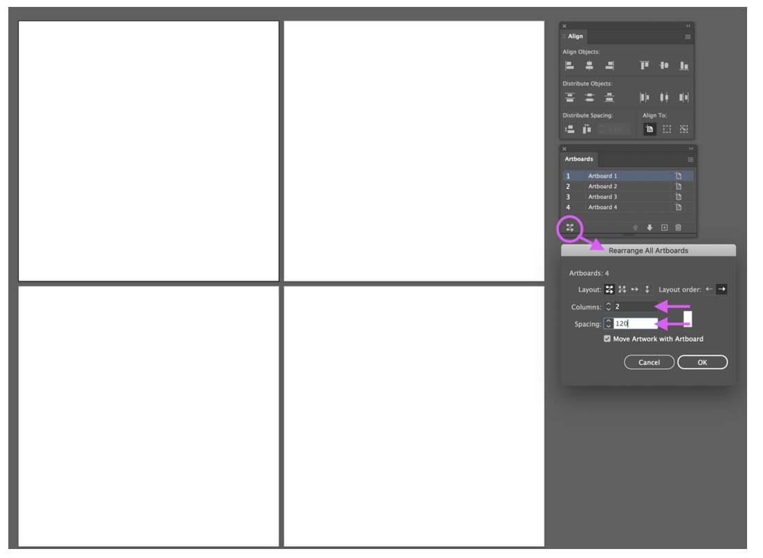
View ARTBOARDS, click bottom left of artboard window to get rearrange artboards:
Choose layout/ 2 columns / Spacing 120 pixels between
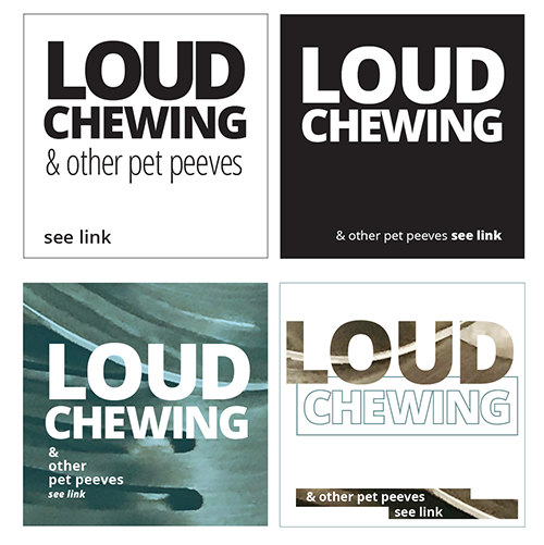
For your preliminary pass at Social Media Posts:
- Look at example below by Professor Maria Giuliani—YET DO YOUR OWN. PLAY WITH YOUR TYPE.
- (Note that your solutions must be different from these).
- When you work: is the hierarchy appropriate? Are the colors and images offering the viewer an easy to read experience? Are point size, line space and letter space working in a cohesive way?
__________
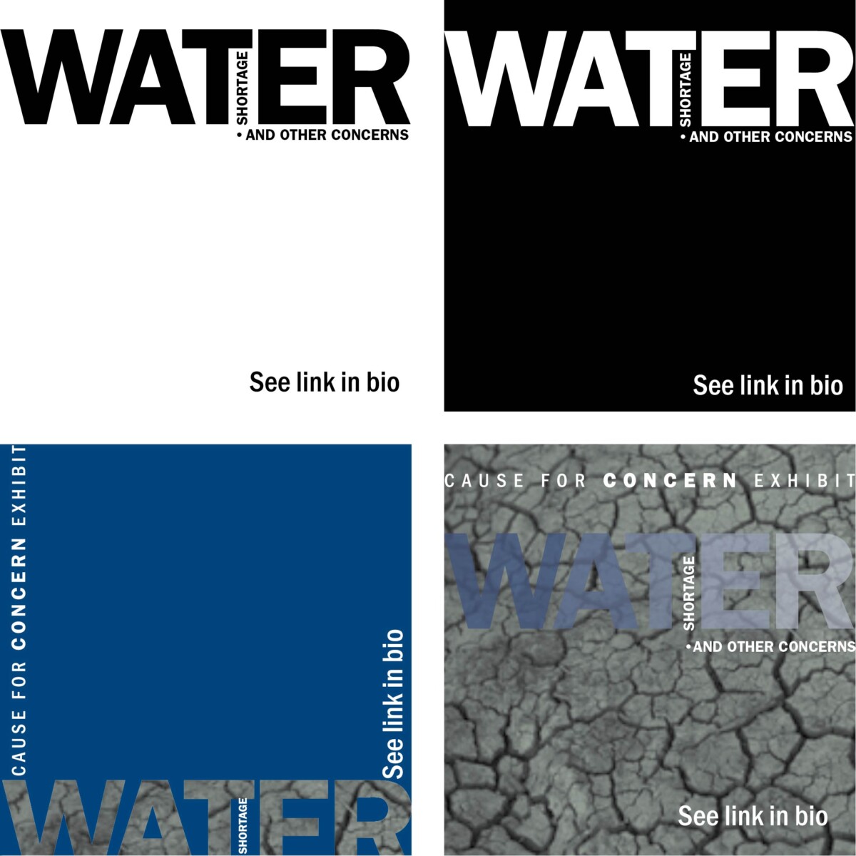
If you’ve done the basics as shown above, Experiment.
The examples below show 4 sketches for an exhibit about a different topic—just to show process.

BELOW: SKETCHING AROUND AFTER DOING INITIAL FOUR
- Keep going. The examples below are further studies for posts about a different topic—and the beginning of experimentation.
- Keep going some more! As shown, some of them are too flat and must be pushed farther or must be abstracted to become intriguing.
- NOTE: take your own images or use copy-right free images. Make sure to credit all images, even if you’ve done them yourself.
When you experiment, use the techniques we went over in earlier classes.
_____________
FOR YOUR POSTERS, referto InDesign handouts we’ve already used:
Assignment (To-Do After Class)
- Due next class: Refine Posters and Complete Social Media posts
- Save and package native InDesign files for Posters FOR YOURSELF. Upload PDF to Dropbox.
- Save and Illustrator files for Social Media Posts and upload
- Name as:
- Lastname_Proj03_Posters_112823
- Lastname_Proj03_SocialMedia_112823


Leave a Reply