Class Info
- Date: Thursday, November 16, 2023
- Meeting Info: In person, Pearl 116, 8:30 to 11:00am, followed by Professor’s office hours from 11:00am to noon in Pearl 116.
Topics
- Review Grid Exercise and Grids, including use of type alignment. Also review Visual Hierarchy. I’ve uploaded some additional grid examples from Layout Essentials.
- Project 03. Continue idea for theme: Annoying! We’ll start with the poster portion. SKETCH. Think beyond the obvious.
- Look at sketches and determine which are the best solutions.
- Translate sketches to actual designs.
Objectives
- Review typography characteristics.
- Review grid.
- Review hierarchy.
- Learn to translate sketches to actual designs (typeface selection, use of grid, visual hierarchy).
Review 1 (on your own)
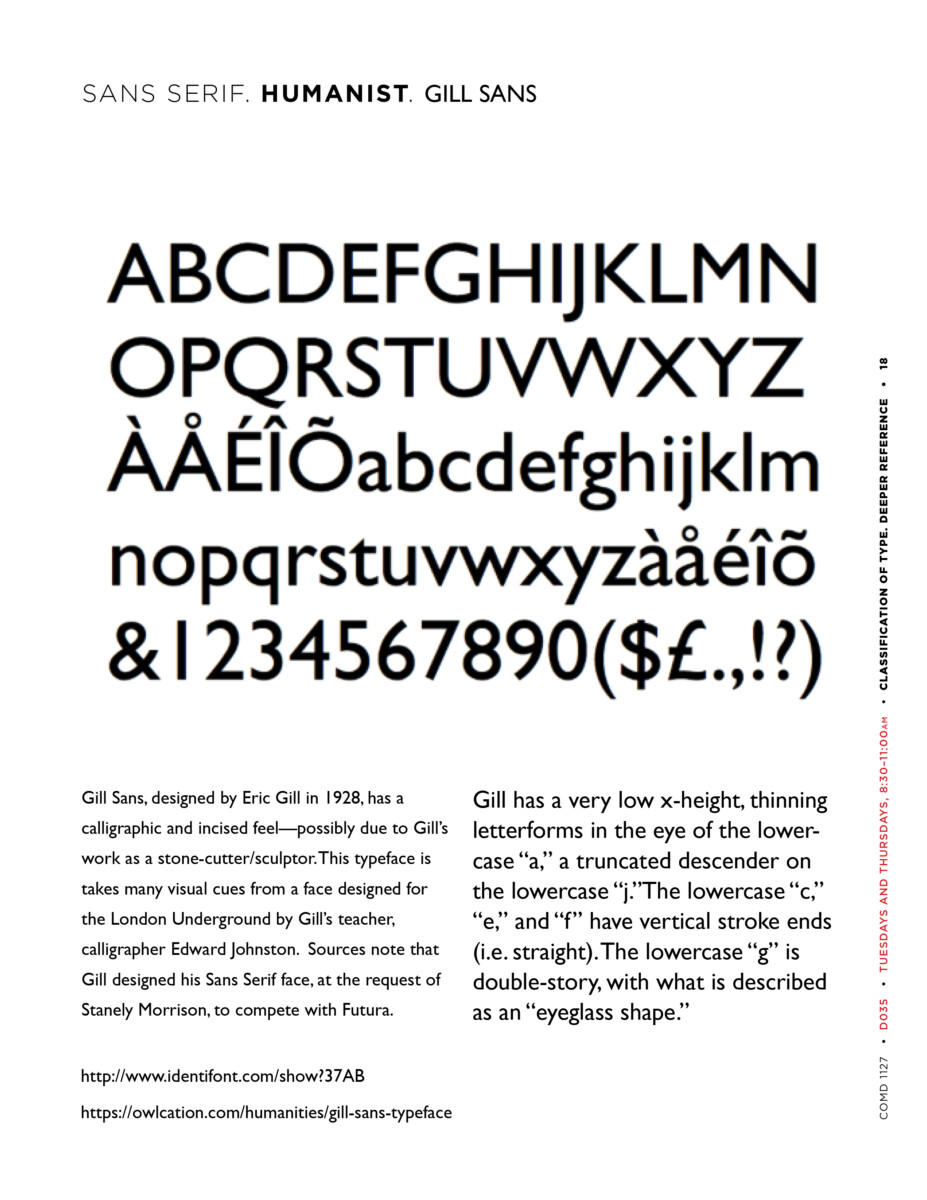
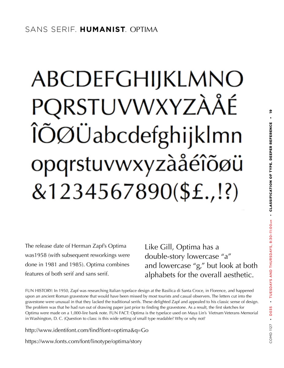
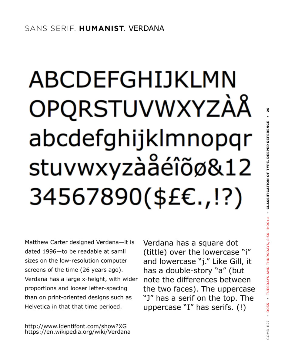
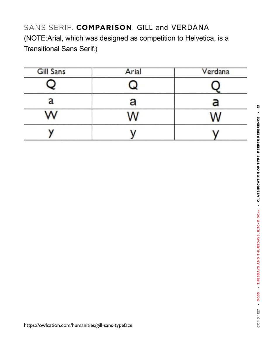
Humanist Sans Serif
______________________
Review 2
Use of Transparency in T, a style magazine.
Note: the paper is white; the photo is inaccurate.
______________________
Review 3
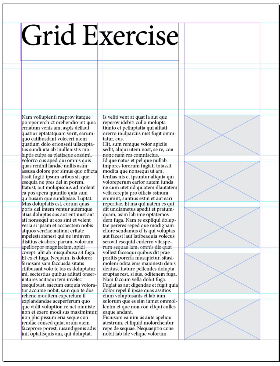
Quick review of your grids.
(Repeated) specs from Class 22:
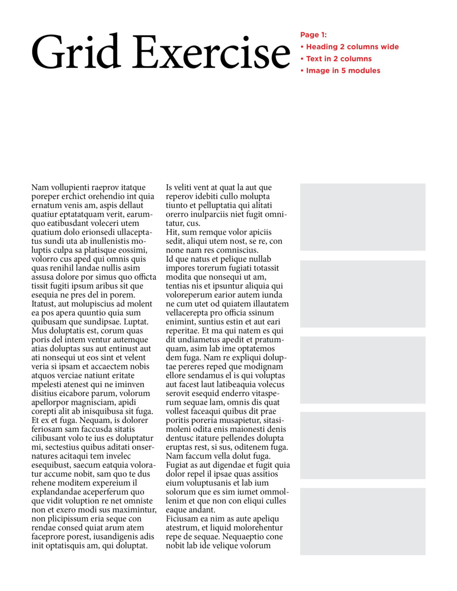
- Page 1:
- Heading 2 columns wide
- Text in 2 columns
- Image in 5 modules
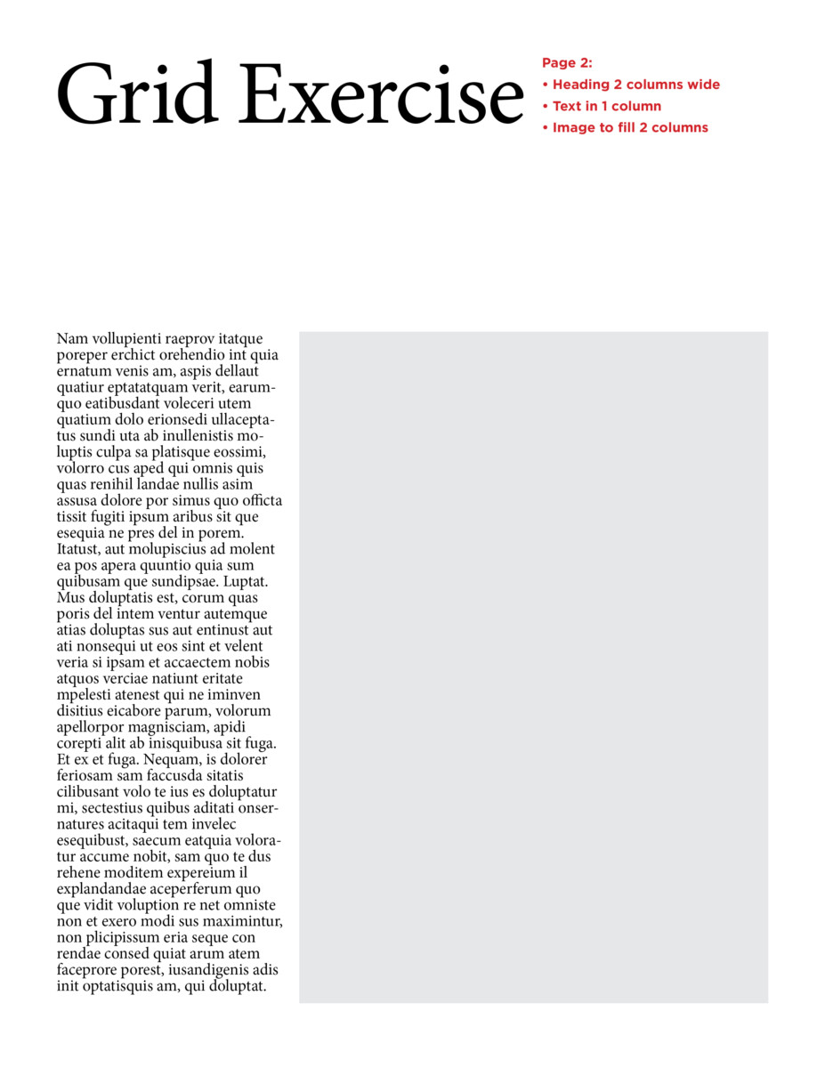
- Page 2:
- Heading 2 columns wide
- Text in 1 column
- Image to fill 2 columns (10 modules)
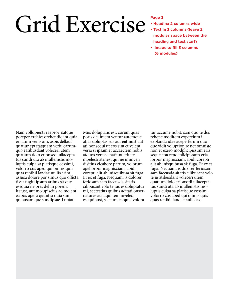
- Page 3
- Heading 2 columns wide
- Text in 3 columns (leave 2 modules space between the heading and text start)
- Image to fill 3 columns (6 modules)
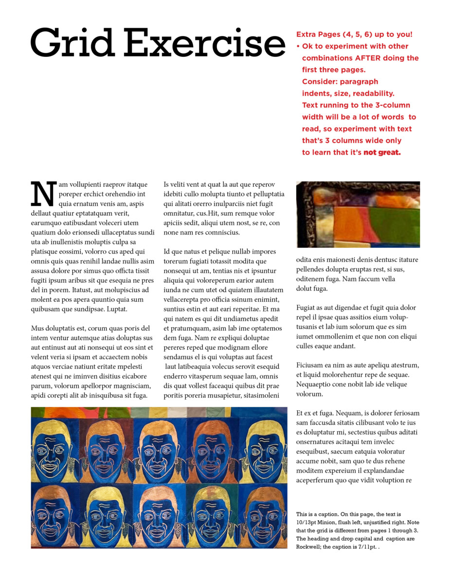
- Extra:
- Ok to experiment with other combinations AFTER doing the three above. Keep in mind paragraph indents, size, readability. Text running to the 3-column width will be impossible to read (SO many words in a line!), so look at text 3 columns wide only to learn that it’s not great.
• • • •
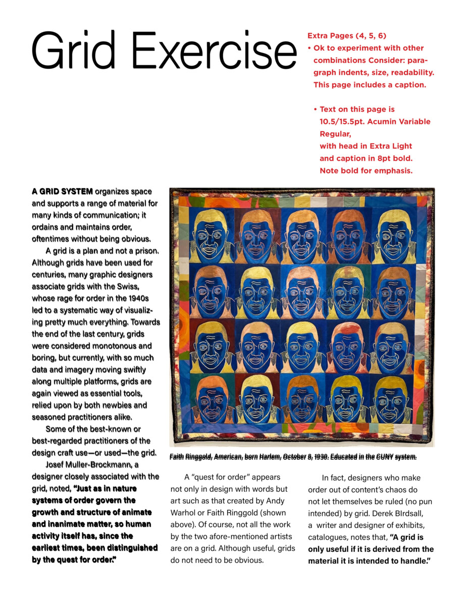
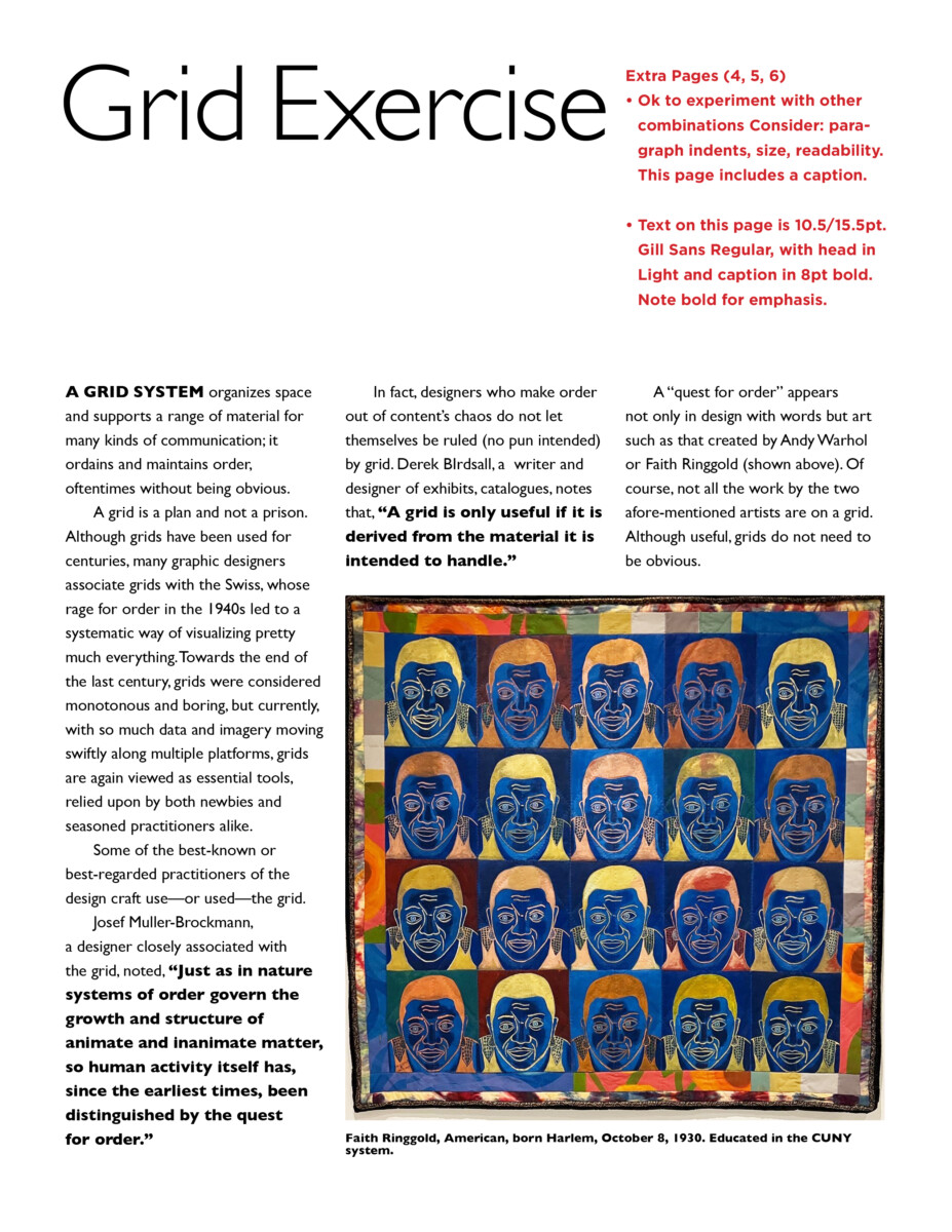
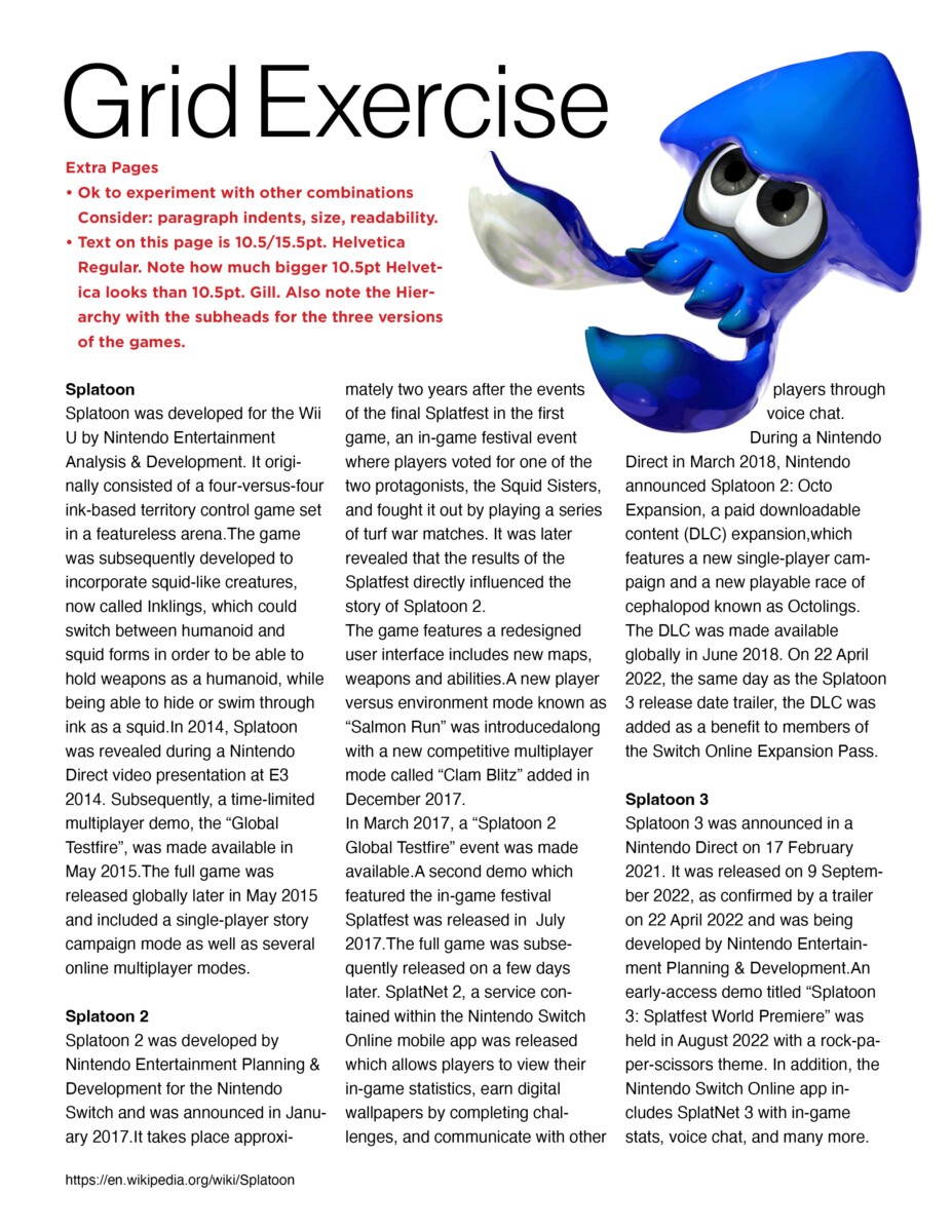
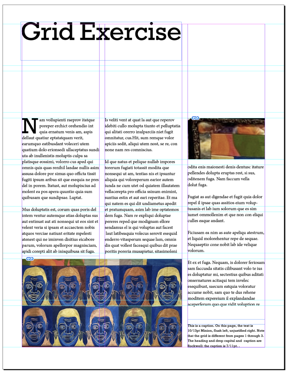
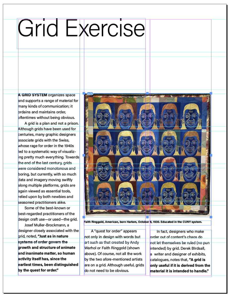
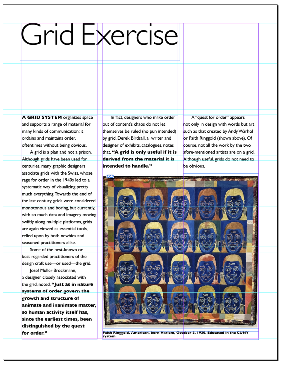
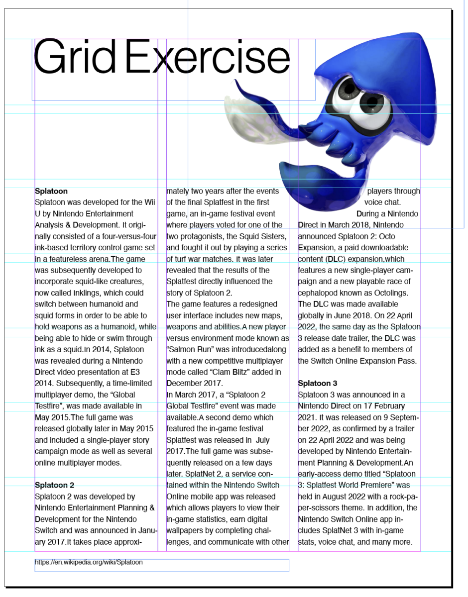
Visuals of grid Exercise with instructions for first 3 plus examples of additional pages. Pages 4 through 7 show text that is NOT dummy/placeholder text (and show paragraph indents).
Review
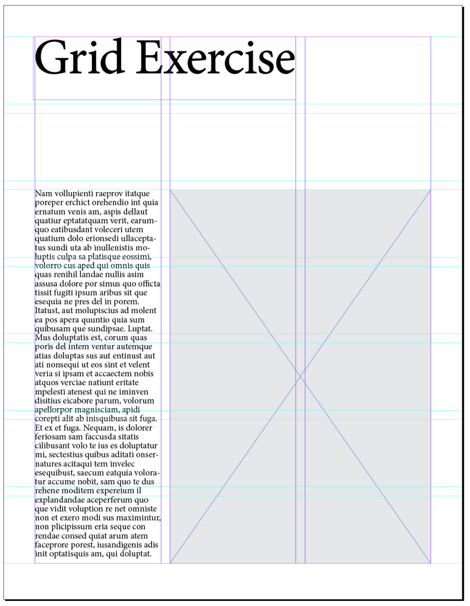
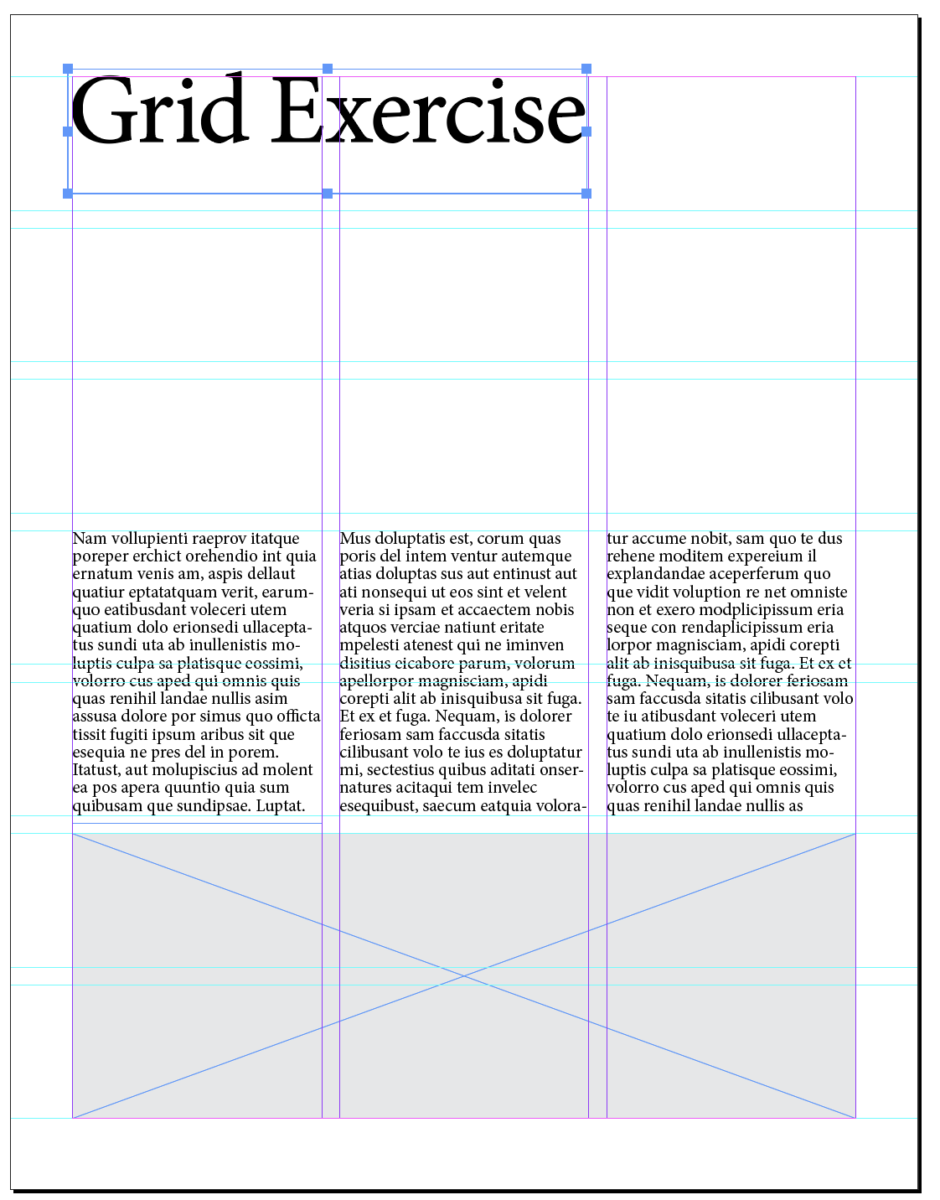
Grid Exercise showing guides for all pages. The first 3 pages show examples of specifications given in Class 22 for this exercise. Pages 4 through 7 show text that is NOT dummy/placeholder text.
Again, there are some additional examples of grids in Dropbox (note the crop marks and identifications because the examples are files set up for a printer).
___________________________________________
Activity 1
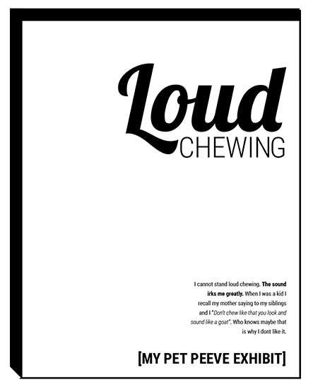
What you find ANNOYING!
Overview / Sketching / Content of the poster
- Include the text, thinking all the while of hierarchy:
- Series title (small): Annoying!
- Main Title: a short title for your peeve
- Your brief copy. For sketching, it is OK to indicate the copy in your sketch as opposed to doing it digitally. Interpret using only type for now. For your text, you may need to edit or adjust. We’ll review.
- (Concentrate on type)
- At the poster foot: Your Name
For when you have the grid and content of your poster, complete the document listed in Class 22.
- Create NEW Document:
- 2-page document
- size 11 x 14 inches. NOTE: this is a much larger size than we’ve been using to date.
- 3 pica margin all around
- 8 columns / 1 pica gutter
- 12 horizontal rows / 1 pica gutter
- GO to LAYOUT>CREATE GUIDES>ADD the rows and gutter> OPTIONS>from margin
- Specs:
- Create 2 different designs (2 layouts following the same grid)
- Use type only
- TWO typefaces max. (but with extensive families ok)
- Black and White
- Follow the grid
- Emphasize your visual hierarchy
- Emphasize contrast with scale (something must be BIG, something must be small)
- You must consider and apply what was previously covered in class: Type selection and variations, alignment, word and letter spacing, line height, expression, hierarchy.
Remember! See above for the content (text).
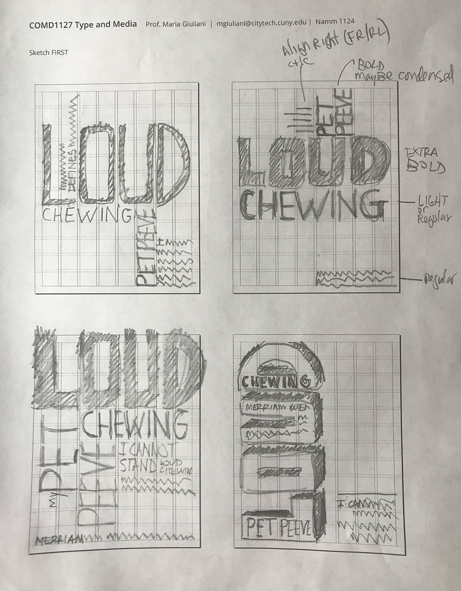
Sketch
Sketch again.
Sketch some more.
and
Think outside the Adobe.
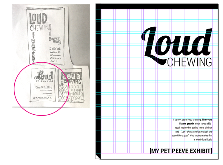
- The sample below, by Professor Giuliani, shows process.
Activity 2
Type Talk
Post in Student Posts > Type Talk >Last name_TypeTalk_Sahre_111623
(Remember to choose a category prior to posting)
Read the short article in Print magazine (which is entirely digital) about the book designed by Paul Sahre and answer the following questions:
- What specifically in Sahre’s project reminds you of work we’ve done in class so far? List two things.
- What is your opinion of the project?
- Have you ever seen or used an old-school typewriter or IBM Electric typewriter?
Assignment (Due before Class 24, Nov. 21)
- Homework
- Complete your sketches. Upload jpegs to Dropbox.
- Complete two different layouts in InDesign
These will have the same grid and the same contents, but completely different layouts. - Once completed take save your InDesign files. Take screenshot of your solutions. These screen shots must show the guides and upload to Dropbox.
- name your folder
lastname_Proj03_sketches_poster1_111623 - lastname_name_Proj03poster2_111623


Leave a Reply