Class Info
- Date: Thursday, November 9, 2023
- Meeting Info: In person, Pearl 116, 8:30 to 11:00am, followed by Professor’s office hours from 11:00am to noon in Pearl 116.
Topics, Discussion, Info
- Type Scavenger Hunt: what you found.
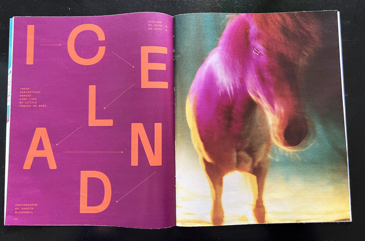
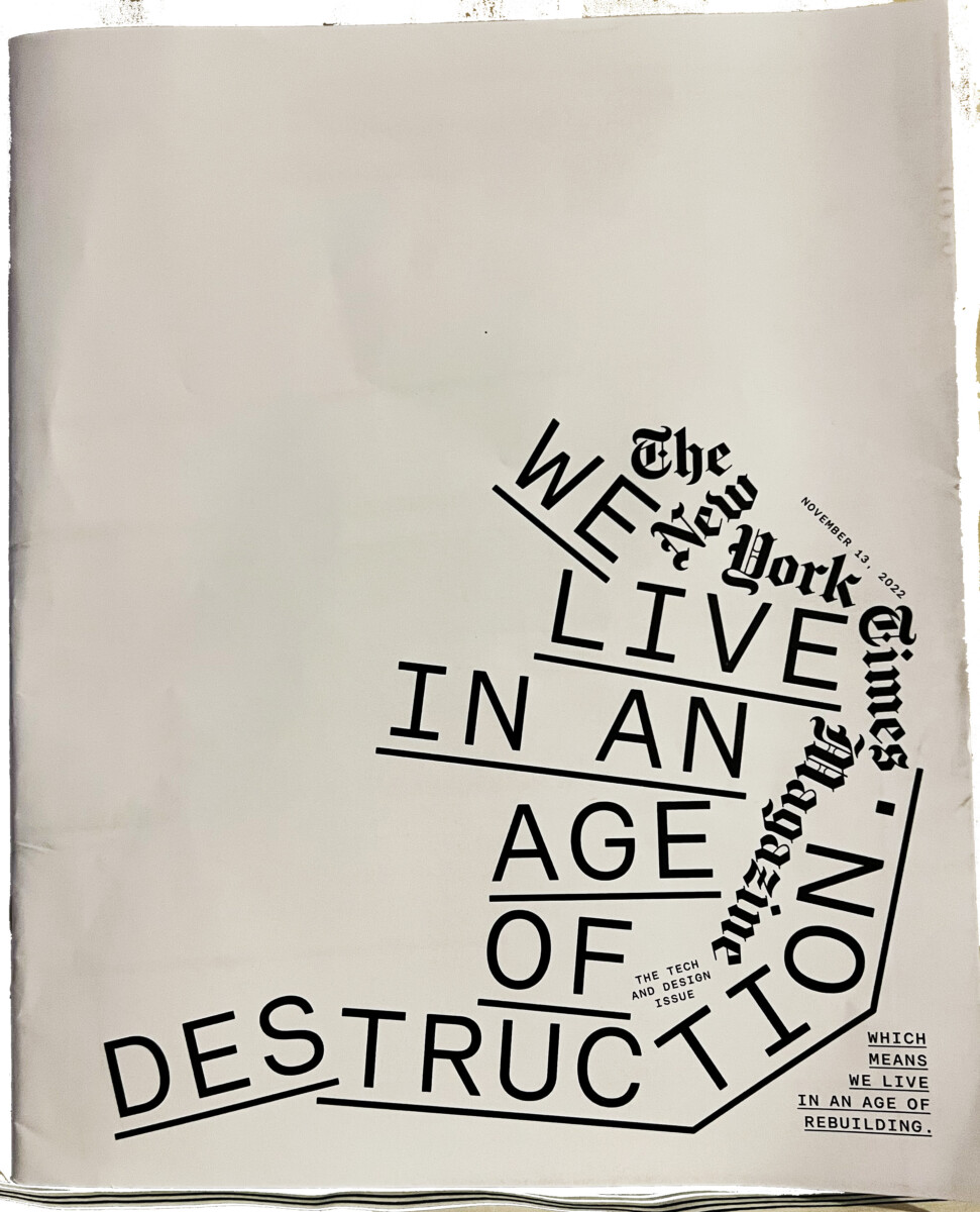
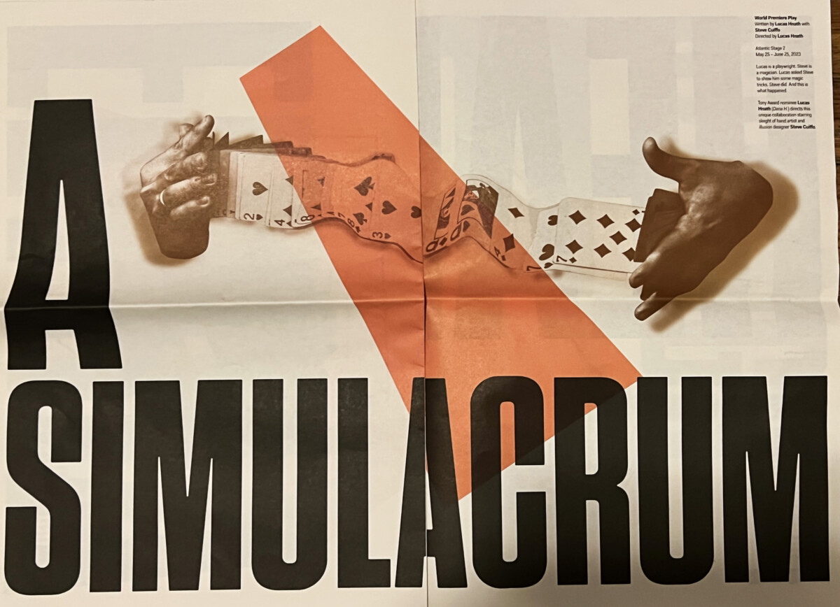
- Examples using Expressive and Playful type. Translation: how what we’re doing in class is used in outside of the classroom.
- Presentations of the rest of students’s Project 2
- Another phase of Color and legibility using texture (type over texture + texture in type).
- The typographical grid. (We will touch on the grid and cover it in depth next class—i.e. Nov. 14). In preparation, review the PDF in the link below.
- A grid is a system of vertical and horizontal guides used for the organization of a layout. Grids are used in graphic and web design.
- Quick Reference PDF: The Grid
- Additional grid reference from Layout Essentials
- Components of the grid:
- Margins
- Columns and rows
- gutters (vertical and horizontal)
- modules and spacial zones
Objectives
- Learn more about working with type and how type engages attention.
- Relate what we’re doing in class to work out in the world.
- Introduction: Grid. Understanding the parts of grid
- Develop understanding of organization in design.
- Start to a concept for Project 03.
A Step Back
- Slab Serif.
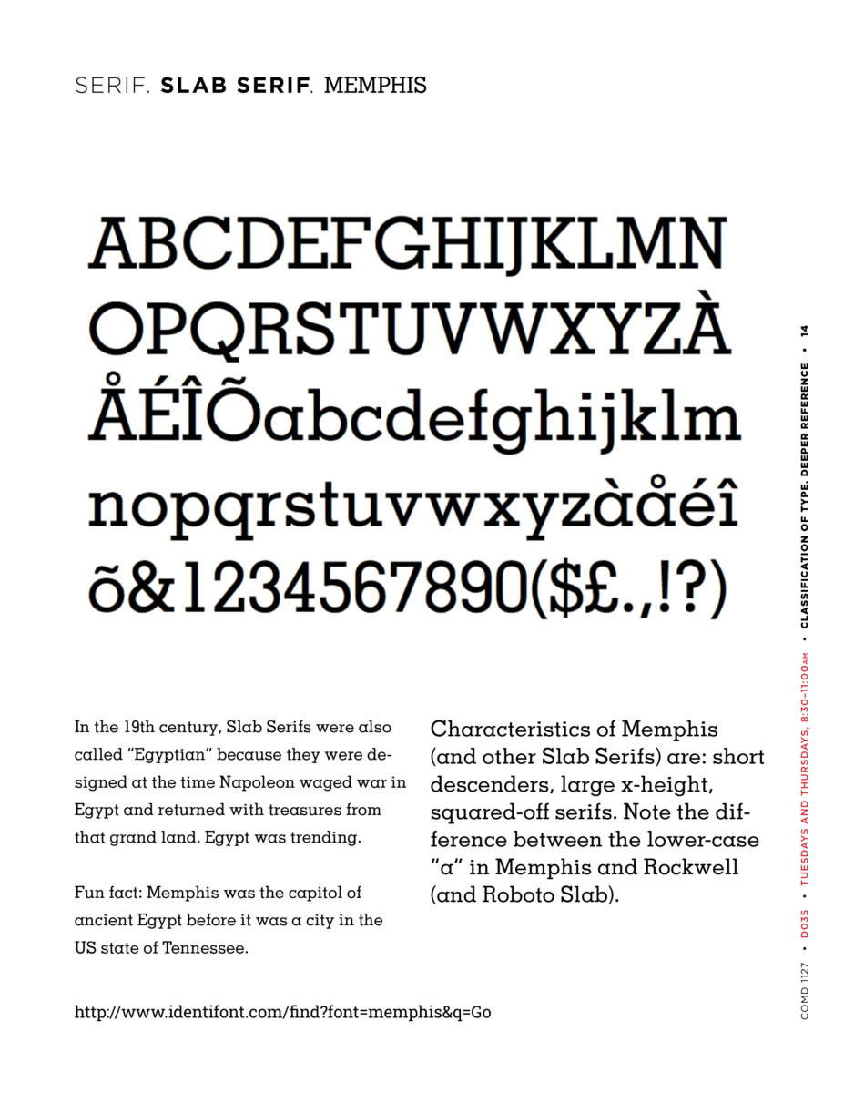
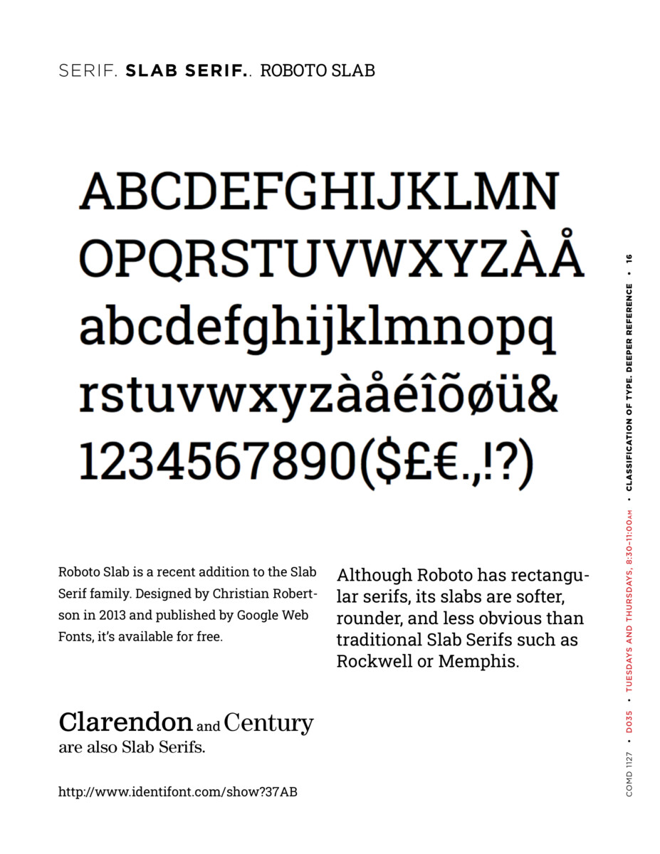
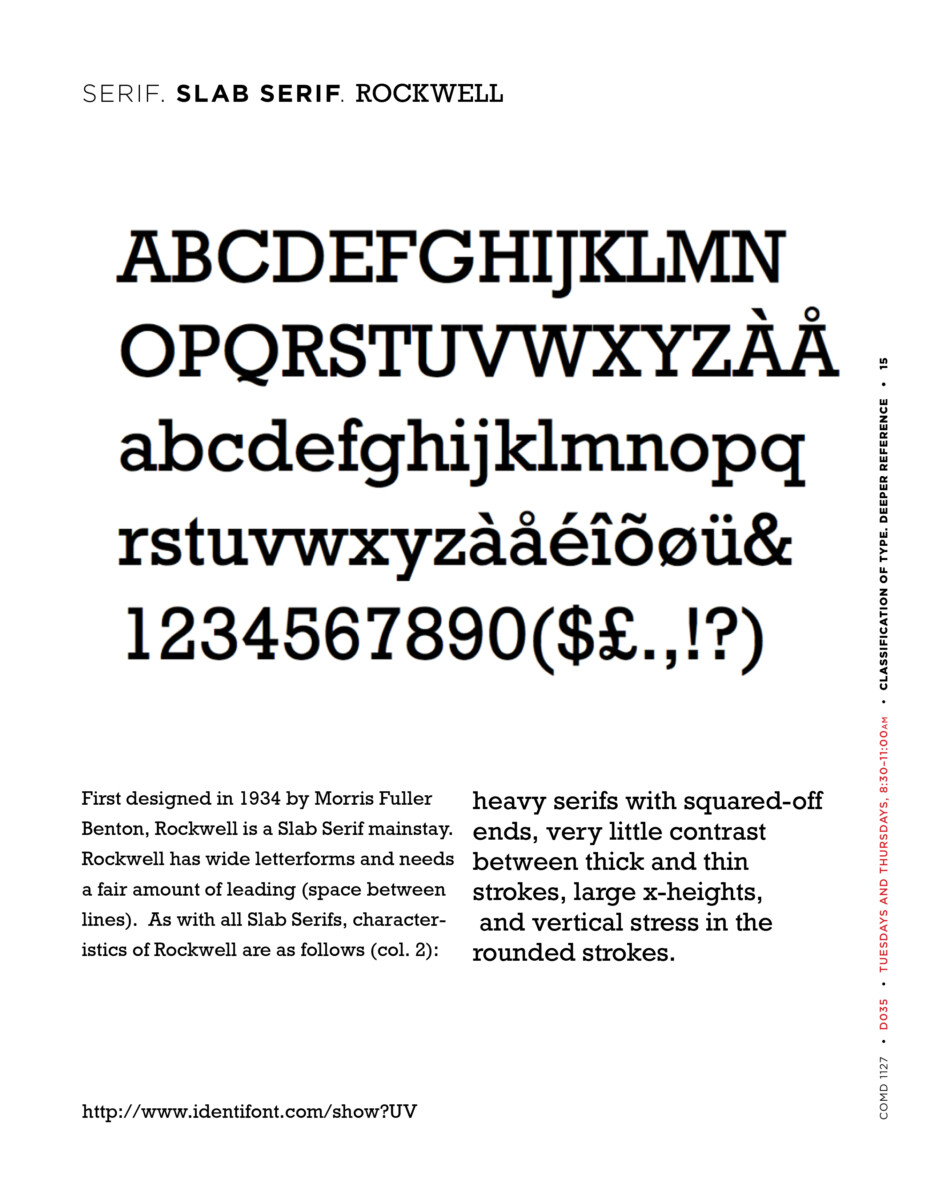
Which of the typefaces in the illustration BELOW is Slab Serif? Type shown is based on wood type, which was big in the 19th century and is back in favor among letterpress printers of today.
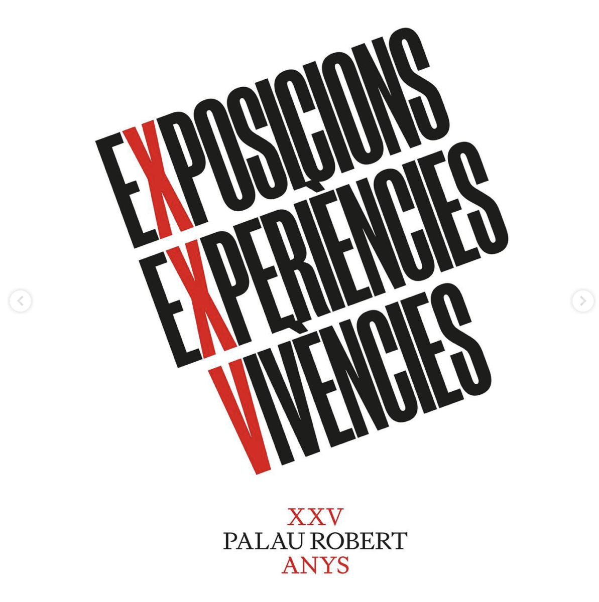
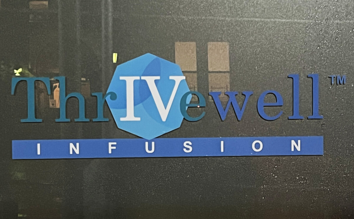
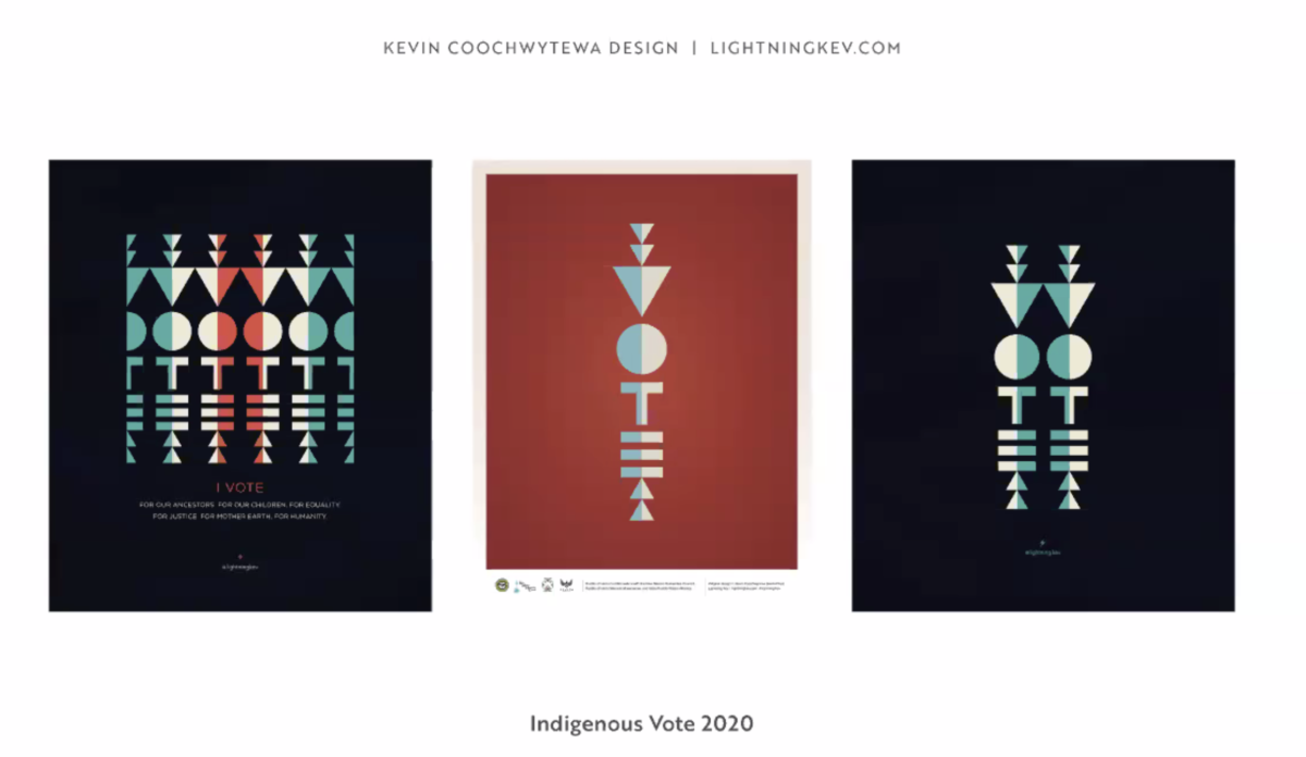
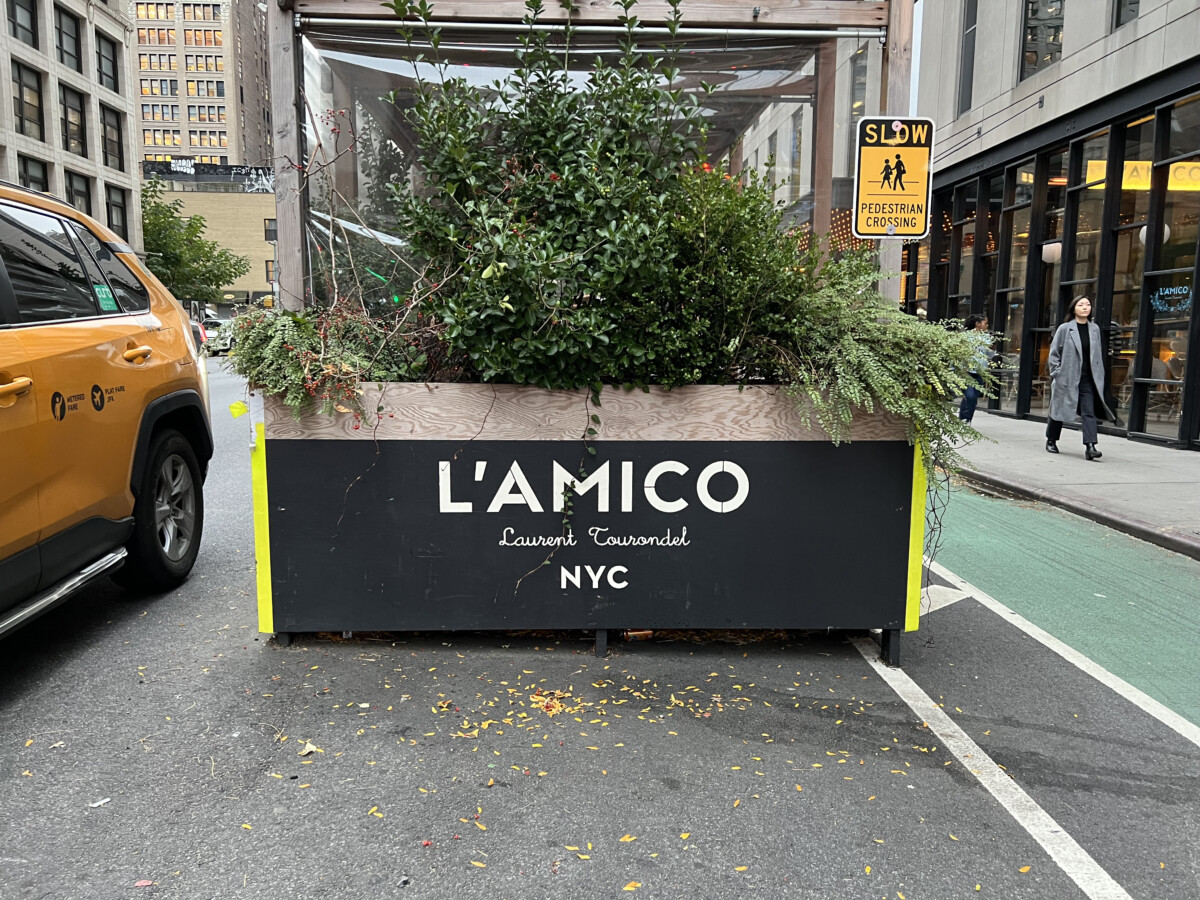
- Type Scavenger Hunt: we’ll review your finds using (1) play on letters or (2) a wordmark for a non-traditional organization (or culture).
- Examples from Class 20 plus a few more are below.

(which may be just as well).
- Other principles we’ve learned. Can you name them?
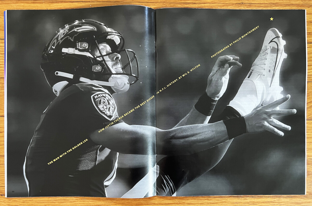
Brandon Tovar: note the image!
Activities
Activity 1
Presentation of Project 2 by latecomers.
Activity 2
During Class: Further explore Color and Typography.
OVERVIEW
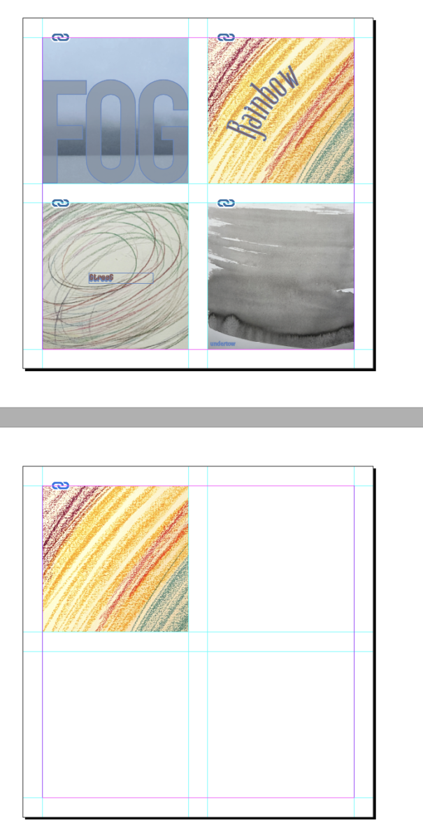
Using InDesign create a page similar to the 4-word and texture document we created in Class 16 (which you showed on page 7 of Project 2). Of course, you can add to your InDesign Document. Choose One of your textures and choose one letter.
- On square 1 (top left): Add One texture and One letter. Use Transparency of the letter.
- Leave Square 2 (Top Right) Blank
- Leave Square 3 (Bottom Left) Blank
- Square 4: Add a texture inside a letter
- STEP BY STEP
- Choose one of your Texture.
- To create a transparent letter, this must first be an outline and not an editable typeface.
- Next, click on the text box with your letter and go to
TYPE > CREATE OUTLINES.
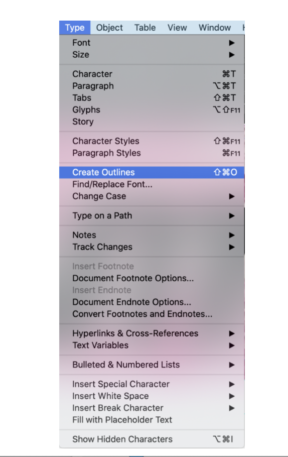
- Once you’ve Created Outlines, click on the box and go to OBJECT > EFFECTS > TRANSPARENCY.
Adjust the transparency and color to see multiple options such as those below.
Again, below is the finished example.
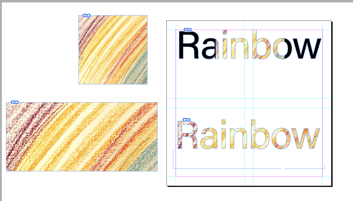
If you’ve completed the exercise and want to go farther, you can add an image into your letter. Here’s how:
- Create outlines
- Then, copy the image you want to use.
- Next, got to EDIT > PASTE INTO (not copy and paste)
If you use an entire word, make sure your image is as large as or larger than the word or you’ll get only a partial image in your word. See below.
Below is a recap of how to insert an image into a word. It’s also in the first link below.
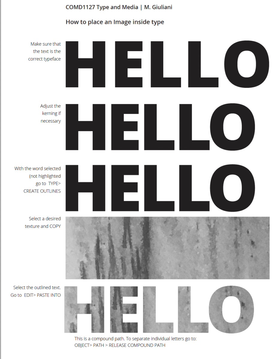
How to add an image inside a letter InDesign
ASSIGNMENT 1
- Create a page similar to the one with your 4 textures
- Following the steps above, add a page FOR EACH OF your texture images as well as a PAGE FOR EACH OF YOUR TEXTURE pulled into a full word. You will have 9 pages in all, including the first page you did weeks ago.
- Save your InDesign FILE as:
Lastname_image_in_letters_110923 - Then Package the file, making sure to include a PDF.
- Upload to Dropbox in your folder.
Homework
Two assignments:
One
Upload your Assignment 1 to Dropbox. (Package first!)
File name: Lastname_image_in_letters_110923
Two
Type Scavenger Hunts (Do the one from Class 20 as well!)
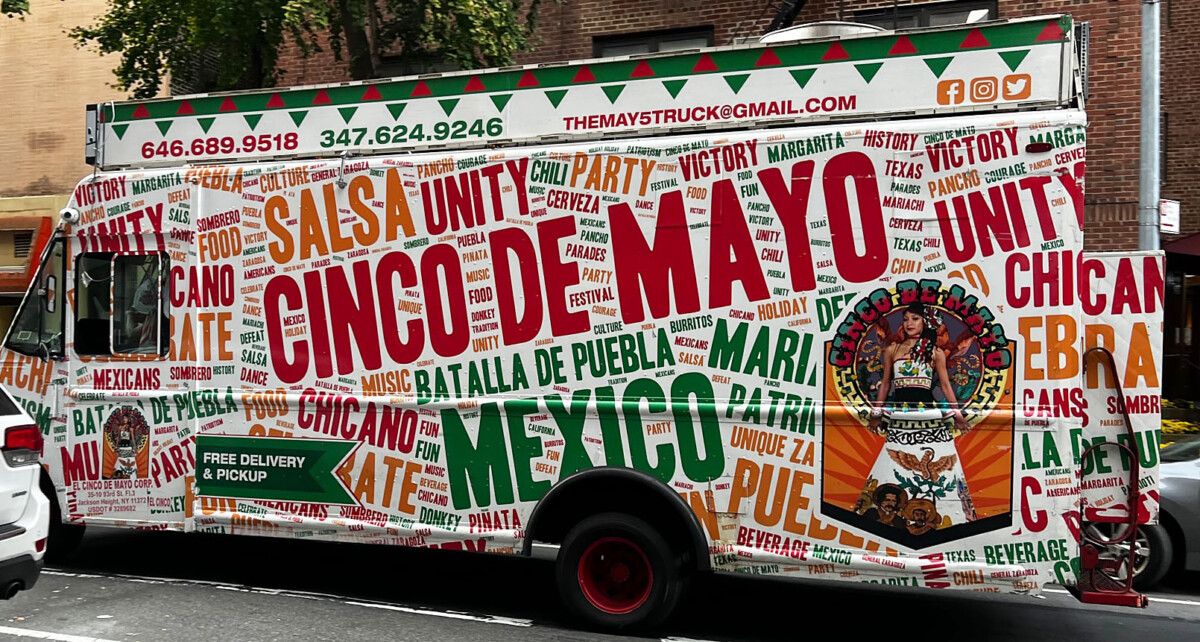
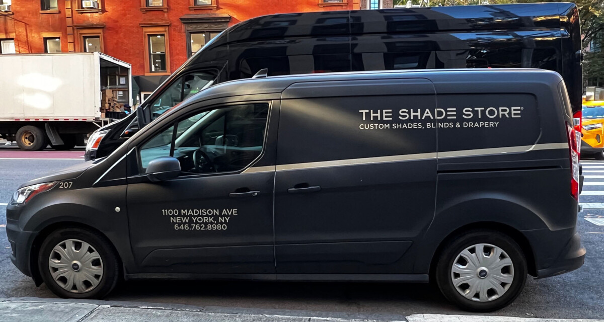
Photograph at least one truck, post it, and describe the typography and its success. Post in Student Posts >Type Scavenger Hunt
File name: Lastname_TSH_truck_110923
__________________________________________________________________________________________
For Project 3. Looking Ahead
Visual Hierarchy, will be included in Project 3.
Intro to Project 3
- Intro to project 3 | Part 1. Posters Series and Social Media Posts
- We will create a fictional art Exhibit: Annoying!
- We will design a series of posters (which will be the actual contents of the show) and Social Media Posts (which will advertise the exhibit). This is the last project for the semester, and will incorporate all the previously typographic information discussed in class (typeface selection, alignment, word spacing: tracking, kerning, line height: leading, color & typography, the grid, visual hierarchy, and basic motion).
- How do all these elements create a comprehensive design in a series?
________________________
Class 22 will cover grids and visual hierarchy.
A look ahead to Class 22 (no need to do in Class 21).
- Create a document in InDesign and practice.
- How to create columns and rows (modules)
- How to use the grid


Leave a Reply