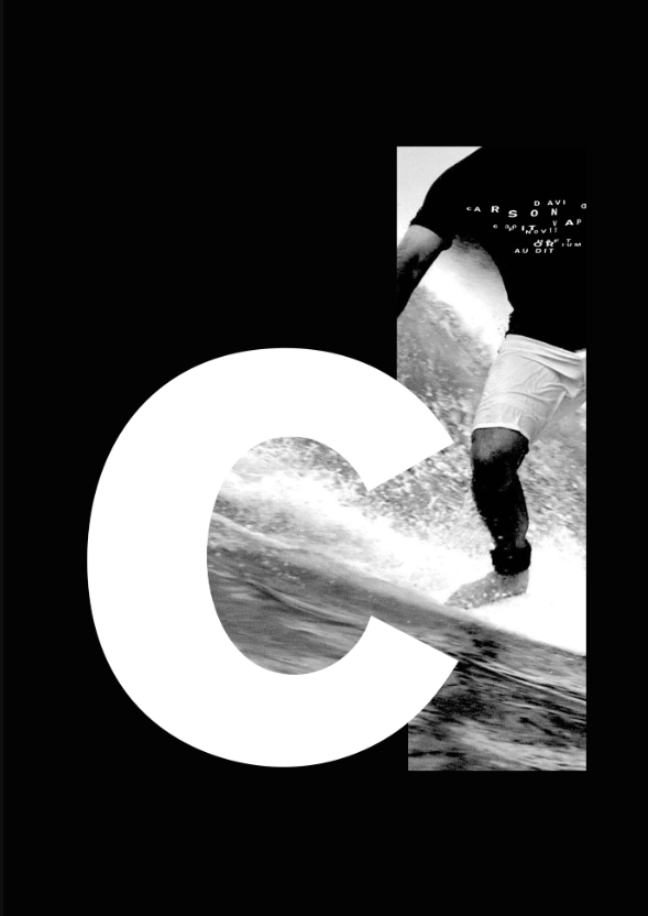
- A-examples 1A, 1B, & 2 use sans serif meanwhile example 3 uses serif
- B-the difference of the weights show importance of the text from the others while showing it clear and crisp
- C-the typefaces are appropriate in the examples such
Author: Seraphina Huang (Page 1 of 4)

- I-the design of the text II-the alignment of the text
- The project is very unique since it uses a typewriter, the designer Paul Sahre purposefully abandoned current production methods. He used a different method for the design by using the


