Author: Mathews Vargas (Page 2 of 3)
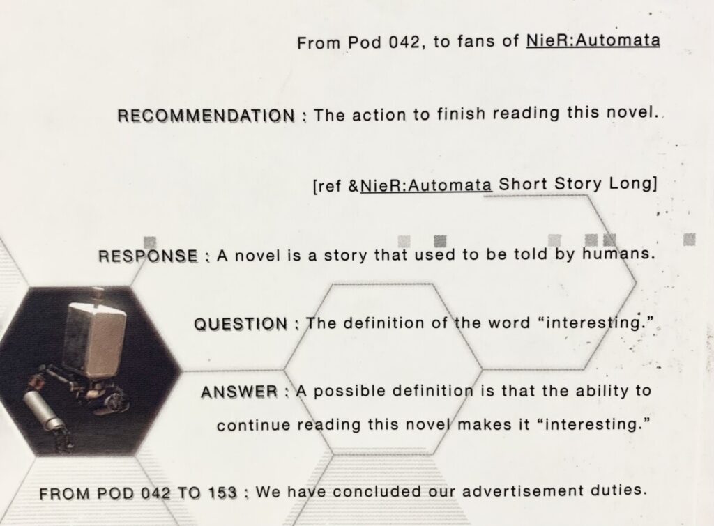
the cover that catches my attention the most is the last one because of how it stands out, its clear and bold, and the uniqueness of the serif helps make it pop out more. and as for the typography that … Read More


