The second image catches my attention, because the letters are placed in a curved form showing type on a path. I noticed that that the letters are getting smaller and smaller as it reaches the edge of the book. Looking … Read More
Author: Jessica (Page 3 of 4)
I found this on my computer as I was doing work. This image shows bold text next to regular text. The Congratulation park is bolder than the bottom part.
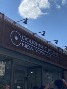
I found this doughnut shop as I was walking around … Read More
While walking around the store and running some errands, I found these examples on the shelf at Target. The Glade logo looks like a script-style font. The logo looks very fancy and shows a sense of elegance. The “L” extends … Read More
This signage does not convey the image of fine jewelry because the characters look like bubble letters, and bubble letters reminds me of a childlike way of writing characters. A typeface that I would suggest is Rockwell.… Read More


