Author: Jessica (Page 1 of 4)
In this poster, I see a lot of movement with type. This reminds me of a gif something that we experimented on in class. In the second post, there are repetitions of type being used. Lastly, You can also see … Read More
Sahre’s project reminds me of the work that we have done in class such as type on a path and playful typography. Sahre also included what typeface she used in her book just like what we did in project 1 … Read More
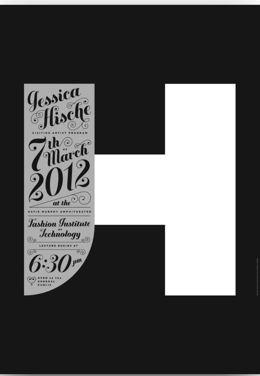
I chose this poster because it looks very decorative and fancy in a way. The classification that Jessica Hische uses is script to advertise about her event. Some text are bigger and have a heavier weight to really emphasize the … Read More