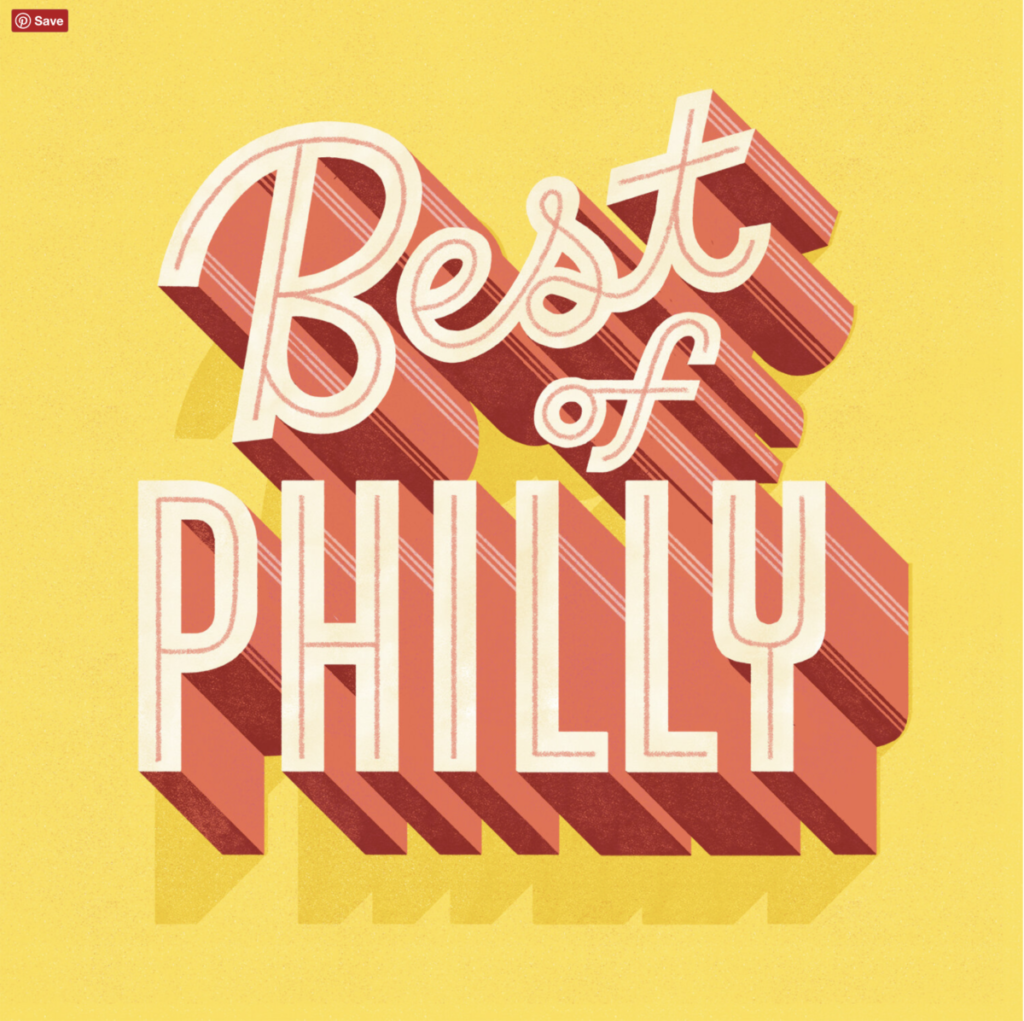
I chose this piece from Mary Kate McDevitt. I think it’s bold and expressive because the bright colors and shadows to make the text look more 3D. One thing i like about the style of this artist is how their … Read More
Beth Tondreau | COMD1127—D035 | Fall 2022

I chose this piece from Mary Kate McDevitt. I think it’s bold and expressive because the bright colors and shadows to make the text look more 3D. One thing i like about the style of this artist is how their … Read More
The font that is used for Larry’s fine jewelry Inc is very generic, bland and uninteresting. It doesn’t look appropriate for it to be known as a jewelry store. A better font for this logo would be “Brush Script MT” … Read More
© 2025 COMD1127 Type and Media
Theme by Anders Noren — Up ↑