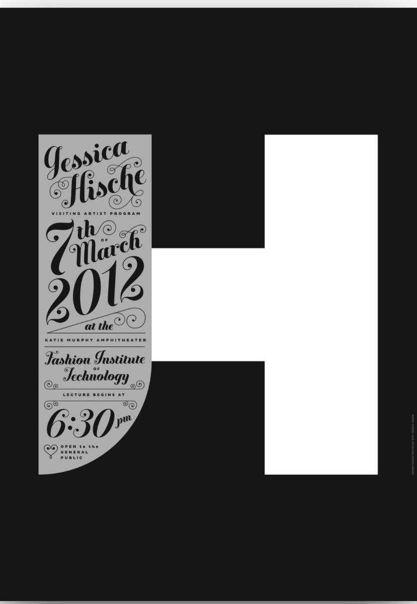
I chose this poster because it looks very decorative and fancy in a way. The classification that Jessica Hische uses is script to advertise about her event. Some text are bigger and have a heavier weight to really emphasize the name, date, location, and time of the event. The color that Hische uses is black, gray, and white which makes it easy to read.


Leave a Reply